This document describes the new features added to Alpha Five V12 compared to Alpha Five V11. This document is current through the initial Alpha Five V12 release. To see the new features that have been added to Alpha Anywhere since its initial release, please click here.
Web Applications - Context Object Documentation - The Context object is available to all server side code that executes in the context of a Web application (for applications that use the Alpha Anywhere server and for those that use the Alpha Anywhere plug-in for IIS). This object has an extensive set of methods and properties that allow you to get information about the request and the response to interact with the security framework.
Click here to see Context object documentation.
UX Component - Slider - Date and Character Values - The slider
control by default allows you to select a numeric value in a range of
numbers. But it can also be configured to select a date value from a
range of date values, or a string value from a pre-defined list of
choices (e.g. Poor, Average, Good).
This video shows how the Slider can be configured as a numeric,
character or date slider. It also shows how the range of allowed values
(numeric and date sliders) or the list of choices (character sliders)
can be dynamically changed at runtime.
Watch Video - Part 1
Watch Video - Part 2
UX and Grid Component - Javascript Code Editors - Syntax Errors - When you save a component that has Javascript code, you can configure Alpha Anywhere to show a warning if your code has errors.
By default, this is turned on. You can turn off this feature on by going to the View, Settings menu and then navigating to Preferences, Javascript.
Javascript Library - Date Object - .toFormat() and .fromFormat() - The built-in Javascript Library has two methods that extend the standard Javascript Date object that make it very easy to parse and display date values.
The dateFormat string can use these directives
switchYear - used in .fromFormat() when the year is set to a 2 digit year. Help determine which century the year is in (e.g. 1950 or 2050)
For example
var d = new Date()
alert(d.toFormat('dd-Mon-yyyy'));
var d = new Date();
// date time format
d.fromFormat('12/24/1998 10:00:00 am','MM/dd/yyyy
0h:0m:0s am');
// date w/ switch year (1950)- third parameter
d.fromFormat('12/24/10','MM/dd/yy',50);
This will show '15-Jun-2013' (assuming that's what today's date is)
UX Component - List Control - Free-form Template - Event Handlers in HTML Markup - Touch Devices - When you create a List control that uses a Freeform Layout, you define an HTML template for each row in the List.
Consider the following very trivial template:
{Firstname} {Lastname}<br />
<button onclick="alert('button1')"
>button1</button>
In this example, the template contains a button with an onclick attribute that defines the button action.
NOTE: Of course the button could have been added in the 'Fields' pane of the List builder in which case the template would simply have a placeholder for the button (e.g. {Button1} ), but we are just trying to illustrate a point here.
When you run the UX that contains the List on a desktop browser, clicking on the button will fire the event. However, when you run on a mobile device (i.e. a device that supports touch events). clicking on the button will not fire the button event!
To solve this problem, the ontouchstart event can be used. In the example below, the template markup has been modified. Note that both the onclick and the ontouchstart attributes are used so that the same component will run on both touch and non-touch devices.
{Firstname} {Lastname}<br />
<button onclick="alert('button1')" ontouchstart="alert('button1')"
>button1</button>
UX and Grid Components - Javascript Function Declarations and the Global Namespace - Best Practices - When you define a Javascript function in a Grid or UX component, the function is defined in a global Javascript namespace. This can cause a problem if two components define the same function.
Consider the following situation:
Say you have two UX components, UX1 and UX2.
In UX1 you define the following function:
function myfunc1() {
alert('Hello Bob');
}
In UX2 you define the following function:
function myfunc1() {
alert('Hello Alice');
}
Now assume that a button on UX1 opens UX2 in a window, div, Panel, etc. When UX2 is loaded, it is going to define the 'myfunc1' function in the global namespace. So if the user then clicks a button on UX1 that calls myfunc1(), instead of seeing 'Hello Bob' as she would expect, she will see 'Hello Alice' because UX2 has redefined the global function.
The solution is for each component to define its functions in its own namespace. The most obvious namespace to use is a namespace in the component object, since this is unique for each component instance.
So, in UX1, instead of defining myfunc1 as shown above, you could define the function as follows:
{dialog.object}._functions.myfunc1 = function() {
alert('Hello Bob');
}
To call the function you would use this code:
{dialog.object}._functions.myfunc1();
NOTE: _functions is a namespace in the component object that already exists. You can use you own namespace in the object if you prefer.
In effect, the above pattern is adding new methods to the component object.
In the case of a Grid component, you would use this pattern:
{grid.object}._functions.myfunc1 = function() {
alert('Hello Bob');
}
Where to Define Functions
Normally, you would define Javascript function in the Javascript Functions pane of the Grid or UX builder. However, when defining your functions using the above recommendations (i.e. as properties of the Grid or UX object), defining your Javascript code in the Javascript Functions section is not recommended.
Instead, it is recommended that you define your functions in the client-side onRenderComplete (or in the case of the Grid, the onGridRenderComplete) event.
The reason for not defining the functions in the Javascript pane is as follows:
Putting the code in the onRenderComplete, or onGridRenderComplete event circumvents this problem, because these events are guaranteed to fire.
Using JSON Notation when Defining Multiple Functions
When defining multiple functions, using JSON syntax is very convenient. For example,
{grid.object}._myFunctions = {
function1: function() {
//define function1 here
},
function2: function() {
//define functin 2 here
}
}
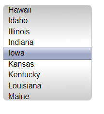
UX Control - SpinList - Different Appearances - The CSS styles sheets now allow you to select a sub-theme for SpinLists. For example, the sub-theme below is 'LightSelectionBand', which puts a band around the selected item.

UX and Grid Component - Pop-up Modal Windows - Custom Class for the Lock Background - When you display a modal pop-up window, the screen background is 'locked' by displaying an overlay behind the window. The overlay is opaque and it prevents the user from clicking on controls off the window.
You can now specify a custom CSS class for the 'lock' style. This allows you to set the color of the lock screen. For example, in the image below, we have set the lock color to a transparent green color.
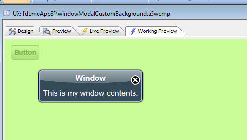
To set the Lock Background class name, set the new 'Lock overlay CSS class name' property (shown below).
To use the default appearance set the class name to <Default>
To set an invisible background use the special <Invisible> class name.
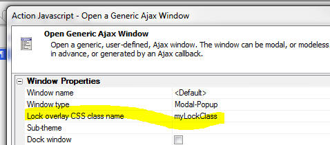
In the above example, here is how the 'myLockClass' CSS selector is defined.
.myLockClass { background:
rgba(150,250,50,0.5);}
UX Components - Cordova/PhoneGap Javascript - When you build a mobile application that runs in a Cordova/PhoneGap native shell, it is necessary to load the correct Cordova Javascript library.
A property in the UX builder (shown below) allows you to specify that the UX component should load the Cordova Javascript libraries.

A property in the Web Project Properties dialog (shown below) allows you to specify if the Cordova libraries are loaded from a 'built-in' version of these libraries (only IOS and Android versions are currently built-in), or from a 'Local' source (a file a special folder in your webroot).

The default source is 'BuiltIn'.
The actual Javascript that is served when the 'BuiltIn' option is used can be overwritten by creating a file in a special folder in the Alpha Anywhere Application Server executable folder. (If you are using the Development version of Alpha Anywhere for testing, you would put the file in the Development version executable folder).
For example, to override the 'built-in' IOS Cordova Javascript file, create a file called 'cordova\ios\cordova.js' in the executable folder.
To override the 'built-in' Android Cordova Javascript file, create a file called 'cordova\android\cordova.js' in the executable folder.
If you change the source to 'Local" then you must create a file called 'cordova.js' in a special folder in the webroot. The naming convention for this folder where the 'cordova.js' file is located is as follows:
<webroot>\Javascript\Cordova\Platform\buildNumber\cordova.js
where Platform is the platform (e.g. iOS, Android, Blackberry10, etc.) and buildNumber is the build (e.g. 2.8.0 or 'currentRelease').
For example:
<webroot>\Javascript\Cordova\iOS\2.8.0\cordova.js
<webroot>\Javascript\Cordova\iOS\currentBuild\cordova.js
<webroot>\Javascript\Cordova\Android\currentBuild\cordova.js
NOTE: You can create these files in the Javascript\Cordova folder in your web project and they will be published to your webroot when you publish your project.
Specifying the Platform and BuildNumber
The platform and buildNumber can be
specified two ways:
1. Assume you have an .a5w page that loads the UX
component. In this case you can add parameters to the
query string. For example:
page.a5w?__cordovaVersion=2.8.0&__cordovaPlatform=android
2. Assume that the UX component is loaded by an Ajax
callback. Before the callback is made, set properties in
the global A5.flags Javascript object. For example:
A5.flags.cordovaPlatform='iOS';
A5.flags.cordovaVersion='currentRelease';
UX Component - Buttons - Advanced Button Styling - In V11, Buttons could optionally be set to use 'Advanced Button Styling'. When this property is turned, buttons are generated as special Javascript objects and they have more functionality than standard HTML markup buttons. In V12, the 'Advanced Button Styling' checkbox is hidden by default, and all buttons are automatically set to 'advanced buttons'.
For backward compatibility, if you want to show the 'Advanced Button Styling' property you can go to the Properties pane, 'Advanced' section, and turn on the property.
For touch enabled devices, you should be sure that all buttons are set to 'advanced buttons'.

UX Component - SpinList Control - Height - You can specify the height of the SpinList control. By default, the SpinList control shows one entry above and one entry below the selected item. You can specify the height as either a number (e.g. number of items to show above and below the selected item), or a dimension (e.g. '200px' - an explicit size for the total height of the control).
You can change the height programmatically at run-time. For example:
var s = DLG1_DlgObj.getControl('spin1');
s.height = 2; //set height to 2 entries above and below
s.refresh();
s.height = '100px'; //set height to 100px
s.refresh();
Note that you must call the .refresh() method after changing the height property.
UX Component - List Control - Multi-select Mode - The List control can be in either a single or multi-select mode. In multi-select mode, the user can select multiple rows in the List. If the List is in multi-select mode, when the UX is submitted, the data in the List is in the form of an array ( just as the data submitted from a checkbox or dropdownbox configured to allow multiple selections is in the form of an array).
When multi-select mode is enabled, you can specify the method for selecting multiple rows. The options are:
With the 'control-click' option, clicking on any row selects the row and clears all existing selections. To extend the selection, you control-click on additional rows. This method is really only meaningful for a desktop web application. On a mobile device, there is no concept of a control key.
With the 'click' option, clicking on an un-selected row, selects the row and vice-versa. Therefore, in order to select multiple rows, you simply click on each of the rows you want to select.
You can programmatically toggle between selection modes. For example, assume the list control is called 'LIST1':
var lObj = {dialog.object}.getControl('LIST1');
lObj.selectionMode = 'additive'; //set to click mode
lObj.selectionMode = ''; //set to control-click mode
Tip: You can programmatically set the current selection to nothing as follows:
var lObj = {dialog.object}.getControl('LIST1');
lObj.setValue(''); //list is in single select mode
lObj.setValue([]); //list is in multi-select mode
UX and Grid Component - Action Javascript - Print Report Action - SQL
Reports - IN Clause - When using Action Javascript to display a report based
on a SQL datasource, you might want to use the SQL IN clause in your report
filter.
Watch Video
Download Component (Requires a connection string called 'Northwind' to
sample Northwind database)
For example, you might have a checkbox control and you want to print the report showing all values checked in the checkbox control. The syntax for the IN clause is as follows:
SELECT * from PRODUCTS WHERE COLOR IN ('red', 'green', 'blue')
Translating this to use arguments:
SELECT * from PRODUCTS WHERE COLOR IN (:whatcolor)
In the above example, you cannot use a simple character argument. You must use a special 'array argument'.
In the Action Javascript builder, when you define arguments to use in the report filter, a special naming convention is used to indicate that the argument is an array argument. If the argument name starts with 'array_', the argument is assumed to be an 'array argument'
TIP: Here is some sample code that shows how you use Xbasic to populate an 'array argument':
dim args as sql::arguments
dim tempArray[0] as c
tempArray[] = "red"
tempArray[] = "blue"
tempArray[] = "green"
args.add("whacColor",tempArray)
UX Component - 'onFieldValidationError' Client-side Event - The 'onFieldValidationError' client side event will fire if there were any field level validation errors when the UX component was submitted. The event handler gets passed a property called 'errorsArray' which is a Javascript array of objects. Each object has an 'errorText' and 'control' property indicating the name of the control that had the error and the error text.
UX Components - 'Pull Past End' Settings and Events - On touch enabled devices, scrolling is preformed by dragging on an element. Drag scrolling is enabled on the following controls:
NOTE: In the case of a 'Container' you would need to give the Container a fixed height (or width if you wanted horizontal drag scrolling) and you would need to set the inline style of the container to overflow: auto;
By default, drag scrolling is only turned on if the control contains scrollable content. For example, a List control that only has a few rows that are all visible does not have scrollable content. However, if the List has more rows than can be seen, then it does have scrollable content.
When the user drags beyond the end point (top, bottom, left or right) of the control's content, the behavior is defined by the 'Pull Past End' settings. You can specify settings for both the vertical and horizontal direction. The setting options are:
For example, in a List control that only has a few rows, if you set the Vertical setting to always, the user will be able to drag down on the List and see the List content move down on the screen.
When you 'pull' past the end of the content in a control, there are Javascript events that fire. These events are:
A common pattern in mobile applications is to refresh content, or fetch additional content when the user 'pulls' on the content beyond its end point, and then releases. The 'Pull Past End' settings and events in the UX component make it possible for developers to code this type of behavior into their mobile applications.
UX Component - Embedded UX Component - Refreshing the Embedded UX - A
common pattern when building large UX components is to break the component up
into smaller pieces and then embed a child UX component into a parent UX
component using the [Embedded Object] control on the UX Component toolbox.
When you use this technique, you may want to refresh the child UX component when
certain values in the parent UX component change.
The UX component has a method to refresh the embedded UX component:
{dialog.object}.synchronizeEmbeddedUX(alias);
where alias is the alias of the embedded UX component.
TIP: There is a corresponding action in Action Javascript for this method - 'Refresh/synchronize embedded UX component'.
When the .synchronizeEmbeddedUX() method is called, the client-side 'onSynchronizeDialog' event and the server-side 'onSynchronize' event also are fired.
Watch Video - Part 1
Watch Video - Part 2
Download Components
When the embedded UX component is refreshed, here is what happens:
UX Component - Breaking Large Components into Multiple Smaller Components - When building mobile applications using the UX component, the UX component can grow quite large, depending on the complexity of your applications.
A best practice, when building large mobile applications, is to break the application into multiple smaller UX components, rather than creating one, very large, UX component.
There are two techniques that are commonly used to break an application into multiple components:
A single master UX component can employ both strategies.
To open a child component in a window that is styled to look like a Pane, you use the standard Action Javascript action to open a component (typically a UX component). In the builder of the 'Open UX Component' action, you can click the 'Pre-defined window styles' hyperlink to bring up a genie that will allow you to style the window in which the child component will be shown so that the window looks and behaves like a Panel.

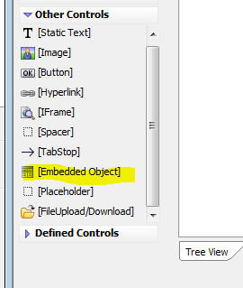
To embed a child component in a parent component, you select the [Embedded Object] tool on the toolbox.
Opening a Child UX in a Panel Window - Understanding the Caching Option
When you use the Action Javascript builder to open a child UX in a Panel Window, the builder shown below is displayed:
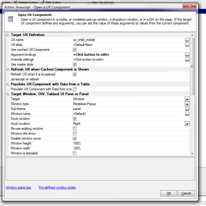
Notice that the builder has a property 'Use cached UX component'. This allows you to specify if a cached version of the UX should be used the second and subsequent times that the child UX is opened.
The first time you perform the action to open the child UX component, the component is rendered. If you select the option to use a cached version, then the second time you perform the action to open the child UX, the previously shown component is simply re-shown (which is very fast), rather than rendered from scratch (which is slower).
When a cached UX is shown, you will typically want to refresh it in some way. The 'Refresh UX when it is re-opened' property allows you to specify that it should be automatically refreshed.
The way in which the UX should be refreshed is not necessarily know by Alpha Anywhere. You might have some specific custom code that you need to run. Here is what happens automatically if you have checked the refresh option:
In addition, to the client-side onSynchronizeDialog event, you can also specify an optional Javascript function to run when the UX is synchronized.
The client-side and server-side events allow you to specify custom actions to perform when the UX is synchronized.
Note that when the cached UX is shown the server-side onDialogInitialize and onDialogExecute events are not fired. Only the onSynchronize event is fired.
Embedded a UX in a Parent UX Component - Refreshing the Child Component
When you embed a UX component in a parent UX component the child UX typically has one or more Arguments that get bound to control in the parent UX component. After the child UX component has been rendered, it is possible (and quite likely, probable) then the value in the binding controls in the parent UX component will change and you will want to refresh the embedded UX component. This is easily done using a method of the parent UX component.
The .synchronizeEmbeddedUX() method allows you to specify the alias of the embedded UX component to refresh.
For example, assume that you embedded a UX component in a parent UX component and you set the embedded UX component alias to 'UXCHILD1'. The following Javascript code would refresh the embedded component:
{dialog.object}.synchronizeEmbeddedUX('UXCHILD1');
NOTE: When you embed a child component into a parent UX component you do not have to give the child UX an explicit alias. The build will suggest <DefaultAlias> as the alias name. However, if you want to be able to use the .synchronizeEmbeddedUX() method, or have the parent UX control easily be able to invoke methods on the embedded UX component, then you should give the embedded UX an explicit alias.
Communicating Between Components
When you break a single UX component into multiple components, then 'communicating' between components is more challenging. For example, say that you have some code in the parent component that needs to read a value from a control in a child component, or you have some code in the child component that needs to read or set a value in a control in the parent component.
If the application is constructed as a single large UX component, then it is obviously very easy because all controls are in the same 'namespace'. So, to set the value in a control called 'SHIP_ADDRESS', with the value in a control called 'BILL_ADDRESS' you might use this code:
var address = {dialog.object}.getValue('BILL_ADDRESS');
{dialog.object}.setValue('SHIP_ADDRESS',address);
But if the 'BILL_ADDRESS' control is in the parent UX and the SHIP_ADDRESS is in the child UX, and the button that invokes the action is in the parent component, then your code will need to be a little more complex.
Assume that the child UX component was assigned the alias 'UXCHILD1'. You can then use a built-in placeholder to reference the child UX component.
The code in the parent component can use this built in placeholder to reference the child UX component:
{dialog.EmbeddedDialog_[DialogAlias]}
where, [DialogAlias] is the alias of the child UX component.
So, in the particular case when the alias of the child UX component is 'UXCHILD1', the placeholder would be:
{dialog.EmbeddedDialog_UXCHILD1}
And the could would become:
//read the value of the control in the parent component
var address = {dialog.object}.getValue('BILL_ADDRESS');
//set the value of the control in the child component
{dialog.EmbeddedDialog_UXCHILD1}.setValue('SHIP_ADDRESS',address);
It is also possible that you might have some code in the child UX component that need to set the value of a control in the parent component, or invoke some other method of the parent component. For example, assume than in the above example the 'BILL_ADDRESS' field is in the child component and the code is also in the child component. Assume that the 'SHIP_ADDRESS' field is now in the parent component. Here is how your code would be written:
var address = {dialog.object}.getValue('BILL_ADDRESS');
//get a pointer to the child UX component's parent object
var parentObj = {dialog.object}.getParentObject();
//call the .setValue() method of the parent object.
parentObj.setValue('SHIP_ADDRESS',address);
Panel Headers and Footers in Child Components
If you are displaying child components in Panel windows or embedded into a parent component, you need to be aware that if the parent component or container Panel Window has a header or footer, and your child UX component also has a header or footer, you will end up with two headers or two footers surrounding the child component. This may not be what you want. You will therefore need decide where the headers and footers should be defined - in the parent component, or in the child component.
Consider the case of UX component with this structure:
PanelNavigator
PanelCard1
some control on Panel Card 1
PanelCard2
embedded UX component
If a header is defined in the child component and you want to have a button that will return focus to PanelCard1 in the parent component, the standard Javascript code to do this:
{dialog.object}.panelSetActive('PANELCARD_1')
will not work because 'PANELCARD_1' is not visible to the embedded UX component. Instead, the code has be change to:
var pObj = {dialog.object}.getParentObject();
pObj.panelSetActive('PANELCARD_1');
UX Component - Chart Control - Resize the Chart - The Chart control in a UX component is a server-side control. That means that a bitmap of the chart is generated on the server and the bitmap is sent to the client. Because it is a server-side control, it is not possible to use Javascript to resize the control at run-time, as is possible with other control types.
To work around this limitation, new options have been added to the .refreshChart() method of the UX object. You can now pass in an optional JSON object that specifies the size of the chart when it is refreshed. The size must be specified in pixels.
For example:
//refresh 'chart1'
{dialog.object}.refreshChart('chart1');
//refresh chart and change its width to 800px
{dialog.object}.refreshChart('chart1',{width: 800});
//refresh chart and change its height to 400px
{dialog.object}.refreshChart('chart1',{height: 400});
//refresh chart and change its width and height to 400px
{dialog.object}.refreshChart('chart1',{height: 400, width: 400});
Watch Video
Download
Component
A practical use case for this functionality is in mobile applications where a
chart is displayed in a Panel and you would like the chart to fill the Panel and
to automatically resize itself on an orientation change. In this video we show
how a chart can be resized automatically when the orientation of a device is
changed.
Watch Video
Download Component
UX Component - Panels - Getting Panel Size - New methods have been added to the UX component to get the size (height and width) of a panel.
For example:
var width = {dialog.object}.panelWidth('MYPANEL');
var height = {dialog.object}.panelHeight('MYPANEL');
HTTP_Fetch(), HTTP_Get(), HTTP_GetPost() and HTTP_Put() - Optional SSL Cipher List - The HTTP_* functions now take an optional SSL cipher list parameter.
If the optional parameter is not specified, the following value is used:
TLSv1+HIGH:!SSLv2:RC4+MEDIUM:!aNULL:!eNULL:!3DES:@STRENGTH
This is the same value that is used in the Application Server. This setting is based on:
http://www.skytale.net/blog/archives/22-SSL-cipher-setting.html
UX Component - Ajax Callbacks - Client-side onAjaxCallbackFailed Event -
A new client-side event has been added. The onAjaxCallbackFailed event will fire
if an Ajax callback fails (i.e. the server does not send a response).
This 'e' object that is passed into the event handler includes:
e.xbasicFunctionName
which is the name of the Ajax function that was intended to handle the Ajax callback. The value in this property tells you specifically which callback has failed. In many cases e.xbasicFunctionName will have a value like 'system:somevalue' if the Ajax callback was being handled by some built-in feature of the UX component, rather than a user-defined Xbasic function.
In mobile applications, where the intermittent network connections are more likely, it is good practice to define a handler for this event.
NOTE: The {dialog.object}.ajaxCallback() method also allows you to specify a failure handler.
UX Component - onTimer Event - A new client-side event has been added. The onTimer event fires on a specified interval. By default the onTimer event is off. To turn on the event, go to the Properties pane.

You can stop and start the onTimer event programmatically using these Javascript methods:
{dialog.object}.startOnTimerEvent(intervalInMilliseconds)
{dialog.object}.stopOnTimerEvent()
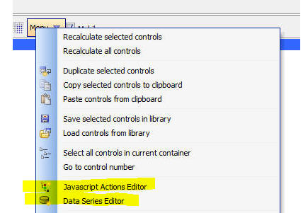
UX Component Builder - Editing Javascript Actions and Data Series - Quick Access - The 'Menu' button now has entries to give you quick access to the Javascript Action editor and the Data Series editor.

AlphaDAO - SQL Server - Slow queries with very large
tables in MS SQL Server using character arguments -
Alpha Five passes all values in character arguments to a
database as Unicode to provide support for text and
symbols in all languages. Character data types in SQL
Server can be Unicode (nchar() or nvarchar()) or
standard character (char() or varchar())
When the Unicode argument is passed to SQL Server and
the actual column being searched is not Unicode, SQL
Server internally does an implicit conversion to match
the field data type to the argument data type. This
conversion is known to cause slower than expected
queries, especially in large tables and �contains� type
searches that use the LIKE operator in the query.
This problem only exists in SQL Server and only when the
columns being searched are standard character (char() or
varchar()) and character arguments are used.
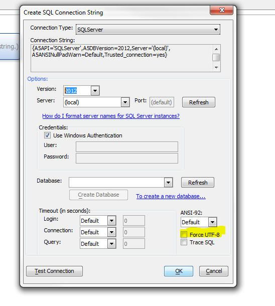
A new option have been provided in the connection string
for SQL Server only to convert all character arguments
to UTF-8 and then send the data to the database as
standard character (not Unicode). The option "Force
UTF-8" can be checked if none of the columns in the SQL
Server tables are Unicode, only limited language support
is required, and the tables contain a large number of
rows. This option effects all character arguments in all
queries using the connection.
For example, on a table with 2,000,000 records, the
query time went from 2.5 seconds to .5 seconds for a
'contains' search.
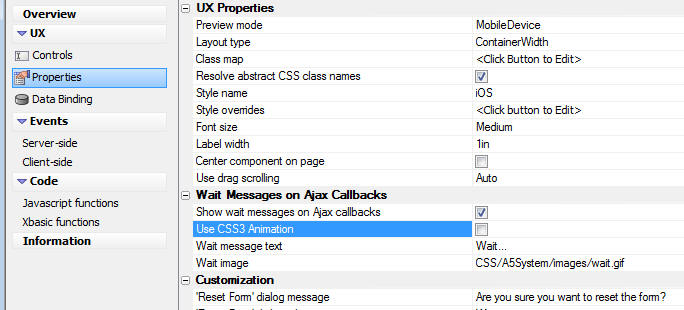
UX Component - Automatically Displaying a 'Wait' Message During Ajax Callbacks - In mobile applications, where network connections are often slow, it becomes important to let the user know that there will be a delay while an Ajax callback completes. This is easily done with a global setting in the UX Component.
To turn on automatic wait messages, go to the Properties pane in the UX Component.
UX Component - SpinList Groups - A new 'container' sub-type ('SpinListGroup') allows you to group multiple SpinList controls so that they have the appearance of a single control.
For example, in the screen shot shown below, the first frame container shows three SpinList controls that have been placed in a special 'SpinListGroup' container. Notice how the three controls appear to be a single control.
In the second frame container, the same three SpinList controls are not inside a 'SpinListGroup' container, and therefore they appear as three independent controls.
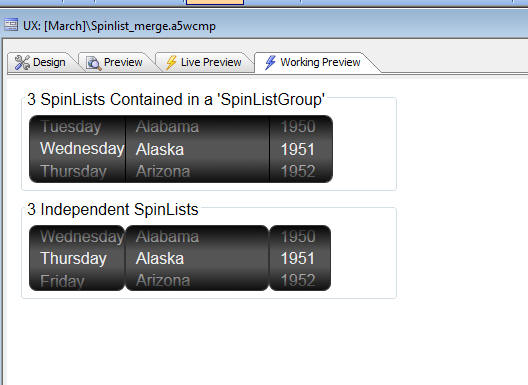
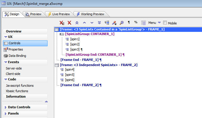
The screenshot below shows how the above UX component was designed. Notice that the SpinList controls in the first frame are contained in a 'SpinListGroup' container.
UX Component - List Control - Action Javascript - Populate Controls with List Data - A new option has been added to the 'List Control Actions' actions in Action Javascript that allows you to easily populate controls on the UX component with data from the current row in the List.
UX Component - Wait Messages - Two new method have been added to the UX object:
The .showWaitMessage() method puts a wait message over a designated section of the screen and also locks the controls in the designated section so that the user cannot click on controls that are locked. This method is often used at the start of an Ajax callback. When the callback is complete, the .hideWaitMessage() method is called..
UXWaitMessageTarget can be set to:
You can have multiple wait messages displayed at the same time, each locking a
different section of the screen.
Two types of wait windows can be created. You can use an animated gif, or you
can use CSS3 transformations in place of an animated gif.
You can pass in optional parameters to the .showWaitMessage() method. The
optionsObject optional parameter allows you to control the appearance of the
wait window. See example below.
Examples:
//display a wait message over 'CONAINER_1' and also lock the
contents of 'CONTAINER_1'
{dialog.object}.showWaitMessage('container:CONTAINER_1');
//add some custom text to the wait message
var wo = {};
wo.message = 'Saving...';
{dialog.object}.showWaitMessage('container:CONTAINER_1',wo);
//use a custom gif for the wait message
var wo = {};
wo.icon = 'images/mywaitgif.gif';
{dialog.object}.showWaitMessage('container:CONTAINER_1',wo);
//use css3 animations
var wo = {};
wo.useCSSAnimation = true;
wo.cssAnimationSettings = {};
wo.cssAnimationSettings.size = 16; //set the size of the animation object to
16x16 pixels
{dialog.object}.showWaitMessage('container:CONTAINER_1',wo);
NOTE: The wait message is automatically hidden after 5 second. This is done in case an error occurs and the Ajax callback that would normally clear the wait message is not received. You can control the time before the wait message is automatically cleared by executing this Javascript in the UX component:
{dialog.object}.waitMessageAutoCloseDelay = 6000 //set time to 6 seconds
The .hideWaitMessage() method hides a specific wait message (as specified by the
optional UXWaitMessageTarget parameter), or all wait messages
if no parameter is passed into the method.
Both the .showHideMessage() and .hideWaitMessage() actions are available in
Action Javascript.
UX Component - Mobile - Controlling The Sensitivity of the Abstract Click, Double Click and Swipe Events -
Interpreting abstract events on a mobile device is tricky. For example, when a user taps on the screen, is that a 'click' event, or the start of a drag event?
Alpha Anywhere has certain Javascript variables that define values that are use in making these interpretations. These variables can be changed to customize how Alpha Anywhere interprets various gestures.
The 'click' event has a 'wiggle' amount - move more than that distance and it isn't registered as a click. This has a default value which can be overwritten. The default value is 5px.
To change this values, execute this Javascript:
$e.abstractEvents.click.wiggle = 20;
A good place to execute this Javascript would be in the onRenderComplete event.
You can also set the 'dlbClick' duration:
$e.abstractEvents.dblClick.duration = 1000 // e.g. 1sec
You can also set the duration before the 'downHold' event is registered:
$e.abstractEvents.downHold.duration = 1500 // e.g 1.5 sec
And, you can also set the swipe velocity (units are pixels/millisecond):
$e.abstractEvents.swipe.velocity = .75 // this is the default,
higher = faster
Reports - Layout Table Reports - Export to Excel - Live Formulas - Layout Table reports can be exported to Excel. When you design the Layout Table Report you can set properties in the report definition so that when the report is exported, the Excel file has live formulas in it.
Watch Video - Part 1
Watch Video - Part 2
Watch Video - Part 3
In order to define a live Excel formula, you set properties for a cell in the Layout Table report in the cell's 'Excel' property in the Property Sheet.
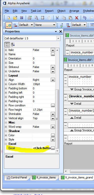
The 'Excel' property has a smart field which brings up a builder where you can specify instructions on how the Excel formulas should be generated.
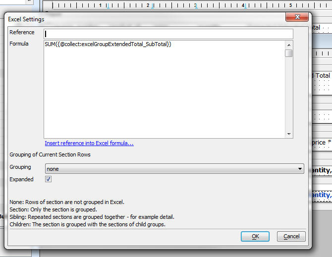
For example in the screen below (which shows the 'Excel' property for the 'extended total' column) a formula has been created to multiply the value in a cell called 'excelPrice' by the value in a cell called 'excelQuantity'.

Cells in a report are given names by setting the 'Reference' property in the 'Excel' property. For example, for the 'Price' column in the report, the Excel property shows:
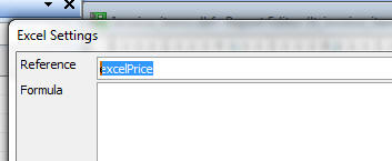
Note that no Formula is defined here. The sole purpose of setting the 'Excel' property was to give the cell in the report an explicit name that could be used in the formula for the 'extended total'.
The @collect directive is a special command that can be used to 'gather' cell references and build an expression.
For example, the screen below shows how a live 'Grand Total' formula can be created.
Assume that the report has a group break on InvoiceNumber and that the group sub-total for the ExtendedTotal field has been given an explicit reference name of 'excelGroupExtentedTotal_SubTotal'.
The formula shown below says: take the address of each Group SubTotal field and put that address into the sum function.
So, assume that the report has three group breaks and that the Group Sub-totals are in cell E10, E20 and E30 when the report is exported. The formula below will translate into this Excel formula:
sum(E10,E20,E30)
Label Reports - 'Intelligent Mail' Barcodes - The special USPS 'Intelligent Mail' barcodes can now be printed on Label and Envelope style reports.
Here is what an Intelligent Mail barcode looks like:

To put an Intelligent Mail bar code on a label or envelope, start with the Envelope Genie:
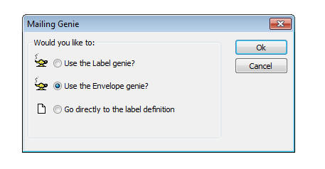
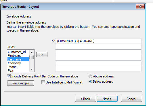
In the genie, check the 'Include Delivery Point Bar Code checkbox. Also check the 'Use Intelligent Mail Format' checkbox.
When you click next, the 'Intelligent Mail Bar Code' dialog is displayed. Enter the expression for the bar code.
The easiest way to build the expression is to click the 'Builder' button.
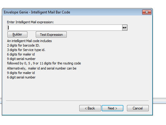
The builder dialog is shown below. You can specify expressions or static values for the various parts of the Intelligent Mail expression.
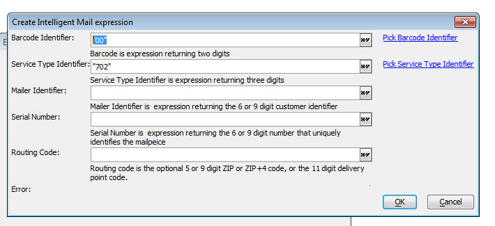
The builder will build a calculated field in the report that uses the intelligent_mail_barcode() expression to generate the correct expression and select the correct font.
NOTE: Alpha Anywhere installs two fonts in the Windows Fonts folder to support Intelligent Mail. These fonts are: USPSIMBCompact.ttf and USPSIMBStandard.ttf.
UX Component - Panel Navigator - Dynamically Adding new Panels to a Panel Navigator - You can dynamically add new Panels to a Panel Navigator at run-time using Javascript.
Watch Video - Part 1
Watch Video - Part 2
Down Component
NOTE: This is conceptually similar to dynamically adding new panes to a Tab control or new bands to an Accordion control. For more information, see the section 'Grid and UX Components - Tab and Accordion Control - Dynamically Adding and Removing Tab Panes/Bands'
The Javascript to add a new panel is:
//specify a unique name for the new Panel.
var panelName = 'NEWPANEL';
//specify a Panel title (optional)
var panelTitle = 'NewPanel';
//define a new Panel Card
var myNewPanelCard = new A5.PanelCard({
theme : '{dialog.style}',
body: {
content: {
type: 'html',
src: 'this is
my new panel text for: ' + panelName
}
}
})
//get a pointer to the Panel Navigator where the new Panel
will be added
var pNav = {dialog.object}.panelGet('PANELNAVIGATOR_1');
//add the new Panel Card to the Panel Navigator
pNav.addPanel({
name: panelName ,
title: panelTitle,
src : myNewPanelCard
});
//optionally, set focus to the Panel just added
pNav.setActivePanel(panelName);
NOTE: In the above example, where the code that sets focus to the new Panel is defined, you might be tempted to use the {grid.object}.panelSetActive() method to set focus to the Panel that was dynamically added. This method will only work for Panels that exist at the time the UX is originally rendered. It will not work for dynamically added Panels. Instead, you must get a pointer to Panel Navigator, and then call the .setActivePanel() method of the Panel Navigator.
In the above example, we have added a new Panel Card to the parent Panel Navigator. However, you can also dynamically add new Panel Navigators and Panel Layouts to the parent Panel Navigator. The syntax to create a new Panel Navigator or Panel Layout object is:
var newPanelNavigator = new A5.PanelNavigator([arrayOfPanels],panelNavigatorSettingsJSONObject)
var newPanelLayout = new A5.PanelLayout([arrayOfPanels],panelLayoutSettingsJSONObject)
The Javascript to remove a panel is:
//specify the name of the Panel to remove
var panelName = 'NEWPANEL'
//get a pointer to the Panel Navigator from which the Panel
will be removed
var pNav = {dialog.object}.panelGet('PANELNAVIGATOR_1');
//remove the Panel
pNav.removePanel(panelName);
Closing the Dynamically Added Panel
If the dynamic panel is added to a Panel Navigator that has been configured to use Tab Bands as the method for navigating the child Panels, you can allow the user to close a dynamically added Panel. When the .addPanel() method is called, the JSON object that defines the new Panel should include:
close: true
For example
//get a pointer to the Panel Navigator where the new Panel
will be added
var pNav = {dialog.object}.panelGet('PANELNAVIGATOR_1');
//add the new Panel Card to the Panel Navigator
pNav.addPanel({
name: panelName ,
title: panelTitle,
src : myNewPanelCard,
close: true
});
In the image below, Pane4 was added dynamically with the close option set to true. As you can see, the Tab Band label for the Pane includes a close icon. If you tap on the close icon, the Pane is closed and is removed from the Panel Navigator.

UX Component - Data Bound Components - Action to Load Primary Keys - In a Data Bound UX component it is common to load the primary keys for the table to which the UX is bound. Once the primary keys have been loaded, you can navigate from record to record by clicking on record navigation buttons, or (optionally) making a selection on a slider or from a special List control that shows the primary keys. Previously, the List control that was used to select the primary key was a special 'system generated' list, and you did not have much control over how the List was configured.
Now, you can use a custom List control as a 'record navigator'. In the builder for the server-side 'Get Primary Keys for Parent Table' or for the 'Get primary keys for records in a query' action in Action Javascript, a new property allows you to specify the ids of any List controls that should be used as record navigators. You can select more than one List.
Only Lists that are based on SQL or DBF tables can be used as record navigators. In the case of SQL data, the List must be configured to return the primary key. In the case of DBF tables, the List must be configured to return the record number.
Watch Video - Part 1
Watch Video - Part 2
Watch Video - Part 3
Download Component (Note: Before running the component you will need to edit
the connection string and point to the sample Northwind database.)
UX Component - 'Window' Container Type - Displaying content in pop-windows (also sometimes called 'overlays') is a common requirement in web and mobile applications. This is easily done by wrapping the content you want to show in the pop-up window in a container with a sub-type of 'Window'.
Note: 'Window' Containers are one technique for showing
content in pop-up windows. You can also use the 'Open a Pop-Up Ajax
Window/Overlay' action in Action Javascript to display content in pop-up
windows.
To see a discussion contrasting the 'Window' Container method for showing pop-up
content with the 'Open a Pop-up Ajax Window' action in Action Javascript, watch
the video.
Watch Video
Watch Video - Part 1
Watch Video - Part 2
Watch Video - Part 3
Download Component (Note: Before running the component you will need
to edit the connection string and point to the sample Northwind database.)
In order to show the window (thus showing the content that is in the 'Window' container), the 'Show Container Window' in Action Javascript is used. This action takes the name of the container window.
For example, in the screenshot shown below, the UX Builder shows several 'Window' containers:
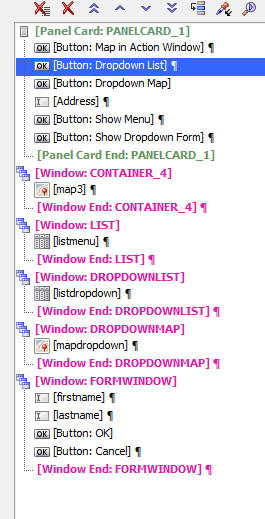
When the UX component is initially rendered, the content in the 'Window' containers is not shown.
In order to show a particular window, the button that shows the window executes the:
{dialog.object}.showContainerWindow()
method.
This method is available in Action Javascript. See the 'Show Container Window' action.
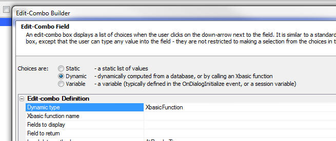
Edit-combo and Auto-suggest - Populating Choices with an Xbasic Function - When you define the data source for an edit-combo or auto-suggest control, you can now specify that the 'Dynamic type' is an 'Xbasic Function'. Other options for the 'Dynamic type' include DBF Tables and SQL Tables.
If you select the 'Xbasic Function' option then you can specify the name of the Xbasic function to call. This function must return the data to display in the control in a cr-lf delimited list.
If the list returns more than one column of data, the columns must be pipe delimited.
The first row of the list must be the column names. Column names must be in upper case.
The Xbasic function takes a single argument, the 'e' object. The 'e' object contains the same information typically available in the 'e' object on an Ajax callback. The best way to see what's in 'e' is to put a debug(1) statement in the Xbasic function and then run the component. When the debugger opens, you can explore the contents of the 'e' object.
The following example shows a function that returns multiple columns of data:
function getData as c (e as p)
getData = <<%txt%
ID|FIRSTNAME|LASTNAME
1|Bob|Smith
2|Fred|Jones
%txt%
end function
In the above example, the Xbasic function is trivially simple and the list of data could just have easily been defined using the 'Static' option. However, if you want to populate the list using a Web Service, or a RESTful API call, then the Xbasic Function option is ideal.
UX Component - Dropdownbox, Radiobutton, Checkbox Controls - Populating Choices Using an Xbasic Function - You can now populate the choices in these controls by calling an Xbasic function.
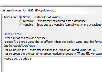
To specify the Xbasic function, select the 'Static' option in the builder and then for the static data enter:
=xbasic:functionName
where functionName is the name of the Xbasic function you want to call.
The Xbasic function takes the 'e' object as an input parameter, and must return a cr-lf delimited list of data.
For example:
function getData as c (e as )
getData = <<%txt%
Alpha
Beta
Gamma
%txt%
end function
SQL Database - Create Table Genie - A new genie allows you to create tables in a SQL Database.
To access the Genie, select 'Create SQL Table...' from the Tools, External Databases menu option when the Control Panel has focus, or click the 'SQL' button on the toolbar when the Web Control Panel has focus.
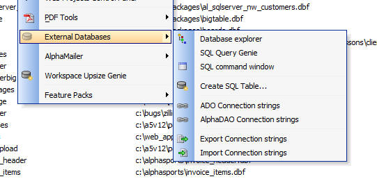
To use the Genie you follow these steps
The Genie has options to save the table definition you have defined to a library so that you can quickly load a previously defined table structure.
The screenshot below shows the pane in the Genie where the table structure is defined.
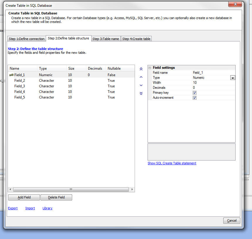
Note: This Genie is not intended as a replacement for the stand alone tools, such as SQL Management Studio (SQL Server), Navicat (MySQL), Toad (Oracle), which have much more complete table designers. It is intended for simple table definitions, where the convenience of creating the table from within Alpha Anywhere is most important.
UX Component - Server-Side Actions - Save Submitted Data Action - Store Current Location in Record - A new option has been added to the Save Submitted Data to Tables action. You can now store the current location in specified fields in the table. (See highlighted section in the screenshot below).
This option is particularly useful in mobile applications because the mobile device can submit the current location when the data is submitted.
IMPORTANT: When you turn this option on, you must change
the code in the Submit button to ensure that the current location is submitted
along with the rest of the data on the component. The submit method on the
button that submits the UX component must be changed to:
{dialog.object}.submit('','',{getLocationData: true})
You must specify which fields in the table you are editing will contain the latitude and longitude values. If the table also contains a Geography or Geometry field, you can also encode this field at the same time that the record is saved. Geography/Geometry fields are special fields supported by certain SQL databases that allow you to do 'location' searches (e.g. find all records within 1 mile of my current location).
You can specify if the location data should be update every time the record is edited, or only when the record is initially created.
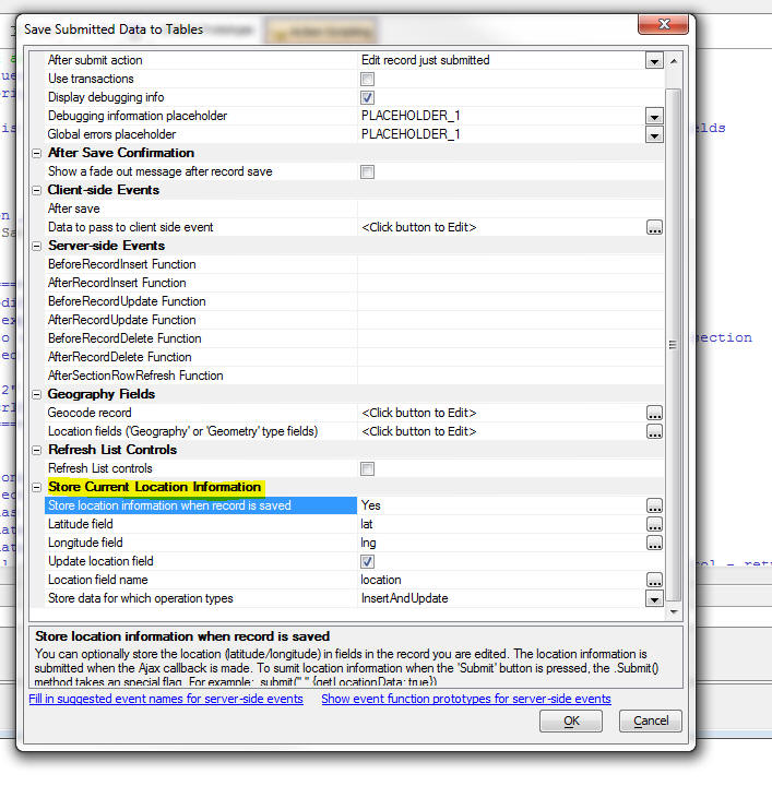
Contrasting 'Store Current Location' with the 'Geocode record' Feature - The ability to store the current location when the record is saved is entirely different than the the 'Geocode record' feature (see screenshot above).
The 'Geocode record' feature is used to compute lat/lng values from an address field in the record that you are editing. This address is not the current location of the user who is editing the data.
{dialog.object}.submit() Method - Submitting Current Location - This method can now submit the current location along with data from the controls on the UX component.
The current location is obtained from the browser. Not all browsers support this feature.
The user will be prompted for permission to submit his/her current location.
The syntax to set the .submit() method to submit the current location is:
{dialog.object}.submit('','',{getLocationData: true})
The following variables are submitted when the user submits the UX component:
UX Component - Populate Controls with Data From a Table When UX is not Data Bound - When a UX component has been Data Bound, you can easily populate the controls on the component with data from the tables to which the component has been bound.
NOTE: This option is only available for SQL tables. .DBF tables are not currently supported.
IMPORTANT: When you use this option to populate the UX
controls, you cannot use the server-side action (in the
AfterDialogValidate event) to 'Save submitted Data to Table(s)'.
If you wan to save changes that you make to the controls that were populated,
you must use the save action for an unbound UX. This action is the
'Update, Insert or Delete data' action in the list of 'Action Javascript'
actions.
The reason that you cannot use the 'Save submitted Data to Table(s)' server-side
action is that the object that contains data about the primary key of the record
you are editing is not updated when you populate controls using the 'Populate
controls in an UNBOUND UX Component' is used.
It is very important to understand the distinction between working with a Data
Bound UX component and a component that is not Data Bound.
However, there may be situations where you have a UX component that has not been 'Data Bound', but you still want to populate controls on the component with data from a table.
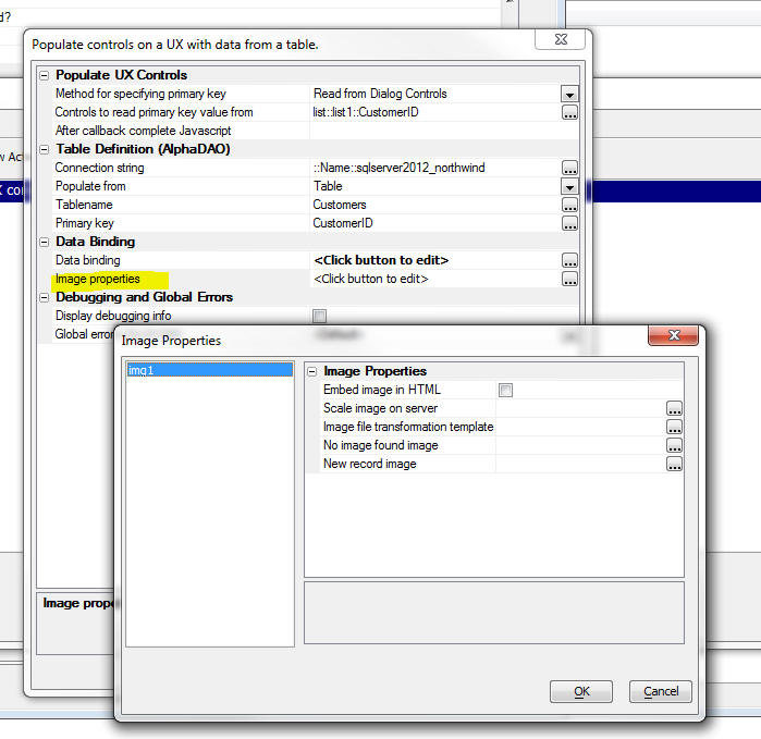
The new 'Populate controls in an UNBOUND UX Component' action in Action Javascript makes it easy to do this.
The builder for this action is shown below:
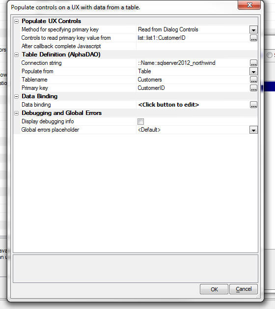
The builder lets you specify:
If any of the controls that you map to are Image controls, an additional property is shown where you can define properties of the image. See screenshot below:
UX Component - Saving Data To a Table When UX is not Data Bound - When a UX component has been Data Bound, you can easily define a button that submits the UX and saves the submitted data to the tables to which the UX component has been Data Bound. This is typically done by defining the 'server-side' 'Save submitted data to table(s)' action.
However, there may be situations where you have a UX component that has not been 'Data Bound', but you still want to edit the values in a table, enter a new record into a table, or delete a record from a table.
The new 'Update, Insert or Delete data' action in Action Javascript allows you to do this.
NOTE: This option is only available for SQL tables. .DBF tables are not currently supported.
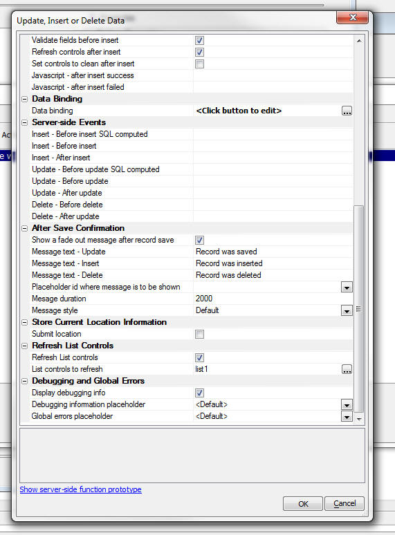
The builder for this action is shown below:
(Since the screen has many options, two screenshots are needed to show all of the properties).
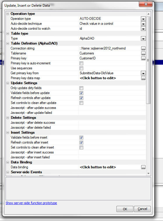
When you use this action, you specify the operation type. The operation type can be:
'Auto-decide' means that the type of operation to perform will be determined at run-time. For example, under one condition it might be an Insert, but under another condition, it might be an Update.
The typical use case for the 'Auto-decide' option would be when you are creating a new record and then subsequently editing the record. For example, assume you have a customer record. The ID control on the UX will display the primary key for the customer record. If there is no value in the ID field, then it is assumed that the record you are entering is a new record. However, after you save the record, the ID field will then be filled in with the primary key of the record just created. If you click the Save button again, this time you want to Update the record (not create a new record with a duplicate ID - which would fail anyway).
If you select the 'Auto-decide' option you can either specify the name of a control to watch, or the name of a Javascript function to call. The Javascript function must return 'update', 'insert', or 'delete'.
You will need to specify the connection string to the database and the name of the table in that database that you want to update.
Validating Data Before it Saved
When you use this action, all data validation settings that you define for controls on the UX are enforced before the data is saved. However, you might want an additional level of validation. You can use the:
server side events for this purpose.
Another common use of these events is to modify submitted data before it is committed.
For example, assume that the table you are editing has a field called 'timeLastUpdated' and you want to automatically store the current date/time in this field, you could put this code in your event handler
e.dataSubmitted.timeLastUpdate = "" + now()
These two event also allow you to set the:
e.abort
flag. If this flag is set to .t., then the insert or update is not performed.
Refreshing List Controls
In many cases, when data is saved, you will also want to refresh one or more List controls on the UX component that are displaying the data that was edited. You can check the 'Refresh List controls' property and then specify which List controls should be refreshed.
Storing Current Location Information
When the data are saved, you can automatically store the current location information (latitude and longitude) in fields in the record.
UX Component - Image Upload - Automatically Create Thumbnails - When you use the 'Image Upload' action in Action Javascript to upload images to the server (or in the case of a mobile application, to take a picture using the device and then upload that picture to the server), you can now specify that thumbnail versions of the uploaded image should be automatically created.
You can create as many different thumbnails of the uploaded image as you want.
To specify that you want to create thumbnails when the image is uploaded, check the 'Create image thumbnails' property in the 'Image Upload' builder.
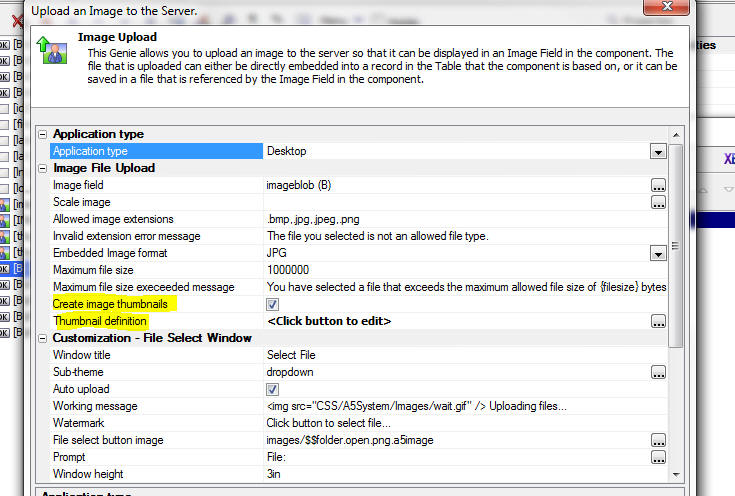
When you check the 'Create image thumbnails' property the 'Thumbnail definition' builder is displayed:
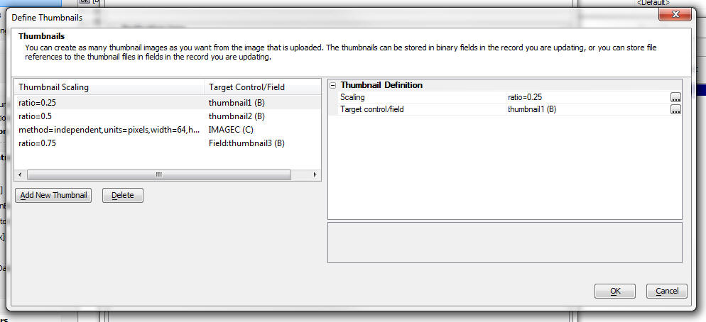
This builder allows you to define as many thumbnail images as you want. For each thumbnail that you specify, you specify the scaling options and where the thumbnail should be stored. It can be stored as binary data in a field in the record you are updating, or it can be stored in a file in a folder on the server and a reference to the filename can be stored in a character field in the record you are updating.
QR Encode Text - A new menu option has been added to the Tools menu in the Web Control Panel to QR encode text. The text you would likely want to encode is a URL. The reason you might want to QR encode a URL is because mobile devices typically have QR Code readers, and by scanning a URL that has been QR encoded, you can easily open the URL without having to type it.
Image Upload - Mobile Devices - Using the Camera and Image Library on a Mobile Device - Image upload now includes support for access to a mobile device's camera or photo library.
This feature is exposed in the 'Image Upload' action in Action Javascript.
In a desktop web application, when the user clicks on a button that executes an 'Image Upload' action, the file selector open to let you pick an existing image on your machine. The selected image is uploaded to the server and when the record you are editing is committed, the image is saved in one of the fields of the record you are editing. (Either the binary image data is saved in a binary field in the record you are editing, or the image is saved in a file in a specified location and a reference to the image filename is stored in a field in the record you are editing.)
In a mobile application, you would want to capture an image using the camera on the device, or select an image from the image library on the device.
The builder for the 'Image Upload' action (show below) now has a new property called 'Application Type'. This property can be set to 'Desktop' or 'Mobile'.
If you select the 'Mobile' option, then you have a further option that allows you to specify whether your application will utilize the Cordova/PhoneGap framework (which requires a Cordova/PhoneGap native app wrapper) or HTML5. The various options displayed will dynamically change based upon this selection.
NOTE: Cordova/PhoneGap is currently supported for iOS
devices only (Android support is coming). In order to test and use the
Cordova option for the 'Image Upload' feature, you must either run the component within an iOS native shell
that you build yourself that includes support for Cordova, or download a
special 'pre-built' native shell with Cordova support from the iOS app
store.
To get the 'pre-built' native shell with Cordova support, follow this
link: GardenWeb Browser with Cordova Support.
To get more information on Cordova, follow this link: Apache Cordova.org
NOTE: HTML5 Camera and Photo Library access is supported in the latest releases of most mobile browsers.
Image Compression
Both the HTML5 and Cordova options allows for image resize and compression prior to file upload. Since mobile devices typically have multi-megapixel cameras, the image file can be quite large, a real concern when uploading images over a cellular network.
HTML5 Image Capture
When you select the 'HTML5' option, the following dialog appears:
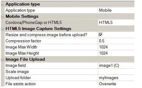
If image compression is selected, use a compression factor from 0.1 to 1.0, with 0.1 representing the most compression possible. A reasonable tradeoff of resolution/size is the default of 0.5
You must specify the maximum image width and the maximum image height. The default is 1024 pixels for the width and the height. You are specifying the maximum value that will be used for each dimension. The aspect ratio will not change. Thus if you shoot a portrait image with the default setting, the saved image will be 1024 x 768.
As implemented in most browsers, HTML5 does not allow for distinct access to the camera or the photo library. As such a popup will appear and prompt the user for the requested selection. The visual popup is determined by the device and will vary on iOS and Android devices. The end result (access to the camera or the photo library) is the same.
TECHNICAL NOTE: When accessing camera or photo library through HTML5, there is no built-in image compression facility. Therefore, we have added code to enable image compression. We've taken care of a number of tricky issues regarding image compression in HTML5 on iOS devices. Compression is handled by loading the image to a hidden HTML5 canvas element and extracting the binary data for uploading. iOS automatically applies sub-sampling to JPG files when certain size thresholds are exceeded. This can cause the image to appear "squished" when loaded to an HTML5 canvas, which is required to compress the image client side with JavaScript. We've included code that detects this sub-sampling condition and adjusts the image data accordingly. There can still be an issue with certain images that include an alpha channel (since the alpha channel is used for the sub-sampling image issue detection), but images that are shot with the iPhone or iPad do not exhibit any issues in our testing. If you load a large digital image to your iPhone library from a high resolution camera, you may see this anomaly (image appears "squished") if the image includes an alpha channel. In that case, it's best to compress the image BEFORE loading it to your iPhone photo library. When compressing the image client side, we also must determine the exact orientation of the camera in order to rotate the compressed image so that it appears correctly. We do this client side by extracting the orientation from the EXIF data contained in the original image. We then rotate the image to the proper orientation for server side storage and viewing. Since all of this work is done client side, prior to uploading the image to the server, we've cut down significantly on the image payload and thus the application latency and network bandwidth required.
NOTE: You can test the HTML5 option on the desktop if you run the component in Chrome. When you select the camera, Chrome will open the file select dialog. You can not test this option on the desktop in Working Preview, or in Firefox or IE.
Cordova/PhoneGap Image Capture
When you select the 'Cordova' option, the following dialog appears:
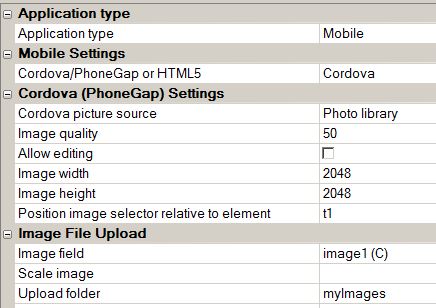
In order to use this option your application must be running in a native shell that loads Cordova. If you are running in a native shell, it is recommended that you select the Cordova option, rather than the HTML5 option.
There are some benefits to using the Cordova option over the HTML5 option. These benefits include:
To compress the image before uploading it, specify the image quality (compression factor) which is a value from 1 to 100.
iOS includes support for in-app editing, which is enabled with the Allow editing checkbox.
You must also specify the image width and height (in pixels). If the picture source is the camera, an option to save the photo to the device's local photo album is provided.
An additional option, Position image selector relative to element, is displayed if the picture source is the Photo library. This option is applicable to the iPad only and the entry indicates an element id which is used to compute the required left and top offset for absolute positioning of the native iOS iPad popup image select box.
UX Component - Client-Side Events - OnCordovaReady Event - This event fires when the UX component is running in a native shell that loads Cordova/PhoneGap. The event fires when the device is ready.
Arrays - Populating with Comma Separated Values - New methods have been added to the Array object to make it easy to populate arrays with comma separated values. These methods leverage the Import feature, the allows you to import data contained in CSV files into .dbf tables.
The new methods are:
When importing data that has field names, you can indicate the data type by including a colon followed by the field type after the field name. For example:
Name,Age:N,DOB:D
In the example below, note that there is a comma in the company name 'Groupon, Inc.' This comma is NOT a field delimiter.
'define a text string that has some data to initialize an array
dim txt as c
txt = <<%txt%
#ticker,name,price:N,change:N,mktcap,chgPct
#"GRPN","Groupon, Inc.",6.37,"-0.01",4.194B,"-0.01 -
-0.16%"
#"YELP","Yelp Inc. Class
A",25.545,"-0.165",1.628B,"-0.165 - -0.64%"
#%txt%
'dim a property array with a size of 0
dim arr[0] as p
'import the csv file. the second argument is used to specify that the first row of
'the data contains field names.
'Notice that the 'price' and 'change'
fields are imported as numeric data.
arr.initialize_from_csv(txt,.t.)
'the array is automatically resized as
the data are imported
?arr.size()
= 2
?arr[1]
= change = -0.01
chgPct = "-0.01 - -0.16%"
mktcap = "4.194B"
name = "Groupon, Inc."
price = 6.37
ticker = "GRPN"
'dump the data in CSV format, without
field names
?arr.dump_csv()
= "GRPN","Groupon, Inc.",6.37,-0.01,"4.194B","-0.01 -
-0.16%"
"YELP","Yelp Inc. Class
A",25.545,-0.165,"1.628B","-0.165 - -0.64%"
'dump the data in CSV format, with field names.
?arr.dump_csv(.t.)
= "ticker","name","price","change","mktcap","chgPct"
"GRPN","Groupon, Inc.",6.37,-0.01,"4.194B","-0.01 -
-0.16%"
"YELP","Yelp Inc. Class
A",25.545,-0.165,"1.628B","-0.165 - -0.64%"
'dump selected fields in CSV format
?arr.dump_csv(.t.,"name,price")
= "name","price"
"Groupon, Inc.",6.37
"Yelp Inc. Class A",25.545
Grid and UX Components - Tab and Accordion Control - Dynamically Adding and Removing Tab Panes/Bands - The Tab and Accordion objects now support the ability to dynamically add and remove Tab Panes (for the Tab Object) and Bands (for the Accordion) object at run-time. The following new methods for the Tab and Accordion object are supported:
For example, assume you have a UX component with a Tab object with an ID of 'TAB_1'. The following Javascript can be used to add a new pane to the control
//get a pointer to the tab Object
var tObj = {dialog.object}.getControl('TAB_1');
tObj.addTab('MyNewPane','This is the html to show in the new pane');
Web Control Panel - Customizing the Information Shown in the Control Panel - You can now customize the information show in the Web Control Panel.
To customize the Web Control Panel layout, click the 'Customize' button on the Web Control Panel toolbar.

This will bring up the customization builder:
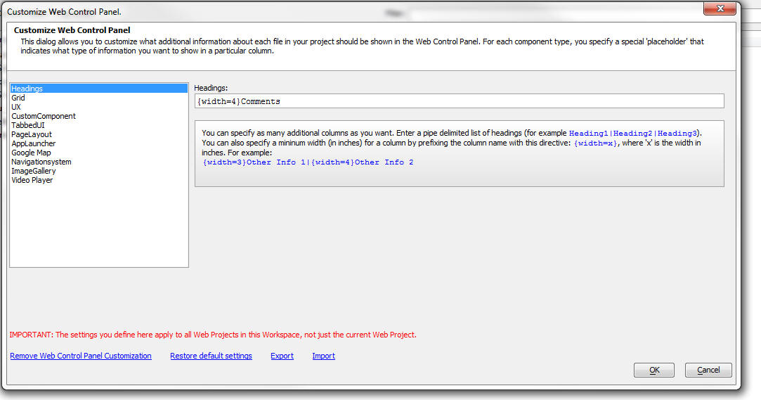
The builder allows you do define exactly what information you want to display for each component type. You can also specify how many additional columns of information you want to display in the Control Panel.
For example, the screen show above shows that one additional column of information will be added to the Control Panel and this column will have a default width of 4 inches. If you want more columns, enter a list of column headings using the pipe as a delimiter. For example:
Column1|Column2
For each component type, specify what information want to show. You do this by selecing pre-defined placeholders to extract information from the component. For example, in the case of a Grid components, the following pre-defined placeholders are available:

If there is not pre-defined placeholder to extract the information you want, you can defined your own Xbasic function to exract the required information.
Grid Component - Tree Control Navigator - Enhancements have been made to the Tree Control navigator so that now you can automatically filter the records shown in the Tree Navigator when the user filters the records shown in the Grid.
UX Component - Spin List Control - The Spin List control allows the user to select from a pre-defined list of choices by swiping on the list to 'spin' the list. The item that the list stops on is the selected item. This is an ideal control for mobile applications because it is so 'touch friendly'.
Watch Video - Part 1
Watch Video - Part 2
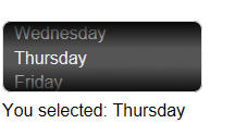
The Spin List is like all other controls in that it has a .setValue() and .setValue() method and its value gets submitted like any other control when the UX is submitted.
You can programmatically repopulate the items in the list by calling the control's .populate() method, as shown in the example code below:
//Get a pointer to the control
var so = {dialog.object}.getControl('MYSPINLIST');
/*
Create an array with data. The array contains JSON objects with an 'html' and 'value' property.
*/
var d = [
{html: '<span style="color: red;"><u>green</u></span>', value: 1},
{html: 'blue', value: 2},
{html: 'red', value: 3},
{html: 'yellow', value: 4}
]
//Repopulate the control
so.populate(d);
UX Component - Panel Card - New IFrame Type Panel Card - When you add a Panel Card to a UX component, you can specify if the Panel is a 'standard' card, or a special 'IFrame' card.
If it is an IFrame type card, you will typically want to set the IFrame URL programmatically.
Here is how this can be done. Assume that the ID of the Panel Card is 'PANEL3'.
//get the ID of the IFrame.
var iFrameId = DLG1_DlgObj.panelGetId('PANEL3','body');
//set the IFrame URL
$(iFrameId).src = 'http://www.imdb.com/title/tt0078841/';
UX Component - AjaxCallback Method - Location Information - The .AjaxCallback() Method of the UX object can now optionally include location information in the data that is sent back to the server on the callback.
If you want to include location information, add a new optional parameter to the method call.
The optional parameter is a JSON object.
{getLocationData: true}
For example:
{dialog.object}.ajaxCallback('','','myfunction','','',{getLocationData: true});
The following variables will be available in the callback data (in the 'e' object that is passed into your Xbasic event handler):
__locationFound - true/false
__locationLatitude - the latitude value
__locationLongitude - the longitude value
NOTE: If getLocationData is set to true, then when the callback takes place, the user will be asked for permission to share location information. If the user declines, the callback will still take place, but the __locationFound field will be false.
NOTE: Firefox appears to have a bug in that if the user declines to share location information, the 'error' event handler is not fired, and as a result, the Ajax callback does not occur.
UX Component - AjaxCallback Method - OnCallback Failed Javascript - The .AjaxCallback() Method of the UX object can specify Javascript to execute in the event that the callback fails (i.e. the server does not send a response).
To specify the failure error handler, add a property to the optional JSON object that is passed to the .ajaxCallback() method.
For example:
{errorFunction: function() { alert('callback failed'); }}
Here is a full method call:
{grid.Object}.ajaxCallback('','','myXbFunction','','',{errorFunction: function() { alert('callback failed'); }});
NOTE: You can also specify a global handler for Ajax callback failures by defining the client-side onAjaxCallbackFailed event.
UX and Grid Builder - Javascript Editors - Auto-complete - Javascript auto-complete in the editors has now been improved and will now show control names, panel names, etc, when right clicking on an argument in the auto-complete help.
UX Component - List Control - The List control builder now has two new buttons on the builder:
The Preview button allows you to do a live preview of the List from within the builder. You do not have to first close the builder and run the component to see the List. The preview does have some limitations. For example, if the List is paginated, clicking on the buttons to fetch next page will not work.
The 'Show' button has a sub-menu that allows you to show the JSON data that the List will display, or the JSON settings for the List control.
UX Builder - Working Preview - IE10 - Mobile Simulator - If you are running on a machine with IE10 installed, Working Preview in the Mobile Simulator will not give a much more authentic mobile experience. Drag scrolling will be enabled, and scroll bars will not be displayed.
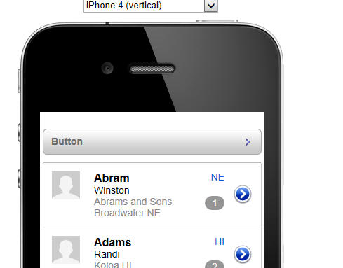
Buttons - 'Disclosure' Style - When you create a button you can now easily create 'disclosure' style buttons. These are buttons with text on the left and an icon on the right (as shown in the image below).
This is done by turning on 'Advanced button styling' for the button, and then setting the button style to:
Text left & image right
In addition, an 'Image left & text right' style is also supported.
UX Component Builder - Wysiwyg View - The 'Wysiwyg View' (an alternate view for the Tree View when designing a component) has been removed. The recommended way to get a quick preview of your design is to switch to the Working Preview pane.
CSS Styles - Legacy styles for Web Components - All legacy style for web components (e.g. Airport, Nantucket, GlassBlue, etc.) are no longer supported and have been removed from the Install Program. If you want to continue to use a style that you created with a previous version of Alpha Five, or a legacy Alpha Five style, you can copy the CSS folder to your web project.
NOTE: Using legacy styles with V12 is not recommended because many of the new control types added in V12 require CSS definitions that are not present in the legacy styles. For example, the Switch and Slider controls will not display at all with a legacy style.
UX Component - CRUD Operations on an 'Unbound' Component - The built-in Server-Side action to save data to table(s) when a UX component is saved is very powerful, but it requires that the UX component first be 'data bound'.
NOTE: CRUD is a common acronym for CReate, Update and Delete.
In some types of application you may want to submit some fields to one table
and other fields to another table, and so on. In this case, you could not use
the built-in server-side 'Save Submitted Data to Table(s)' action.
A new action in Action Javascript allows you to perform Update, Inserts and
Delete operations against any table, without requiring that the UX be 'data
bound'.
The 'Update, Insert or Delete data (Low Level)' action in Action Javascript allows you to perform Insert, Update or Delete actions on any table. It also allows you to set the operation type to 'Auto-Decide' which means that the operation type is decided at run-time. You specify the name of a Javascript function to call and depending on the value returned by this function, an Insert, Update or Delete will be performed.
For example, assume that you are updating data in a table called 'customer' and that the primary key for this table is a field called 'customer id'. Assume that the 'customer id' field is mapped to the 'customerPK' control on the UX component. You might want to perform an Insert operation if the value in the 'customerPK' control on the UX is blank, but an Update operation if the control contains a value (i.e. the value would be the primary key of the record you want to update). Here is how you could define auto-decide Javascript function (called 'myAutoDecideFunction' in this example):
function myAutoDecideFunction() {
var pk = {dialog.object}.getValue('CUSTOMERPK');
if(pk == '') return 'insert';
else return 'update';
}
NOTE: The 'Update, Insert or Delete data (Low Level)' action is only available for SQL databases. .DBF Tables are not currently supported.
When you define the 'Update, Insert or Delete data (Low Level)' action, all data binding is defined as part of the action. For example, you specify the connection string, name of the table to update, and how controls on the UX are mapped to fields in the table.
There are significant differences between the server-side 'Save Submitted Data to Table(s)' action and this new Action Javascript action. The intended use case for each is different, and it is important to understand when each is appropriate to use.
The 'Save Submitted Data to Table(s)' action, which operates on a data-bound component, treats the entire UX as a single logical form and data is written to multiple tables (if the data binding has bound the component to multiple tables). The updates are wrapped in a transaction. For example you might have a UX with the following data binding:
Order_Header ---->Customers
====>Order_Items--->Products
The 'Order_Items' are displayed in a Repeating Section. When you submit the UX, data are written to all of the tables.
On the other hand the 'Update, Insert or Delete data (Low Level)' action writes data to a single table. It implicitly assumes that the UX component is not a single 'monolithic' form, but instead that the UX has different 'logical' sections in it, each of which are intended to update different tables.
Xbasic - Exif Data in Images - Helper::ExifInfo Class - A new class has been added to Xbasic to make it easy to work with Exif data in images.
There are a large number of properties in the ExifInfo class and there are also methods to set and extract thumbnail information. See the Documentation Viewer for more details.
For example, here is an Interactive window session:
dim eh as Helper::ExifInfo
'load the exif data
? eh.LoadExifData("c:\images\test.jpg")
= .T.
'read property values
? eh.Copyright
= ""
? eh.Gps.Altitude
= "74.728"
? eh.Gps.Area_Information
= ""
'Make a change to a property value (Round up the GPS altitude data)
eh.Gps.Altitude = "74.73"
? eh.Gps.Altitude
= "74.73"
'now save the change back to the image file
? eh.SaveExifData("c:\images\test.jpg")
= .T.
'check that our change actually got saved
dim eh2 as Helper::ExifInfo
eh2.LoadExifData("c:\images\test.jpg")
? eh2.Gps.Altitude
= "74.73"
UX Component - List Control - Freeform Layout - Pre-defined Templates - The List control allows for two different layout types:
The Tabular layout is conceptually similar to the Grid component. But for mobile applications, the Freeform layout is likely to be the most useful type.
The Freeform layout lets you design a 'template' using HTML to control the presentation of the data in each row. The template HTML contains placeholders for the fields in the List data source. With the appropriate template, you can design very sophisticated List layouts, as shown in the image below.
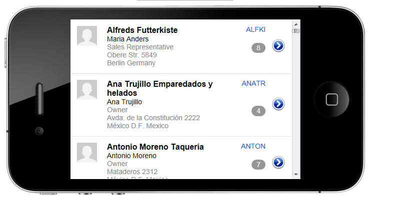
The List Builder offers several pre-defined templates, which you can use as-is, or further customize.
For example, when you are in the Freeform Template editor, and you click the 'Pre-defined Templates' button, you will get this dialog.
In the property grid on the right hand side, you can specify that you do not want your template to include an image on the left, and you can also specify that you do not want a 'disclosure' icon on the right.
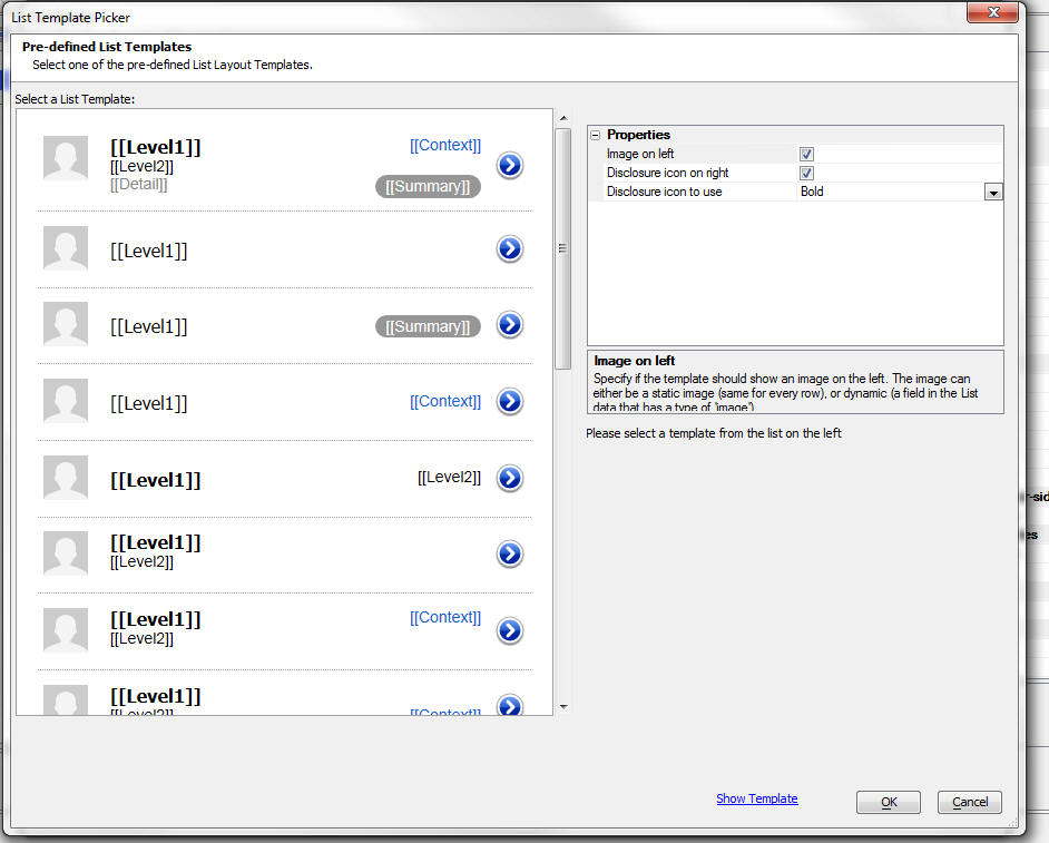
The templates shown below have the left image and disclosure turned off.
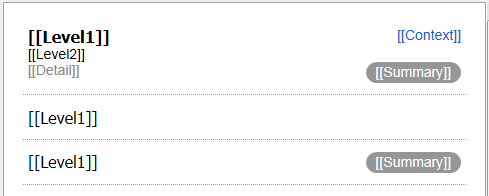
Once you select a pre-defined template, you must replace the placeholders ([[Level1]], [[Level2]], etc.), with placeholders for data in your List data source.
For example, if your List data source has fields called {Firstname}, {Lastname}, etc, you might replace [[Level1]] with {Firstname} {Lastname}.
UX Component - Text Boxes - Rounded Corners - Input controls with rounded borders are common in iOS mobile applications. This is easily done in the UX component by applying the appropriate CSS class to the text box control.
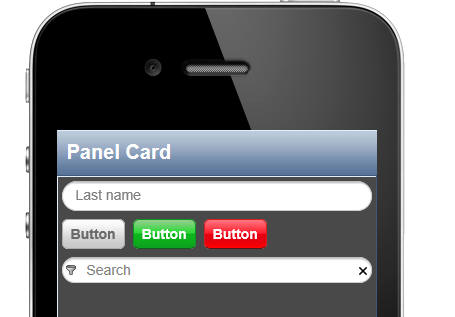
In the above example. we have a standard text (with a watermark showing 'Last name').
The rounded border was achieved by setting the class to
iOSEdit iOSEditRound
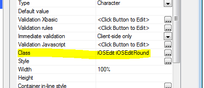
The second textbox (with a watermark of 'Search') is more complex because this control has been defined to have 'in-line buttons'. Therefore setting the class on the input control will not give you the effect you want because the control itself (including the in-line buttons) are wrapped in an outer container. Instead, the styling must be applied to the container. This has to be done by setting the 'Container in-line style' to:
border-radius: 16px;
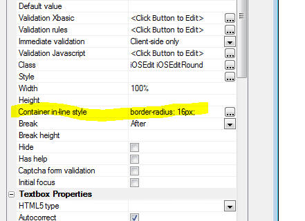
UX Component - Control Sub-themes - When you select a style for a component (for example 'iOS'), all of the controls (e.g. buttons, labels, etc) are styled in a certain way. The style definitions actually contain multiple different definitions for certain controls. For example, a button can be styled as a 'confirm', 'deny', 'navigate back', or 'navigate next' button, simply by selecting the appropriate 'sub-theme'.
Example showing button with different sub-themes.

In the case of the 'left' and 'right' button, if the button is placed in a Panel Header or Footer, it automatically takes on a different appearance, as shown below.
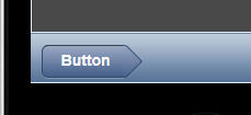
It is also possible to add your own 'sub-themes' to a
style definition.
Watch Video - 1
Watch Video - 2
UX Component - onOrientationChange Event - Mobile Applications - When the orientation of a mobile device changes, a common design pattern is to change the layout of the screen in some way. When you build your application using Panels - Panel Layouts, Navigators and Cards - much of the layout changes that are required happen automatically because of the architecture of the Panels. However, if you still need a specific onOrientation change event you can use the client-side onOrientationChange event.
The onOrientationChange event passes in the 'orientation' parameter in the e object. This parameter is either set to 'portrait' or 'landscape'.
UX Component - Client-side Show/Hide Expressions - Device Orientation - Client-side show/hide expressions are typically written to show or hide certain controls on a UX component automatically. The client-side expression builder now exposes a new system field that can be used when specifying show/hide expression.
dialog.orientation
This system field will have a value of either 'landscape' or 'portrait' (lower case).
This allows you to easily write a show/hide expression that will only show certain controls when a device is in landscape or portrait mode.
For example, the following show/hide expression can be used to only show a container if the device is in portrait mode:
dialog.orientation = "landscape"
UX Component - List Control - Multiple Layouts - Device Orientation - The List control can have multiple Layouts. You can specify which layout to use when the device orientation is landscape and which layout to use when the device orientation is portrait.
Grid and UX Component Styles - Understanding the Style.js File - All styles, (e.g. iOS, MobBlue, etc) are defined in two main files - style.css and style.js.
For example, say we are discussing the 'iOS' style. There is a sub-folder in the executable folder called CSS. Inside this folder there is a folder called 'iOS'. Inside the iOS folder there is the style.css and style.js files.
NOTE: The location of the style sub-folder (in this discussion, we are talking about the 'iOS' sub-folder), might not actually be in the CSS folder in the executable folder. If you have used the style editor to edit the style, a copy of the style will be stored as a 'local' or 'global' style. In this case the style sub-folder will be in the web project folder (in the case you copied the style to a 'local' style), or in the parent folder of the web project (in the case you copied the style to a 'global' style).
The style.css file contains the CSS definition.
The style.js file defines how many of the many of the controls (such as windows, tabs, edit-combos, auto-suggests, date pickers, switches, sliders, etc) are styled. Essentially, this file defines what CSS classes (defined in the style.css file) are used to style a control.
NOTE: The controls whose styling are not
controlled by style.js are the 'intrinsic' HTML controls
such as dropdownboxes, checkboxes, radio buttons, etc.
The styling of these controls are, of course, controlled
by classes defined in the style.css file.
In addition to controlling the appearance of
controls, the style.js file can also be used
to set other properties of a control which affect its
'behavior'.
TECHNICAL NOTE: The style.js file is loaded
and executed before the component is rendered. This
allows you to inject arbitrary Javascript into the
style.js to affect the behavior of controls.
An example of how some Javascript code could be added
to the style.js file to affect the behavior of controls
is to set all edit-combo boxes to read-only (forcing the
user to make a selection from the dropdown, rather than
typing into the control directly).
What is a Sub-Theme?
Many of the Alpha Anywhere UX component controls can have sub-themes. The available sub-themes for a control are defined in the style.js file, and can be extended. For example, in the image below, we show several buttons, each of which has a different sub-theme selected.

Here is an excerpt from the style.js for the iOs style. In the excerpt shown, we are showing the sub-themes available for the 'PanelCard' control.
A5.themes.add('iOS',{
panelCard: {
base: {
className: 'iOSPanelCard',
header: {className:
'iOSPanelHeader'},
body: {className:
'iOSPanelBody'},
footer: {className:
'iOSPanelFooter'}
},
top: {
className: 'iOSPanelCard',
header: {className:
'iOSPanelTopHeader'},
body: {className:
'iOSPanelTopBody'},
footer: {className:
'iOSPanelTopFooter'}
}
},.......
For example, the excerpt shown above shows that a PanelCard has two sub-themes:
All controls must have an entry called 'base'. This is the default sub-theme for each control type. If no sub-theme is specified for a control, or a non-existent sub-theme is specified, then the 'base' sub-theme will be used.
In the above example, there are two sub-themes, but there are potentially an unlimited number of sub-themes that can be defined.
Notice that the style.js definition looks like a standard JSON object string.
The style.js file specifies the various properties of a control. For example, it shows that the CSS class name for the PanelCard header is 'iOSPanelHeader' (for the 'base' sub-theme) and 'iOSPanelTopHeader' (for the 'top' sub-theme).
'iOSPanelHeader' and 'iOSPanelTopHeader' are defined in the corresponding style.css file.
How to Add New Sub-themes
The A5.theme.add() function in the Alpha Anywhere Javascript library can be used to add new sub-themes to a style, or to modify the setting an an existing sub-theme.
For example, lets assume you want to define a new sub-theme for a panelCard, and also modify some settings on the 'base' sub-theme. Here is the Javascript that you would add to the style.js file (at the bottom of the file).
A5.themes.add('iOS',{
panelCard: {
base: {
className: 'mySpecialClass'
},
myNewSubTheme: {
className:
'iOSPanelCard2',
header: {className:
'iOSPanelTopHeader2'},
body: {className:
'iOSPanelTopBody2'},
footer: {className:
'iOSPanelTopFooter2'}
}
}
});
Clipboard - Code Editor - The right click menu in the code editor now has a new menu option, Paste Other, which keeps a history of items on the clipboard.
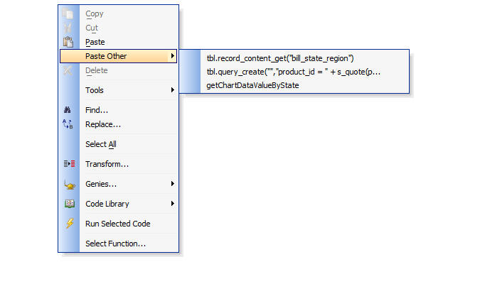
UX Component - Javascript Functions - When you save the UX component, Javascript code is now validated and syntax errors are reported.
Reports - Web Applications - 'Project Reports' - In V11, in order to define a Report for use in a Web Project, you had to return to the Control Panel for Desktop Applications. You could not define your reports or edit them from the Web Control Panel.
Note: If you are running V11 with V12 beta features turned on using feature keys, you will not be able to see 'Project Reports'. This requires a 'real' V12 build.
Now, you can define and edit Reports directly the Web Control Panel as shown in the image below. The reports that you create and edit at the Web Control Panel are called 'Project Reports'.
In the image below, notice that the Web Control Panel now has a new category called 'Reports (Project)'.
NOTE: Project Reports are only available for reports based on a SQL datasource. For reports based on .dbf tables, you must continue to define your reports at the 'Workspace' level. That means you must go to the Control Panel (not the Web Control Panel) and define your reports there.
For SQL Reports you can either define your reports as 'Workspace' reports, or 'Project' reports. If you prefer to continue using 'Workspace' reports, then that's fine.
Project Reports are stored in individual files with a .a5rpt extension. This makes it easier to publish an individual report after you have edited it, to copy a report file from one project to another, and to backup a report file.
Note: 'Workspace' reports, can be seen by all Web
Projects defined in the the Workspace. A Workspace can
contain multiple Web Projects. A component, or 'Project
Report' defined in one Web Project cannot be seen when
you are in another Web Project in the same Workspace.
When you select a Report to add to a component, or in
Action Javascript, you can select either a 'Workspace'
report, or a 'Project' report.
Reports - Importing 'Workspace Reports' into a Web Project - 'Workspace' Reports (i.e. reports defined at the Control Panel) can be imported into the current Web Project. To import 'Workspace Reports' click the 'Import Reports' hyperlink on the Web Projects Control Panel.

This will bring up a dialog showing all of your existing 'Workspace' reports. Only 'Workspace' reports that are based on SQL tables are shown.
Grid and UX Component - Advanced Export Using Report Definition - Prior versions of Alpha Five have supported exporting data from a Grid component to either Excel or Ascii files. The data was exported as a simple, unformatted table of raw data.
Now, a new type of export is available. You can use a Report Definition to specify the format for an export operation. Data can be exported to:
The 'Advanced Export' option is available as an action in Action Javascript and can be used in the Grid and UX components.
Important: It is important to understand a fundamental difference between the default 'Export' action (which exports data from the current Grid component, and the Advanced Export action. The Advanced Export action does not necessarily export data from the current Grid. It exports the data defined in the Report Definition. The Report could be based on the same table or query that the Grid is based on, but certainly does not have to be.
UX Component - Map Control - Action Javascript - The Map control was added in V11, but in order to perform actions on the Map (such as adding a marker, adding bulk markers, centering the map on a location, etc.), it was necessary to write your own Javascript code (using methods that were added to the Dialog Object). Now, an extensive set of Map actions have been added to Action Javascript, allowing map actions to be performed without any coding at all.
A new action called 'Google Map Methods (UX Component)' has been added.
This action allows you to perform these map actions:
Install Maker - The Install Maker, used for desktop applications to create install packages for runtime-applications, has been dropped. To distribute desktop applications that require the Alpha Five v12 runtime, you can distribute the Alpha Five Runtime Installer to install the Alpha Five Runtime files. You can use a 3rd party installer to install your application files.
Reports - Converting Free-form Reports to Layout Table Reports - Alpha Five has two styles of reports:
The advantage of Layout Table reports is that they can export to HTML, Word and Excel directly, without using the Amyuni printer driver, and they produce Excel, HTML or Word files that are generally close to perfect representations of the original report.
Many developers have a large number of existing reports that are free-form reports, but they would like to take advantage of the benefits of Layout Table reports.
A new command allows you to convert a Free-Form report layout to a Layout Table report.
To access the command, right click on the report and select the 'Convert Free-form to Layout Table report...' command.
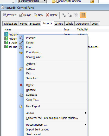
When you convert a Free-form report to a Layout Table report and you then examine the converted report in the Report Editor, you will notice that the report may contain many rows and columns in the layout table that don't contain any objects. These empty rows and columns have been inserted simply to preserve the exact placement of the objects in the report.
Here is how a simple free-form report looks after it has been converted to a Layout Table report. Notice that there are quite a few columns in the layout table that don't have any objects in them.
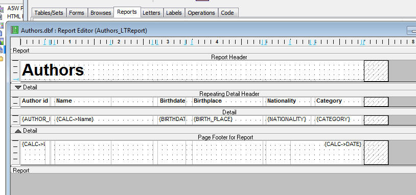
You might want to 'simplify' the table layout by eliminating some these empty rows and columns. The report editor has a command to 'merge' empty rows and columns in the layout table. Select Arrange, Auto Merge... from the menu.
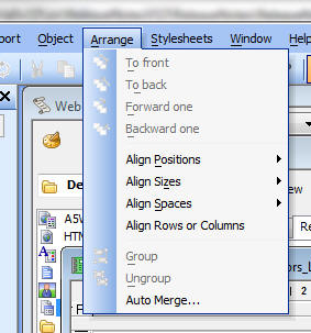
This will display the 'Auto merge Layout' dialog.
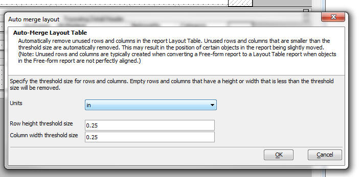
Here is how the report looks after the Auto-Merge dialog has done its magic:
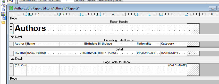
Web Applications - Reporting - HTML Reports - When you use Action Scripting to print a report from an event (such as a button click) in a Grid or UX component, or you add a Report to a TabbedUI component, you now have a new option to specify the 'initial view' of the Report. You can specify that the 'initial view' is either 'PDF', or 'HTML'.
Watch Video - Part 4 - Mobile Applications
For mobile applications, HTML reporting is particularly useful. See below for more information.
In V11 and prior versions, reports were always displayed as PDF documents. Displaying a report as a PDF document is significantly slower than generating an HTML report. That's because PDF documents are created by the 3rd party Amyuni PDF Printer Driver that is bundled with Alpha Five. HTML reports, by contrast, are directly generated by Alpha Five and do not use a printer driver at all.
The advantage of PDF reporting over HTML reporting is generally when the report needs to be printed. However, in many applications, reports need to be viewed, not necessarily printed.
HTML reports can be printed, but when they are printed, the HTML report is treated as a single long HTML document, and page breaks are inserted by the printer. Therefore, page summary values (such as page counts) are meaningless and are not supported.
When a PDF report is created, page breaks are computed by the report writer and therefore page summary values are supported.
The HTML report viewer does allow the user to click a button to get a PDF version of the report if the user wants to print a 'high fidelity' version of the report and does not want to rely on HTML printing.
In the image below we show a Tabbed UI component with a tab pane showing an HTML report. In the second image we show the a tab pane with the PDF view of the same report.
Notice that in the case of the HTML Report:
NOTE: To add bookmarks, table of contents or an index, to a report, you must go the the full report editor (you cannot add these items in the Quick Report Builder), and then select the 'Report' menu dropdown from the report menus.
TECHNICAL NOTE: In the HTML report shown below, the report and the bookmarks are each actually in their own 'Panel Card' and the two 'Panel Cards' are wrapped in a 'Panel Layout'. The bookmarks Panel Card has been configured to automatically hide itself if there is insufficient space to render it. If the bookmarks Panel Card is hidden, a button is automatically placed in the HTML Report Viewer header to show the Bookmarks Panel Card.
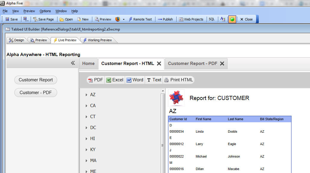
In this image the same report is shown, but this time using a PDF view of the report. Notice that the TabbedUI pane now hosts the Acrobat PDF reader and the report is shown in the PDF reader.
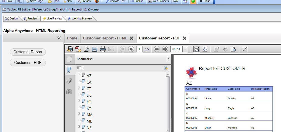
HTML Reporting in Mobile Applications
Mobile applications are typically built using on or more 'panels' in the UX component. When you use Action Javascript to display a report, you can specify the report 'target'. This is typically set to a 'window', a 'div' or a 'tabbed UI pane'. However, now in V12, you can also set the report target to a 'Panel'.
Watch Video - Mobile Applications
Watch Video - Report with Bookmarks
Typically, your UX component will have a series of buttons that the user can click to display different reports. Each of these buttons will be configured to display the report using an 'HTML' initial view and setting the report target to a 'panel card'.
For example, in the UX component shown below, we have 2 Panel Cards wrapped in a Panel Navigator. Panel Card 1 contains various buttons, each of which runs a different report. In each case, the button action is configured to display the report in a Panel (Pane Card 2).
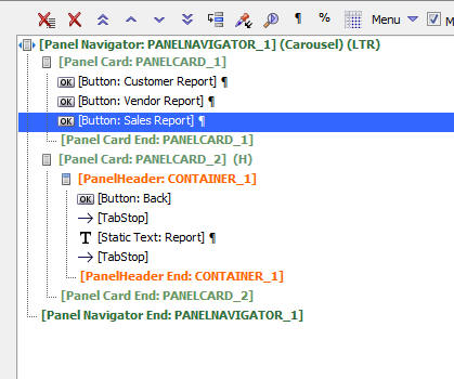
When you design reports, you can turn on the
'bookmarks' and 'table of contents' features. The
'bookmark' feature creates a tree control of all of the
'bookmarks' in the report and allows you to navigate to
any section of the report by clicking on a appropriate
item in the 'bookmark tree', which is displayed to the
left of the report itself. The 'table of contents'
section, on the other hand, is shown before the first
page of the report. You can also navigate to any
particular section of the report by clicking on an entry
in the table of contents.
In HTML reports, the 'bookmarks' tree is automatically
rendered in a Panel. In a mobile application, the Panel
Card that contains the bookmark tree is automatically
hidden if there is not enough space on the device. In
the case where it is hidden, a button is automatically
added to the Panel Header to reveal the bookmarks.
Requirements for HTML Reporting
HTML Reporting requires that a Layout Table version of your report is available. Obviously, if you created the Report originally as a Layout Table report, such a version of Report is available.
However, if you created the Report as a Free-form Report, the Layout Table version of the Report will not necessarily be available unless you instruct Alpha Anywhere to automatically save a Layout Table version of the Report every time you edit the Free-form Report. This is done by selecting the Report, Save Layout Table Version.. command from the menus.
NOTE: Layout Table Reports are only for 'Reports'. You can't make a Layout Table 'Letter' or 'Label' style report.
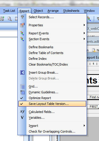
Javascript Editors - Component Builders - Auto-complete - When you editing Javascript code, the editor now supports auto-complete of methods in the Grid and UX (Dialog) object.
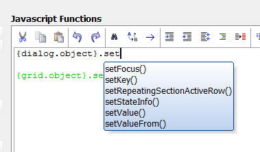
Xbasic Code Editor - Smart Search/Replace of Variable Names - In the Xbasic code editor, a new item on the right-click menu allows you to do 'smart' search and replace of variable names in your code.
The new 'Variable search/replace' menu option brings up the dialog shown below:
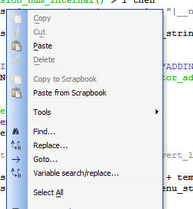
The 'Search' prompt allows you to select the name of the variable you wish to rename.
For example, if you only check the 'Variables and function' option and you change a variable called 'quantity' to 'qty' any occurrence of the string 'quantity' in a comment or string will not be changed.
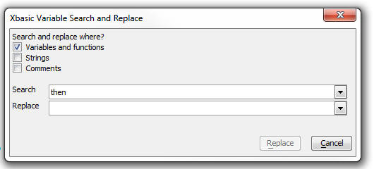
Javascript Windows - Close Window When Clicking on Background - The 'Open a popup Ajax Window/Overlay' action in Action Javascript now has a new property for modal and modeless windows that allows you to set the window to close automatically when the user clicks on the window background. In this respect, the window behaves like a dropdown window. If you have this property enabled, then you don't need to have a close button on the window.
UX Component - Quick Panel Genie - The
Quick Panel Genie allows you to quickly create complex
Panel Layouts.
Watch Video
To get to the Quick Panel Genie click the Quick Panel item on the toolbox.
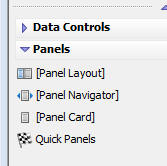
When you select this option you get a dialog where you can use a special simple syntax to defined the Panels that you want to add to the UX builder:
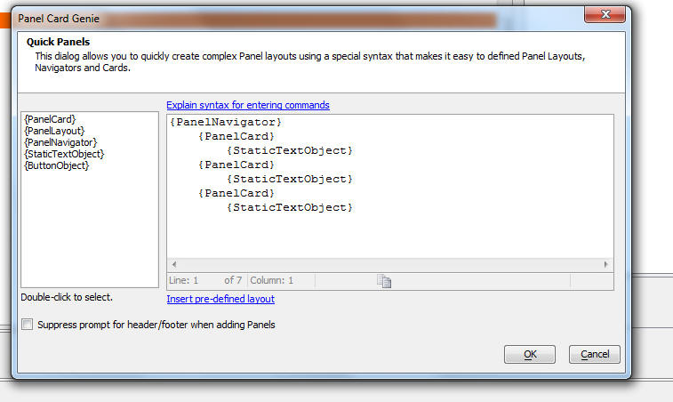
Grid and UX Component - Remote Testing on a Phone or Tablet - To test a component that you are designing on a remote device (e.g. a phone or tablet), you can press the 'Remote Test' button on the toolbar.

When you press this button, the component you are editing is published to the Live Preview folder on your computer and an .a5w page is constructed that contains the component. You then need to get the URL of this page to your remote device so you can enter it in the address bar of the browser on your remote device.
Typing the URL into the address bar of the browser on the remote device is (frankly) quite painful so two alternative methods are available:
QR Code scanners can typically be installed from the App Store on your device.
When you click the 'Remote Test' button, after the component has been published to the Live Preview folder, the following dialog is shown:
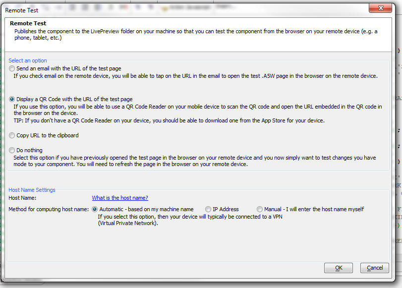
Choose the method for getting the URL of the test page to your remote device. If you chose the e-mail option, you will have to configure the e-mail settings for your e-mail account so that the email can be sent.
After you have opened the page in the browser on your remote device, if you then make changes to your component and you want to see the changes on your remote device, you can choose the 'Do nothing' option.
You will also need to specify the hostname for your computer. You will need to specify a hostname that is visible to your remote device.
If the remote device is on the same network as your computer, or if the remote device is connected to a VPN, then you can use your machine name as the hostname. On some networks, the machine name will not work and instead you must use the IP address of your machine. If you choose the IP Address option, you can click a hyperlink to see the IP addresses currently assigned to your machine.
Grid, UX Component - Action Javascript - Print Report Action - Xbasic Function - If you have selected the option to call an Xbasic function after the report has completed, the e object that is passed into the Xbasic function now includes a new property: fileSessionKey. This property can be used to read the binary data for the report from session storage.
For example:
dim reportBlob as b
Session.GetDataFromFile(reportBlob,e.fileSessionKey)
The e.reportFilename property that is also passed into the function will not necessarily be valid if you are running under a load balancer with multiple Application Servers.
Reports - Layout Table Reports - Linked Reports - Conditional - In a Layout Table Report, each row in the Layout Table can have a 'row condition' property. If this property is false, the row is suppressed. Now, if the row contains a Linked Report, the linked report will only print if the row condition is true. This is an extremely powerful feature as it allows you to set conditions under which the linked report for a given row in a report will print.
UX Component - Lookup Grid - Dynamically Specifying the Name of the Grid to Show at Run-time - When you define a Lookup Grid for a textbox or textarea control, you can now specify the name of a Javascript function to call whenever the user opens the Lookup Window. This Javascript function will return the name of the Grid to show in the Lookup Window.
IMPORTANT: All Grids that are specified must use the same field names in the fields that are mapped back to controls in the UX component, or else the code that fills in fields in the UX with the corresponding mapped field in the Lookup Grid will fail.
UX Component - Using the Google Visualization Api - You can now easily use the Google Visualization API in a UX component. For example, in the UX component shown below, we show a gauge and a geo map.
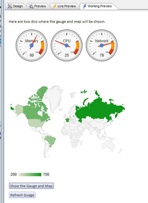
In order to use the Google Visualization API in a UX component you need to ensure that the Google JSAPI is loaded. This is done by going to 'Project Properties' at the Web Control Panel and checking the 'Include Google JSAPI library' box.
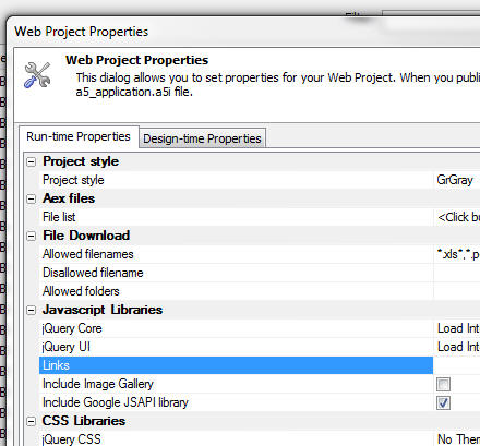
Next, you need to specify in the UX builder which Google visualization libraries you want to load. This is done in the Javascript section on the Properties pane.
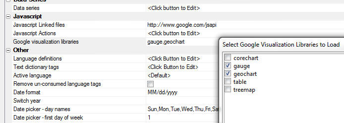
A new client-side event called 'afterGoogleVisualization' will fire after the Google visualization libraries have been loaded. You can use this event to fire your code that draws the charts.
Reports - PageCount() Function - Groups - This function now takes an optional argument - the group name. If the optional group name is specified then the page count resets at the start of each new group.
This function in intended for use in the situation where the report is configured to start new groups on new pages.
Web Control Panel - Deleted Files - When you delete a file, the file is moved to a special __delete folder in the web projects folder and the file can later be restored.
Grid Component - Javascript Actions - The UX Component supports 'Javascript Actions'. Now, Javascript Actions are also available in the Grid component.
A Javascript Action is similar in concept to a Javascript Function, except that Action Javascript is used to define the action.
Once you have defined a Javascript Action, you can invoke it by adding this command to your Javascript code:
{grid.object}.runAction('actionName');
UX Component - ButtonList Control - The Button List is a new control type for the UX component. It displays a series of buttons in either a vertical or horizontal orientation.
The image below shows several Button Lists controls.
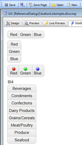
Depending on how the Button List is configured, either one button in the Button List or multiple buttons can be selected. When a button is 'selected' is is displayed as depressed.
Buttons can be displayed as text only, image only or image and text. When displaying images and text, you can configure the image to be left, right, above or below the text.
Unlike a regular button, which has events, such as onClick, etc. the individual buttons in a Button List do not have events.
Instead, you can define an onSelect or onClick event for the Button List as a whole.
In the event handler you can refer to
this.value
to get the value of the button that was clicked on.
The onSelect event is fired whenever the value in the Button List is changed (programmatically, using (say) the .setValue() method), or through the user interface (when the user clicks on a button).
On the other hand, the onClick event is only fired when the user clicks on a button.
When the onClick event fires, the onSelect event will also fire.
A common use case for Button Lists is to select the active pane in a Tab Control (much like you would see in an iOS application). In the image below, the Button List selects the active pane in a Tab Control (shown in the builder in the following image).
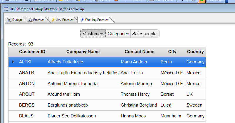
This image shows a Tab Control in a UX component. The method for selecting the active tab pane has been set to 'automatic' and the expression for each tab pane has been set to watch the value of the selected button in the Button List.
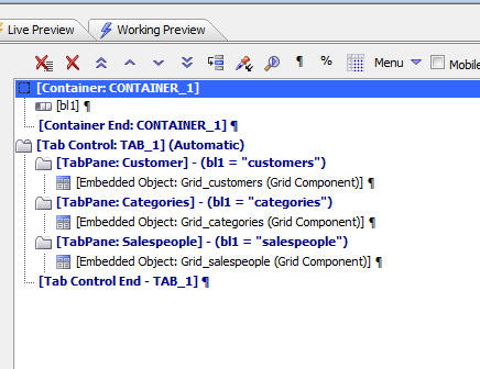
Another common use for a Button List is for radio button and checkbox controls in mobile applications.
Windows - Pointer Icons - When a pop-up widow is displayed (for example to show a Grid, UX component, Report, Menu, etc.), you can now specify that the pop-up window has an icon that 'points' to the element that opened the window.
For example, in the screen shown below, the 'List' button has been pressed and that has opened a window showing a list. The window has a pointer that points back to the 'List' button.
Displaying pointers on pop-up windows is a common pattern in mobile applications.
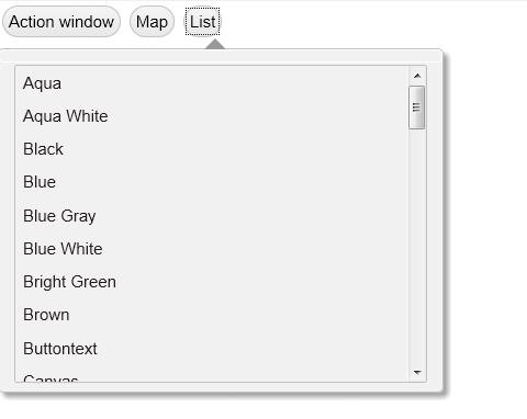
Grid Component - Vertical Alignment of Controls in Columns - A new property allows you to control the vertical alignment of controls in columns. Previously this was always centered. Now you can set the alignment to top or bottom.
For example, in the image below the vertical alignment of all controls has been set to 'Top'

UX Component - Tree Control - The UX Component now supports a 'tree' control as shown in the image below
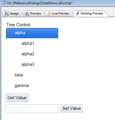
To add a tree control to a UX component, select the Tree control from the 'Data Controls' section in the UX Component.
Just like other data controls (such as Textbox, Radio Button, etc.), the Tree control has a 'value' (based on the current selection in the tree). This value gets submitted when the UX is submitted.
The value of the tree can be set/read using the standard .setValue() and .getValue() methods.
The tree control can be configured to allow multiple selections.
The 'value' of each node in the tree is defined in the tree settings. See video for more information.
The data in the tree control can be defined in three different ways:
Using the Tree Data Genie is the easiest approach. If you ultimately want to specify the JSON yourself, starting in the Genie and having it generate JSON for you, is recommended.
When you open the Tree Data Genie, you get a dialog that looks like this:
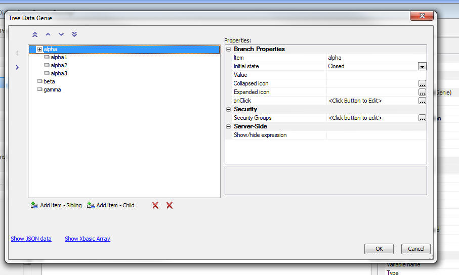
Event handlers for clicks, etc. on the tree and on the individual nodes can be defined at both the tree level and the node level.
For example, if you define an 'onNodeClick' event at the Tree level, it will apply to all nodes in the tree. However, if you define an 'onClick' event at an individual node level, this event handler will mask the event handler defined as the tree level.
The tree control can be dynamically re-populated at any time by calling the tree object's .populate() method.
For example, the following Javascript will reset the choices in a tree control called 'T1':
js = <<%txt%
var tobj = {dialog.object}.getControl('t1');
var d = [
{
html: 'a',
collapsedIcon:
'images/$$application.firefox.png.a5image',
expandedIcon: 'images/$$application.alpha.png.a5image',
children: [
{
html: 'a-1',
icon: 'images/$$application.chrome.png.a5image',
onClick: function() { alert('click on a-1'); }
},
{
html: 'a-2',
onClick: function() { alert('click on a-2'); }
},
{
html: 'a-3',
onClick: function() { alert('click on a-3'); }
}
]
},
{
html: 'b',
onClick: function() { alert('click on b'); }
},
{
html: 'c'
}
]
tobj.populate(d);
UX and Grid Component - Menus - A new action has been added to Action Javascript to display a menu.
For example, in the image shown below, the user has clicked a button and a pop-up menu has been displayed.
Watch
Video - 1
Watch Video
- 2
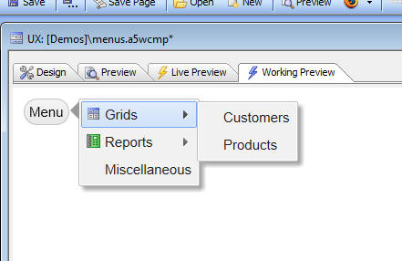
Features of the menu include
Note: All comments and videos on populating the tree control dynamically also apply to the menu control.
Example of an advanced menu showing how menus can have heading sections, input controls, buttons, radio button item, and radio group items. See videos for more information. (Video1, Video2, Video3).
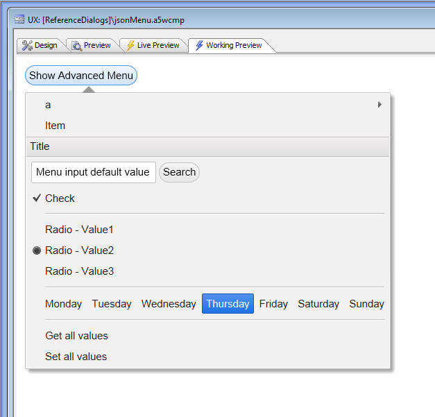
a5_treeTextToJSON Function - Converts a 'tree' definition that is in the form of a crlf delimited list with tab indented values and converts into a JSON tree definition. For use with the Javascript Menu and Tree objects in the UX and Grid components.
The UX component has a new Tree control. And the UX and Grid components have a new action in Action Javascript to display a menu.
Both the Tree and the Menu objects are populated with a JSON string that defines the items in the tree/menu.
This JSON string can either be defined at design time, or can be computed using an Xbasic function. The ability to define the JSON string using Xbasic is extremely powerful because it means that your tree and menu objects can be highly dynamic.
The a5_treeTextToJSON() function is a helper function that you can use in your Xbasic code to generate the JSON definition for the tree or menu.
The function takes a CRLF delimited list of values. Tab indents are used to indicate the level in the hierarchy.
For example, here is a simple tree definition:
MA
Boston
Back Bay
Financial District
Cambridge
Harvard Square
Inman Square
New York
New York City
Midtown
Wall Street
Albany
Ithaca
Using the a5_treeTextToJSON() function, you can convert the definition this JSON
[
{
html: 'MA',
children: [
{
html: 'Boston',
children: [
{
html: 'Back Bay'
},
{
html: 'Financial District'
}
]
},
{
html: 'Cambridge',
children: [
{
html: 'Harvard Square'
},
{
html: 'Inman Square'
}
]
}
]
},
{
html: 'New York',
children: [
{
html: 'New York City',
children: [
{
html: 'Midtown'
},
{
html: 'Wall Street'
}
]
},
{
html: 'Albany'
},
{
html: 'Ithaca'
}
]
}
]
In the above example, the JSON that is generated does not have any additional properties, such as the icon to show for each item, or the onClick event.
The text tree that you pass into the a5_treeTextToJSON() function can include a list of additional properties for each item. These properties are in the form of a JSON object (on a single line), as shown in the following simple example:
dim treeText as c
treeText = <<%txt%
Alpha
Alpha-1{icon: 'myIconA', onClick: 'alert("You clicked on Alpha-1");'}
Alpha-2{icon: 'myIconB', onClick: 'alert("You clicked on Alpha-2");'}
Beta{icon: 'myIconC', onClick: 'alert("You clicked on Beta-1");'}
%txt%
?a5_treeTextToJSON(treeText)
=
[
{
html: 'Alpha',
children: [
{
html: ' Alpha-1',
icon: 'myIconA',
onClick: function(dn) {alert("You clicked on Alpha-1");}
},
{
html: ' Alpha-2',
icon: 'myIconB',
onClick: function(dn) {alert("You clicked on Alpha-2");}
}
]
},
{
html: 'Beta',
icon: 'myIconC',
onClick: function(dn) {alert("You clicked on Beta-1");}
}
]
Important: The indentation in the text string that is passed into the a5_treeTextToJSON function must use tabs, not spaces.
The full list of additional properties that can be specified for each item in the tree is:
| icon | name of the icon image to show |
| collapsedIcon | name of icon when node is closed |
| expandedIcon | name of icon when node is opened |
| onClick | Javascript to run when tree node is clicked |
| onSelect | Javascript to run when tree node is selected |
| onExpand | Javascript to run when tree node is expanded |
| onCollapse | Javascript to run when tree node is collapsed |
| initialState | 'closed' or 'open' - specifies if the initial state of the node is expanded or contracted. |
| attributes | in-line style for the html in the node |
| value | value that should be assigned to the variable when tree node is selected |
IMPORTANT: The property names are case-sensitive.
Tip: When generating the crlf delimited string that is passed into the a5_treeTextToJSON() function, another useful helper function is the *tree_to_outline() function, which takes a string of data in this format:
Ma|Boston|Back Bay
Ma|Boston|Financial
and turns it into an outline format, which is the format needed by the a5_treeTextToJSON() function.
UX Component Builder - Duplicate Controls - You can now right click on one or more controls and the builder and duplicate the controls.
UX Component - Center on Screen - A new property for a UX component allows you to horizontally center the component on the screen. (Only applies when Panels are not used). By default panels are top, left justified. When the property is checked, the UX is horizontally centered in its container.

Tabbed UI - Component - Horizontally Center and Fixed Width - You can now specify that a Tabbed UI component has a fixed width and is horizontally centered on the page.
By default, the Tabbed UI consumes the full width of the browser window in which it is rendered. As the browser window is resized the Tab UI also resizes. But if you check the 'Center TabbedUI on page' property you can specify a width property.

Grid and Dialog Component - Ajax Callbacks - Browser Information - All Ajax callbacks now submit a special variable called __a5browserflags. This is a string in JSON format that contains information about the browser from which the callback was initiated.
For example:
__a5browserflags = {supportsTouch: false, isTablet: false, isSafari: false, isMobile: false, isWebKit: false, isOpera: false, isFireFox: true, isIE: false, isWindows: true, isIPhone: false, isIPad: false, isXoom: false, isKindle: false, isPlaybook: false, isGalaxy: false, isTouchPad: false, isNotWebKit: true, useBasicScroller: true, isPortraitMode: false}
You can use the json_parse() function to turn this variable into a set of Xbasic properties. For example, assume you have a button on a UX component that makes a callback. Inside your Xbasic function, you would have code like this
dim browserFlags as c
browserFlags = e.rv.__a5browserflags
dim bf as p
bf = json_parse(browserFlags)
'Now to see if you are on a WebKit browser, you can check bf.isWebKit
UX Component - List Control - onSwipe Event - The List Control now supports an 'onSwipe' event which fires when a user swipes to the left, right, up or down on the current row in the List.
UX Component - List Control - onScroll Event - The List Control now supports an 'onScroll' event which fires when a user scrolls the List.
UX Component - Tab Control - New Property - 'Panes have border/background' - A new property in the Tab control allows you to turn off the border that surrounds each tab pane and the background color that appears by default on each tab pane.
When using the Tab Control in its 'traditional use' (i.e. user clicks on a tab pane selector) to change the active pane, you will probably not want to turn off pane borders and backgrounds.
However, when using Genie style, or if you select one of the special options for changing the active pane, you will probably want to turn off the tab background and border. See video for example.
UX Component - Injectible Content - Moving Controls from one Location to Another - The UX Component has a special container type called 'Injectible Content'. Any controls that are inside an 'Injectible Content' container will be repositioned at run-time to some other location on the screen. This location can either be div or a Placeholder control.
This allows you to 'move' controls in the UX component to some other location on the screen. This location can be anywhere on the screen, including a div that is positioned inside a parent component.
A practical example of where this technique is very useful is when you want to put a search control inside the 'Data header' section of a List control. The 'data header' appears above the first row of data in a List. This pattern is used, for example, in the iOs Mail Application where Apple has positioned the search box above the list of emails.
UX Component - Panels - Fixed Position Content - 'PanelOverlay' Containers - Normally, all content in a UX component is positioned 'relatively'. In other words if a control in shown in the UX builder after another control, then when the component is rendered, the second control is either to the right or below the first control, depending on whether a 'break' was inserted after the first control.
There may be situations where you would like some content to be positioned in a fixed position. This is easily achieved by placing the content into a Container and then setting the container type to 'PanelOverlay'. A 'PanelOverlay' always 'floats above' the rest of the content on the screen and has a fixed position relative to the top, left, bottom and right of the visible Panel.
When positioning a PanelOverlay you can specify a top, bottom, left and right property. For example if you set the top property to 10px, the PanelOverlay will be positioned 10px from the top of the screen.
If you specify both a top and bottom, or left and right property, the Panel Overlay will be stretched. For example if you specify a left and right property of 50px, the PanelOverlay will start 50px from the left edge and continue to 50px from the right edge.
If the PanelOverlay container is in a Panel Card, the fixed position content will only be visible when the Panel Card is visible. However, if the PanelOverlay container is in a Panel Navigator, or Panel Layout, then the fixed position content will be visible when any Panel Card in the Panel Layout or Panel Navigator is visible. See video for more information.
UX Component - Textbox Controls - In-control Buttons - Textbox controls can have user-defined in-control buttons.
For example in the image below a textbox control has two in-control buttons. On the left we have decorative icon (i.e. clicking on the icon does not perform any action). The icon is shown to give a visual clue as to the textbox purpose (in this case, it is a search box). On the right, we have an icon that clears the textbox entry.

To define in-control buttons, set the 'Custom in-control buttons' property, then click the smart field to define the buttons.
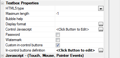
The in-control buttons builder is shown below:
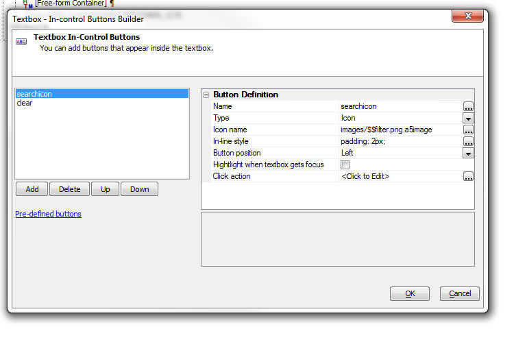
You can add as many buttons as you want. For each button you can specify several properties.
Using in-control buttons with Edit-Combo, Lookup, Date and Time Fields.
Edit-combo, Lookup, Date and Time fields already display a system generated in-control button. For example, in the case of an edit-combo, the system generated in-control button is the down arrow. If you add custom in-control buttons to any of these control types, the user-defined in-control buttons will appear in addition to the system generated in-control buttons. For example, in the image below, a 'clear text' button has been added.

The {this} Placeholder
When you defined the action for an in-control button, you use the special {this} placeholder to get a pointer to the textbox control. For example, say you have defined a 'Search' in-control button and you want to perform a search using the value the user typed into the control. You Javascript click action would include code like this:
var searchFor = {this}.value;
UX Component - Server-side Action Scripting - Save Data - Location for Global Errors and Debugging Information - This action now allows you to define placeholders for global errors and debugging information.
Global errors are displayed when you try to save data and a global error (i.e. an error that is not specific to a particular field) occurs. Normally, Global Errors are defined in a default location. However, when you are working on an application that uses Panels, you will want the error to appear in a specific Panel. You can therefore place a 'Placeholder' control (see the 'Other Controls' section in the UX toolbox) in a specific Panel and then in the Save Data action genie, you can specify the name of the Placeholder where Global errors should be shown.
Similarly, you can specify the Placeholder for debugging information.
Layout Table Reports - RTF Content Type - Layout Table Reports now support RTF content. The main reason for supporting RTF content in Layout Table Reports is so that when a Free-form report is converted to a Layout Table Report you get a higher fidelity in the conversion. Typically when you build a Layout Table Report from scratch you would use HTML content for rich text. However, using the new RTF content type does have some advantages over HTML content because RTF content supports conditional line breaks (i.e. 'soft' line breaks) and page breaks.
A 'soft' line breaks (inserted using the shift+Enter, rather than Enter) is typically used in this scenario. Say you have an address block with these fields:
Address1
Address2
City, State Zip
If Address2 is blank and it has a 'soft' break, then the line taken by Address2 will be suppressed.
The advantage of HTML content over RTF is that you get much richer formatting options and you can insert images into the text.
UX Component - Action Javascript - Delete Record - The Delete Record action can be used to define a button that will delete a record in a UX Component that has been bound to a database. The action deletes the current record in the primary table. For example, assume your UX Component is bound to multiple tables as shown below:
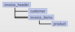
The Delete Record action will delete the current record in the Invoice_Header table (as this is the 'primary' table).
The action exposes the following options:
For example, in the UX component contains a list that is based on the Invoice_Header table, when you delete a record from the Invoice_Header table, you can automatically remove the corresponding row in the List.
List Control - Paginated Lists - If you define a paginated List you can put pre-defined controls (from the Defined Controls section in the UX Builder toolbox) to display:
UX Component - Switch Control - The switch control allows you to display a two state control. The switch can be in an 'on' or 'off' position.
The appearance of the switch is controlled by CSS classes in the style you have selected.
The images below show several switches.
The first image shows the switch in the off position.
The second image shows the switch in the on position. In the 'on' position, the slider is on the right side of the switch.
The third image shows the switch in the on position. Notice however that in this case the slider is on the left side of the switch. This is because the 'flow' property of this switch has been set to 'RTL' (right-to-left). By default, the flow property is set to 'LTR' (left-to-right).
In the fourth image, optional text has been specified to show for the switch's 'on' and 'off' state. Also, the switch control width has been increased to accommodate the text.
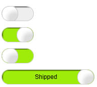
Switch control are bound to variables (just like other data controls, such as textbox, checkbox, etc). This means that the standard {dialog.object}.setValue() and {dialog.object}.getValue() methods can be used to operate on the variable to which the switch is bound.
When the switch is bound to a logical variable, the variable's value is either true or false. A switch that is bound to a logical variable is conceptually similar to a logical checkbox.
When the switch is bound to a numeric variable, the variable's value is 0 when the switch is in the off state and 1 when it is in the on state.
When a switch is bound to a character variable, you can specify what value the variable should be set to when the switch is in the on and off state.
The Switch builder allows you to specify an OnSelect event which is fired when the state of the switch is changed. Your Javascript can reference the value of the switch using:
this.value
IMPORTANT: The 'Layout Type' property must be set to 'Container Width' if you want to use the switch control.
UX Component - Time Picker Customization - The time picker now has new customization options. These customization options apply to the 'hours' picker, 'minutes' picker and the 'seconds' picker (if the time format defined for the control has turned on the seconds portion).
You can now control:
When you specify the choices to be shown you can specify:
The Javascript function will return and array with the choices. The option to use a Javascript function is extremely powerful because it means that the choices can be dynamically computed. For example, if you were prompting for the time that an appointment should end, you would only display 'hour' choices that were after the start time of the appointment.
In the image below the default layout for the 'hours' choices is shown.
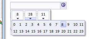
Now the same choices are shown, but the number of columns has been set to 4.
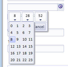
To open the time picker customization builder, click the smart field:
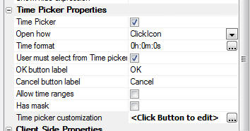
Here is an example of a Javascript function that will return custom choices for the 'hours' picker:
function getHours() {
var d = ['3','5','7','13,'11 pm'];
return d;
}
Notice that you can return values using either a 24 hour clock, or with explicit 'am' and 'pm' designations.
Grid and UX Component - Client-side Show/Hide Expression - Preserve Space - The client side show/hide expression can now preserve the space taken by a control when it is hidden. A new option can be set to either 'Preserve' space of 'Collapse' space taken by the hidden controls.
When an element is hidden the CSS display property, or the CSS visibility property of the element can be changed.
When the 'display' property is changed, the hidden element no longer takes up
space in the DOM and so elements to the right and below the hidden element
will shift to occupy the space formerly consumed by the hidden element.
When the 'visibility' property is changed, the hidden element continues to take
up 'space' in the HTML document.
This means that elements to the right and below this element will not move.
A new option is available in the builder to set the show/hide mode.

In the images below, a client-side show/hide expression has been defined for Button1
The images show the UX when Button1 is shown and then when Button1 is hidden using first the 'Collapse' option, then the 'Preserve' option.
Showing Button1
Button1 is hidden using the 'Preserve' option
Button2 is hidden using the 'Collapse' option.
Action Javascript - Toggle Display Action - Events - You can now specify Javascript to execute after the animation that hides or shows an element has completed.
Reports - Checking for Overlapping Controls - Converting Free-form to Layout Table Reports - Overlapping controls are generally not a problem when you design a free-form report, but when you convert a free-form report to a Layout Table report, they can cause problems. It is therefore recommended that before you convert a free-from report to a Layout Table report you fix all overlapping controls..
When you convert a free-form report to a Layout Table report, Alpha Anywhere will warn you if there are overlapping controls.
A new menu item in the Report editor will allow you to easily find overlapping controls.
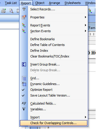
Here is an example of overlapping controls in the Report Editor and the dialog that is shown when you select the 'Check for Overlapping Controls...' menu item:
UX Component - 'Touch' Events - Support has been added for 'touch' events. To be more precise, support has been added for 'abstract' events that can be triggered by a touch event (on a touch enabled screen), a mouse (on a desktop browser), or a pointer (on a pointer enabled screen).
The following abstract events have been added:
NOTE: If, by the time the release takes place, the mouse, finger or pointer has moved off the original target position, then the event is not fired.
These events are termed 'abstract events' because unlike the standard HTML events like onClick, onMouseOver, etc., they are not added in the HTML markup. Instead, they are added using Javascript commands.
What's wrong with using the onClick event in a Mobile Application?
When you use the onClick event in a Mobile application, the browser waits 200ms before responding to the event because it is not yet sure if the event is a click, or the start of some other gesture. This can make your application feel 'sticky'. Therefore, you will want to use touch events in your application. By using the 'click' event, rather than the 'onClick' event (for example), your application will perform well on both a mobile device and a desktop web browser.
UX Component - Moving Code from One Event To Another - A new utility has been added to make it easy to move code from one event to another. For example, say you have defined some code that gets invoked by the 'onClick' event and you want to move the code to the new 'click' event. Here is how you can do it:
1. Select the control in the tree.
2. Click the Menu button.

3. Select the 'Move Javascript code to Different Event' menu item.
The following dialog will appear. Highlight the source event and the target event, then click the Move button.
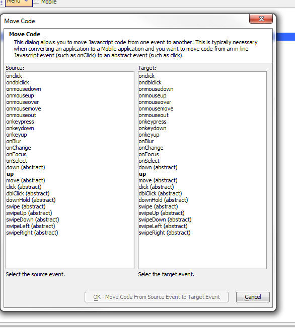
Tabbed UI Component - Integrated Login/Logout Function
The integrated login adds the ability to login and logout of the security system directly from a Tabbed UI component. Links are added to the header section of the component. The login link opens a small dropdown dialog that can be fully customized and animated. There is no need to build a special login component or login page when adding security using a the integrated login / logout in a Tabbed UI.
The controls on a tabbed UI often have security restrictions applied and these controls will be hidden when the tabbed UI page opens with no one logged into the system. The integrated security will then automatically display all controls allowed for the user after login. You can specify a template to use for the message that is displayed in the menu bar after a user logs in. This message typically indicates the name of the logged in user.
The Login action can be specified as 'FullReload' (recommended) or 'AjaxCallback'. Performing an Ajax Callback will be marginally quicker and will result in no screen flicker, but will NOT update any Xbasic code you might be evaluating in the header/footer or home page of the Tabbed UI.
Watch Video - Part 1
Watch Video - Part 2
Watch Video - Part 3
Watch Video - Part 4
Watch Video - Part 5
Customizing the login failure message
The security framework can return several different types of login failure messages. You can customize these messages and translate them into multiple languages. Click on the Show default messages link to add the standard system messages to the customize messages genie.
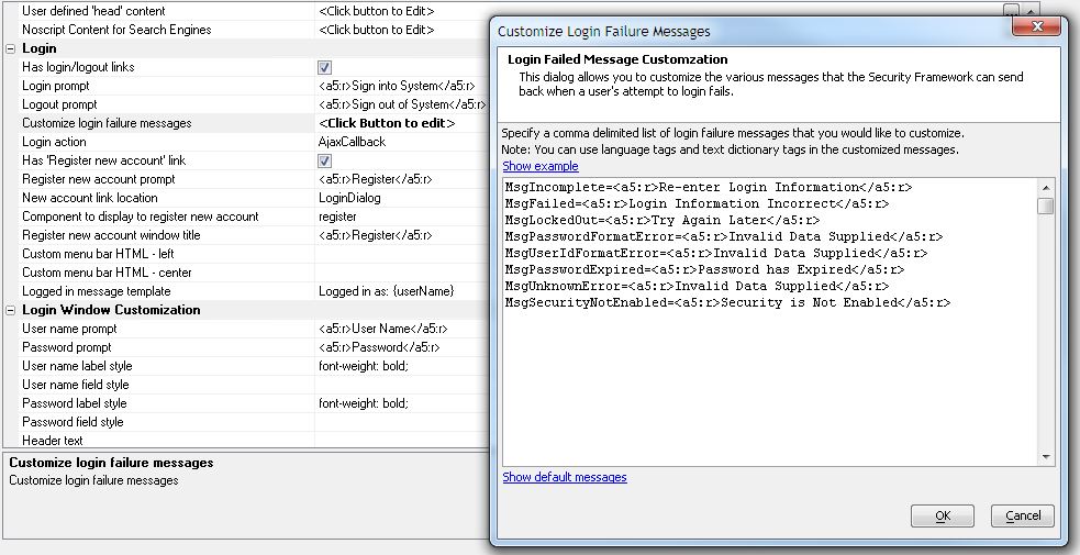
All prompts and text can be customized and can include language tags as shown above.
Register New Account Link
The integrated login includes an option to show a 'Register new account' link. This link can be shown on the menu bar beside the login link, on the actual login dropdown, or both. It is only displayed when no one is logged in. The link will open the component specified in the property 'Component to display to register new account' This component is typically a UX component created from the template named 'Security Framework-CreateNewUserAccount' or 'Security Framework-CreateNewUserAccount_and_AddUserInformationToRelatedTable'. Thse templates will create a basic UX component that can be used to register a new user.
Tabbed UI Component - Allowing User to Change Password
The 'Register new account' link could be renamed and used to open any component. A common component would be a UX component to change the user password. This has been made very easy with a new Action Scripting option 'Change Web Security Password' that has added to the UX Server-side events.
Integrated Login Events
Two server side events have been added for the integrated security.
Tabbed UI Component - Session Timeout Warning
Many applications are dependent on session variables for proper operation or have the security login set to expire when the session expires. This option will show advanced warning to the user to indicate the curent session is about to expire because of inactivity. It can be configured to automatically redirect to the current page or another page when the session expires. This redirect page could be a page to log out the user. This is very useful if the pages show sensitive information and should be closed after a period of inactivity.
The warning dialog will show a button the user can click to extend the session. The messages, window title, and messages can be edited as desired.

A5.executeThisThenThat() Function - Making Ajax Callbacks Run Synchronously - AJAX callbacks are, by definition, asynchronous. That means that if you have two Javascript commands that both do Ajax callbacks, the second command will execute before the first command has completed (i.e. before the first command has received a response from the server) and in fact, the second command might complete before the first command.
The asynchronous nature of Ajax callbacks can cause problem in a Javascript script if you are expecting commands to run synchronously.
The new A5.executeThisThenThat() function makes it extremely easy to make Javascript code run synchronously. For example, consider the following Javascript function that does three consecutive Ajax callbacks and then displays an alert:
function mycode() {
{dialog.object}.ajaxCallback('','','myXbasicFunction1');
{dialog.object}.ajaxCallback('','','myXbasicFunction2');
{dialog.object}.ajaxCallback('','','myXbasicFunction2');
alert('Callbacks are complete');
}
If you were to call this function from a button, the alert would display immediately - long before any of the ajax callbacks had completed, and the callbacks themselves would all fire at more or less the same time.
However, using the A5.executeThisThenThat() function we can easily convert the function to run synchronously. Here is how:
function f1() {
{dialog.object}.ajaxCallback('','','myXbasicFunction1');
}
function f2() {
{dialog.object}.ajaxCallback('','','myXbasicFunction2');
}
function f3() {
alert('Callbacks are complete');
}
function mycode() {
A5.executeThisThenThat(f1,f2,f3);
}
Notice that the code is split into separate functions and then the individual functions are run synchronously by passing them in as arguments to the the A5.runThisThenThat() function.
If one of the individual functions made two or more Ajax callbacks, these callbacks would be asynchronous. For example, if f2() were change to:
function f2() {
{dialog.object}.ajaxCallback('','','myXbasicFunction2');
{dialog.object}.ajaxCallback('','','myXbasicFunction3');
}
Then the code in f2() would run after the code in f1() had completed, but the two callbacks in f2 would be run asynchronously.
The arguments passed into the A5.runThisThenThat() function can either be functions or Javascript code (i.e. strings).
For example:
A5.executeThisThenThat('alert(\'one\');','alert(\'two\');');
IMPORTANT NOTE CONCERNING WORKING PREVIEW - The A5.executeThisThenThat() function is not designed for use in Working Preview.
Action Javascript Editor - Making Actions Run Synchronously - A new checkbox has been added to the Action Javascript editor to allow you to set the actions in your script to be run synchronously.
A big part of V12 is the ability to build Mobile Web Applications. However, there is much more to V12 than this. Even if you have no immediate need for Mobile Applications, you will find a lot for you in V12.
Mobile Application Overview Videos
Simple sample Mobile Application
Introductory concepts - Video 1, Video 2, Video 3
Understanding Panels - Click here for more information on Panels.
The UX Component (formerly the Dialog Component) has been significantly enhanced for building applications for mobile devices. Key to building these types of apps are the new Panel controls that you can place on a UX component.
Click here for more information on Panels.
Pop-up Javascript Windows - Dock Windows - Popup Javascript windows are used extensively when building Web applications. A new option has been added for positioning windows. You can now specify that the window should be 'docked' to an edge of the screen. You can dock the window to the top, bottom, left or right of the screen.
If the browser is displaying a long page (so that the vertical scroll bar is enabled), docked windows will remain in place even when the page is scrolled.
An example of where docked windows might be useful is in a shopping application where the docked window shows the shopping cart and remains on the screen as the user scrolls on the page to add items to the shopping cart.
Another example would be to display instructions that must always be visible as the user scrolls the page.
Pop-up Javascript Windows - Assigning Explicit Name for the Window - When you define a pop-up Javascript window (for example, when you use Action Javascript to open a Grid or UX Component in a window), you can now specify an explicit name for the window. Previously, a default name was assigned to the window.
The advantage of assigning an explicit name is that you can then easily get a pointer to the window object and execute methods of the window object.
//in a Grid component
var wObj = {Grid.Object}.getWindow('{Alias}MYWINDOW');
//Now call a method of the window object
wObj.hide();
//in a Dialog/UX component
var wObj = {Dialog.Object}.getWindow('{Alias}MYWINDOW');
//Now call a method of the window object
wObj.hide();
Dialog Component is Renamed to UX Component - In V12, the Dialog component has been renamed as the UX component. This reflects the fact that the Dialog component is much more than a 'dialog' builder. The entire mobile user experience is built using this component. Hence the name 'UX Builder'.
Map Control - New Event Handlers - The Map Control in the UX Component has two new events in the 'Map Control Javascript' section:
The onInitialize event is particularly useful because if fires after the Google Javascript code for the map has completed running. This means that your Javascript code in this event can safely reference the Google Map object with having to worry whether the map has completed initialization.
All of the event handlers in the 'Map Control Javascript' section can use 'this' to refer to the Google map object. Once you have a pointer to the Google map object, you can apply techniques documented in the vast on-line Google Map documentation.
For example, say you have defined a Map and turned on the 'Map Overview' property and you want to automatically open the 'Map Overview' window when the map is shown. Here is code (from the Google Map documentation) that you can put in the onInitialize event to do this.
this.map.setOptions({overviewMapControlOptions: {
opened: true} });
Javascript Windows - Pre-defined Window Styles - 'Action Sheets' and 'Panel Windows' - When building mobile applications a common pattern is to create 'Action Sheets' and 'Panel Windows'. These types of windows are easily created using the standard Javascript Window object in the Grid and UX component builders. When you are working in the Window builder a genie allows you to quickly configure the window so that it exhibits specialized behaviors.
For example, the screen below shows a simple 'Action Sheet' style Window.
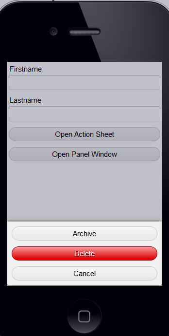
When defining the Window properties in the Action Javascript builder, you can click the 'Pre-defined window styles' button to pick from a list of pre-defined window styles.
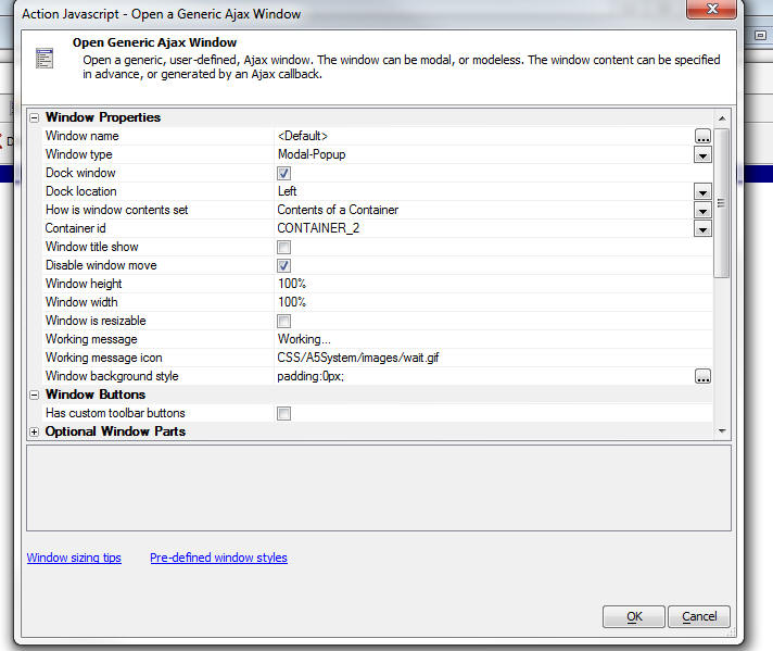
UX Component - Client-side Calculated Fields - Buttons, Hyperlinks and Static Text - You can now define a client-side calculated field expression for buttons, hyperlink and static text controls. This makes it very easy to define dynamic text for a button label.
Chart Control - Text Orientation on Data Point Labels - You can now set the orientation on data point labels.
In the image below the data point labels are shown rotated by 90 degrees. This was achieved by adding the following to the chart CSS:
chart-data {
transform: rotate(-90deg);
}
Alternatively, if you prefer to use the builder, the text orientation property can be set in the builder when you click on the Chart Style smart field in the Chart Builder.
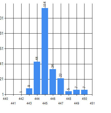
Here is how the Text Style builder for the Chart Styles has been enhanced to allows text rotation properties to be set:
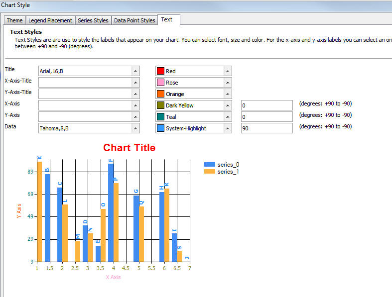
Chart Control - UX Component and Reports - Ability to Control Data Point Colors at the Individual Data Series Level - Now, if a chart plots more than one data series, you can control the colors for data points on the chart at the individual data series level. In the image below, you can see that the chart plots two data series, but each data point (i.e. bar on the chart), has its own color.
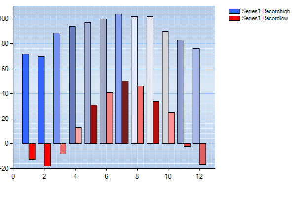
To control data point colors at the individual data series level, it is necessary to manually define the chart CSS. For example, the following snippet from the CSS definition for the above chart shows:
chart-series-1-data-1 {
background-color: #3366ff;
border-style: solid;
border-color: Black;
}
chart-series-1-data-2 {
background-color: #7393f1;
border-style: solid;
border-color: Black;
}
As you can see, styles have been defined here for data point 1 and 2 for series 1. You can define as many styles as you want for data points at the individual data series level.
Watch Video Download Component
Charts - Controlling the Data Interval for the Y Axis - You now have more control over the interval for values plotted on the Y axis. In the example below, the chart on the left has not set an explicit value for the 'Minimum Y Interval', and as a result, the data interval for the Y axis uses a default value computed by the Chart control. In the chart on the right, the 'Minimum Y Interval' has been set to 50.
 |
 |
Grid Component - Images - New options for image fields - For fields in your Grid that contain images, you can now specify these additional properties
Embedding image data into the HTML results in fewer round trips to the server to retrieve the images because all of the data to display the Grid will be in the initial response from the server. This eliminates the effect of seeing images appear on the page incrementally after the initial pages has been shown. (Of course, the downside of this is that the initial HTML payload that must be sent to the browser is larger).
Grid Component - Image Upload - New Record Rows - You can now upload images to the New Record rows. Previously, you could only upload images to existing records. That meant that if you wanted to upload an image to a new record you were creating, you had to first save the new record, then upload the image. Now, this can all be done in a single step.
IMPORTANT: If you are updating an existing Grid to support uploads to the new record rows, you must edit the Grid, then edit the Upload Image action and resave it. This will regenerate the Javascript for the event.
Grid Component - File Upload - New Record Rows - You can now upload files to the New Record rows. Previously you could only upload files to existing rows.
IMPORTANT: If you are updating an existing Grid to support uploads to the new record rows, you must edit the Grid, then edit the Upload File action and resave it. This will regenerate the Javascript for the event.
UX and Grid Component - Auto-Suggest and Edit-Combo Builders - New onItemDraw Event allows you to dynamically modify the style of the data in the list. Watch video Watch video 2
This example shows how you can set the onItemDraw javascript to make alternating row colors in either a edit-combo or auto-suggest control.
if((((indx+1)/2)-Math.round((indx+1)/2)) == 0) ele.style.color = '#aad';;
This example shows how you can highlight the the search string in an auto-suggest control.
var val = $gvs(this._targetId);
ele.innerHTML = ele.innerHTML.replace(RegExp('('+val+')','ig'),'<span style="color:red;">$1</span>');
If the auto-suggest displays multiple columns of data in a template that uses a <table> layout, the problem of highlighting text in each row is more complex.
The HTML template must be modified to place the placeholder for the field you are searching in in a <span> tag.
For example:
<span id="as.{*row}">{LASTNAME}</span>
The onItemDraw Javascript code would then become
var val = $gvs(this._targetId);
var ele2 = $('as.'+indx);
ele2.innerHTML = ele2.innerHTML.replace(RegExp('('+val+')','ig'),'<span style="color:red;">$1</span>');
UX Component - Data Bound Images - Previously,
in a UX Component (formerly called 'Dialog' component)
that was bound to a table, you could not bind image
fields to images in the table. This is now possible.
There are several important options available to you
when you bind an image field to a table. You can specify
that the image data should be embedded directly in the
HTML (as a base64 encoded value), and you can scale
images on the server before rendering the HTML.
By embedding the image directly in the HTML, you reduce the number of server round trips needed to display a record (since no call to the server will be needed to retrieve the image), at the cost of a larger initial payload (amount of data that is sent to the browser when navigating to a new record).
You can also specify an image to show if a particular record does not have any data in an image field.
Images in Repeating Sections can also be data bound. Watch Video
UX Component - Image Upload Action - The UX component now supports Image Upload. You can upload to an Image control on the component that is, or is not, data bound.
If you upload to a 'data bound' image, then when you submit the UX component, the image field in the table is updated.
If you upload to a 'non-data-bound' image control, then when you submit the UX component, your event handler can choose what to do with the uploaded image.
Watch Video - Part1 Watch Video - Part 2
In the case where you upload an image to a non-data bound image control, in your afterDialogValidate event, you will need code similar to this.
(Assume that the name of the Image control to which you upload is called 'MYIMAGE')
dim blobKey as c
'Every image control has an associated control with a '_hiddena5fn' name.
'After the image has been uploaded, it is stored in temporary session storage
'The 'key' for the data in session storage is stored in this hidden field.
blobKey = e.dataSubmitted.myimage_hiddena5fn
blobKey = word(blobKey,1,":")
dim blobUploaded as b
Session.GetDataFromFile(blobUploaded,blobKey)
Session.DeleteSessionFile(blobKey)
'You now have the uploaded image data in a variable
called 'blobUploaded'
'Your event handler can process this data.
You can also upload images to image controls in Repeating Sections. Watch Video
UX Component - File Upload Action - The UX Component now supports File Upload.
In order to add an event handler that performs a file upload action, you must add a special [File Upload/Download] control to the UX component.
The [File Upload/Download] control is in the Other Controls section of the Toolbox.
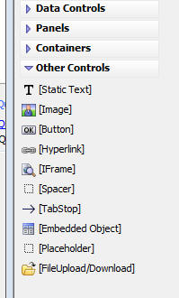
Once you have added the [File Upload/Download] control, you can then use Action Javascript to define a File Upload Action.
The [File Upload/Download] control can be data bound (just like any other control).
However, it is not required that the [File Upload/Download] control be data bound. If the control is not data bound, then then it is your responsibility to decide what to do with the uploaded binary data when the UX Component is submitted.
If the [File Upload/Download] control is data bound, it can be bound to either a character field or a binary field. When the UX Component is submitted, the uploaded data will be saved into the corresponding bound field (assuming you have added a Save Record Server-side event handler to the AfterValidate event).
If the [File Upload/Download] control is bound to a binary field, the binary contents of the uploaded file will be saved in the bound field.
If the [File Upload/Download] control is bound to a character field, the filename of the uploaded file will be stored in the character field, and the uploaded file itself will be stored in the folder that you specified when you defined the File Upload Action. (Actually, the transformed filename, as specified by the 'Stored filename transformation expression' will be stored in the bound field).
In the case where the [File Upload/Download] control is not data bound, your AfterValidate event handler can retrieve the binary data that was uploaded as follows (assuming that the Id of the [File Upload/Download] control is 'FILEUPLOAD_1'):
dim blobKey as c
'Every [File Upload/Download] control has an associated control with
'a '_A5FILEUPLOAD' name.
'After the file has been uploaded, it is stored in temporary session storage
'The 'key' for the data in session storage is stored in this hidden field.
blobKey = e.dataSubmitted.FILEUPLOAD_1__A5FILEUPLOAD
blobKey = word(blobKey,1,":")
dim blobUploaded as b
Session.GetDataFromFile(blobUploaded,blobKey)
Session.DeleteSessionFile(blobKey)
'You now have the uploaded file data in a variable
called 'blobUploaded'
'Your event handler can process this data.
UX Component - File Upload User Defined Action - The UX Component now supports the 'File Upload User Defined' action in Action Javascript. This action allows you to upload multiple files at once. Once the files have been uploaded, an Xbasic event handler that you define can process the uploaded data.
TIP: To see what information is available to you in the 'e' object that is passed into your Xbasic event handler, put an
debug(1)
statement in your Xbasic function, and then run the component in Live Preview.
UX Component - File Download Action - The UX Component now supports File Download.
In order to add an event handler that performs a file download action for an embedded object (i.e. a file that is stored in a binary field in a table), you must add a special [File Upload/Download] control to the UX component.
The [File Upload/Download] control is in the Other Controls section of the Toolbox.
UX Component - Clone Record - .newRecord() Method - New options have been added to the {dialog.object}.newRecord() method that allow you to create a new record that is a clone of an existing record. The following use case describes how this option is useful.
Assume you have a UX component that is used to enter new records into a Contacts table. You are entering a number of new records that all have the same value in many of the fields. After you save the first record, you click a button to make a new record that is a clone of the record you just entered. You make changes to the fields that are different, and leave the fields that are the same unchanged. You then click the Submit button to save the record.
The syntax for the .newRecord() method is:
{dialog.object}.newRecord({cloneExisting: flagClone, fieldsToNotCopy: ignoreList});
Where flagClone is true or false, and ignoreList is a Javascript array of objects on the component whose value you do NOT want to clone (for example, if you were cloning an invoice, you would typically not clone the invoice number).
The JSON object passed into the .newRecord() method is optional.
UX Component - Save Data In Repository - When you are filling in a form in a UX component, you might want to persist the data from time to time (much like when you are composing an e-mail in Gmail, your work is automatically saved periodically). A new method of the UX component allows you to save the data that the user has entered in the Repository.
(The Repository is a special database that is used to store any information that you want. The Repository is configured in your Web Project Properties - accessible from the Web Control Panel).
To save the data that has been entered in the UX component, you call the .saveDataInRepository() method, and supply an arbitrary 'key' value.
The actual data stored in the Repository is the Javascript necessary to repopulate the UX component.
For example, the following code in the onClick event for a button will save the data in the Repository, using 'mykey' as the key value:
{dialog.object}.saveDataInRepository('mykey');
The 'afterSaveToRepository' client-side event fires after the event has completed.
UX Component - Load Data From Repository - Populate the controls in a UX component with data that was previously saved in the Repository.
A button on the UX component might load data from the Repository. For example, assume that data had previously been saved to the Repository with a key value of 'mykey'. This code in the button's onClick event will populate the UX component with the saved data:
{dialog.object}.loadDataFromRepository('mykey');
You can pass in an optional second argument to indicate if the data in the Repository should be deleted after it has been read. The default value is false, which does not delete the data.
The 'afterLoadFromRepository' client-side event fires after the event has completed.
Web Components - Text Dictionary - Previously, language tags were used to internationalize a component (e.g. Grid, UX, TabbedUI, etc). For example, by setting a control label to:
<a5:r>Label1</a5:r>
you could look up the string replacement for Label1 from a "Language Definition" that was stored as part of the component.
Language tags are still supported, but now, a new type of tag is available, the 'Text Dictionary' tag can be used to lookup up the tag definition in a SQL table - the 'Text Dictionary Table'. This makes it much easier to internationalize your application.
Text dictionary tags are defined using:
<a5:t> .... </a5:/t>
Watch Video - Part 1
Watch Video - Part 2
Editing text dictionary entries:
Text dictionary tags are not limited in their use to
internationalizing applications. They can be extremely
useful for displaying dynamic content in an application.
The content shown in the application is retrieved at
run-time by querying the SQL Text Dictionary database.
To start using text dictionary tags in your components, you must first configure your Text Dictionary (i.e. tell your application what connection string and table to use for the Text Dictionary). To configure the Text Dictionary, click on the Project Properties button when the Web Control Panel has focus.
In the dialog you will see a section labeled 'Text Dictionary'. Specify the name of the connection string and the table. If you don't currently have a table, you can click the hyperlink to have Alpha Five create the table for you.
If you have an existing table that you would like to use you can map the fields in your table to the required fields in the Text Dictionary.
The Text Dictionary Table has these fields
'key' is the value of the tag. So, or example, if your component contains this text, the 'key' is 'string1':
<a5:t>string1</a5:t>
For each 'key', you can define data for multiple languages. The 'language' field contains the language name.
The 'data' field contains the text to use for a particular 'key' when a particular 'language' is active.
If you have not defined a record for a particular language, the default value will be used.
Once you have defined and populated the Text Dictionary, you can start using text dictionary tags in your component.
The component builders have a Text Dictionary Tags property with a corresponding smart field:

When you click the smart field, this dialog is opened. It shows:
For example, in the image below, we see that for 'string1', definitions exist for the default language, Greek, and Japanese. We also see that in the component, we defined as string that used a Text Dictionary tag with a key of 'xxxx', but that this item has not yet been added to the Text Dictionary (indicated by the red icon).

Using Text Dictionary Tags in .A5W Pages
When you create a standard .a5w page, you might want to use text dictionary tags in your pages. This can easily be done if you make a change to how your .a5w page is constructed.
Note: The comments here do not apply to using Text Dictionary tags in components. In components, you do not have to anything special to use text dictionary tags.
The Alpha Anywhere Application Server will not process text dictionary tags. Therefore, you must invoke the special Xbasic function that resolves language tags yourself. The Xbasic function that resolves language tags is:
c resolvedText = A5GridHelper_textDictionaryResolver(c textToResolve, c language)
You therefore need to construct your page so that the entire page is just a string that is then emitted.
Here is an example of how an .a5w page can be changed so that it is a string that is emitted:
<%a5
'Define the page as an Xbasic string variable.
dim html as c
html = <<%html%
Define your entire html page here as an xbasic string.
%html%
'Resolve Text Dictionary tags in the string.
html = a5GridHelper_textDictionaryResolver (html,"french")
'Emit the string to the browser
?html
%>
For example:
<%a5
dim html as c
html = <<%html%
<!DOCTYPE html>
<html>
<head>
<meta HTTP-EQUIV="MSThemeCompatible"
content="Yes" />
<meta http-equiv="X-UA-Compatible"
content="IE=edge" />
<meta http-equiv="Content-Type"
content="text/html; charset=UTF-8" />
</head>
<body>
<p>This is the body of my page.</p>
<p>I am going to use a text
dictionary tag now.</p>
<p><a5:t>string1</a5:t></p>
</body>
</html>
%html%
html = a5GridHelper_textDictionaryResolver (html,"french")
?html
%>
UX Component - Delete Record - New .deleteRecord() Method - When a UX component has been bound to a table (or multiple tables), you can now call the .deleteRecord() method to delete the current record from the table to which the UX component is bound.
In the case where the UX component is bound to multiple tables, the current record in the 'primary' table is deleted.
For example, assume that your UX component is bound to these tables (where the ===> indicates a one-to-many relationship):
Invoice--->Customer
===>Items -----> Products
The data from the Items and Products table are shown in a Repeating Section.
When you delete a record in the above example, the current record in the Invoice table is deleted, since the Invoice table is the 'primary' table. No records in any of the linked, child tables, are deleted.
The .deleteRecord() method takes an optional JSON object:
{dialog.object}.deleteRecord({nextRecordToShow
:'newrecord', confirmation: true});
If 'nextRecordToShow' is 'newrecord', then after the record is deleted, instead of focus moving to the next record in the primary key list, focus will go the new record. If you leave this option out completely, or set 'nextRecordToShow' to any value other than 'newrecord', focus will go to the next record.
The 'confirmation' property controls whether the confirmation dialog is shown or not.
The text in the confirmation dialog can be customized in the UX Properties, Customization section.
The 'Delete Record' button can be placed on the UX component by selecting it from the list of pre-defined control in the 'Defined Controls' section of the UX Builder.
IMPORTANT: The .deleteRecord() Method can only
be used if you have loaded Primary Keys for the
'primary' table to which the UX component is bound. You
can load primary keys using the 'Get Primary Keys for
Parent Table' server-side action in the
onDialogInitialize event, or in an Ajax callback, using
the 'Get Primary Key values for Records in a Query'
action in Action Javascript.
Report Server - Full Version of Alpha Anywhere - The Report Server is a feature for the 'Stand Alone
Application Server'. If you are working in the full version of Alpha Anywhere (where
you build your application) and are testing your application using the
Application Server that is part of the Full Version, the Report Server is not enabled.
However, if you install the stand alone Application Server in the same folder as
your full version, you will be able to use the Report Server in the development
environment.
Technical Note: The Report Server code is in the A5ApplicationServer.exe file, so this file must be present in the full version folder.
Report Server - The Report server boosts the throughput of Reports in a Web Application by offloading the processing of reports to a separate process running on unused cores of your machine.
NOTE: The Report Server can only be used if your Application Server is running on a multi-core processor.
The Report Server is separately licensed and can be licensed for 4 core, 8 cores, or max cores on your machine. An Alpha Anywhere subscription comes with a 4 core license. You must enter you Report Server license by going to the Tools, Feature Packs menu when the Web Control Panel is active.
Without the Report Server, when a user requests a report that takes a long time to print, other users of the application must wait until the report has completed.
With the Report Server, other users do not have to wait until the report has completed before their requests are serviced.
Watch the video for a graphic demonstration of the benefits of the Report Server.
The following sample A5W page can be used to report on what the Report Server is doing:
<%a5
dim rs as reportserver::ReportServer
if rs.ClientRequestAllowed() then
? "Report Server Is Running<br>"+crlf()
dim reportJobsPending as c = rs.ListQueue("$(i)|||$(r)"+crlf())
if reportJobsPending <> "" then
? "Reports Currently Being
Printed"+crlf()
reportJobsPending =
strtran(reportJobsPending,"|||","</td><td>")
reportJobsPending = *for_each(x,"<tr><td>"+x+"</td></tr>",reportJobsPending)
? "<table border=\"1\" cellspacing=\"1\"
cellpadding=\"3\" >"+crlf()
? "<tr><th>Report Job id</th><th>Report
name</th></tr>"+crlf()
? reportJobsPending
? "</table>"+crlf()
else
? "No Reports are currently being
printed by the server<br>"+crlf()
end if
dim
reportServerTable as c = rs.ServersAvailable("$(n)|$(g)|$(c)"+crlf())
reportServerTable = strtran(reportServerTable,"|","</td><td>")
reportServerTable = *for_each(x,"<tr><td>"+x+"</td></tr>",reportServerTable)
? "<table border=\"1\" cellspacing=\"1\" cellpadding=\"3\"
>"+crlf()
? "<tr><th>Server</th><th>Reports Generated</th><th>Reports
Canceled</th></tr>"+crlf()
? reportServerTable
? "</table>"+crlf()
else
? "Report Server Is NOT Running<br>"+crlf()
end if
%>
This page shows how many instances of the Report Server are running, how many reports each instance has handled, and how many reports each Report Server instance is currently printing.
For example, the screen blow shows a Tabbed UI with 3 buttons that execute very long running reports.
The first button, runs the sample page shown above.
When the first button is clicked to show that Report Server Information, we see that there are 3 instances of the Report Server (because a multi-core version of the Report Server has been licensed), but that currently all instances are idle (because no reports have been requested). However, we see that previously instance 1 has handled 7 reports, while instance 2 and 3 have each handled 1 report each.
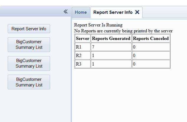
In this next image, the user has clicked on each of the three 'BigCustomerSummary List' buttons. This has sent back three separate requests to the server to print long running reports.
Now, if the Report Server Info button is clicked we see that the Report Server is running and that all three Report Server instances are processing reports.
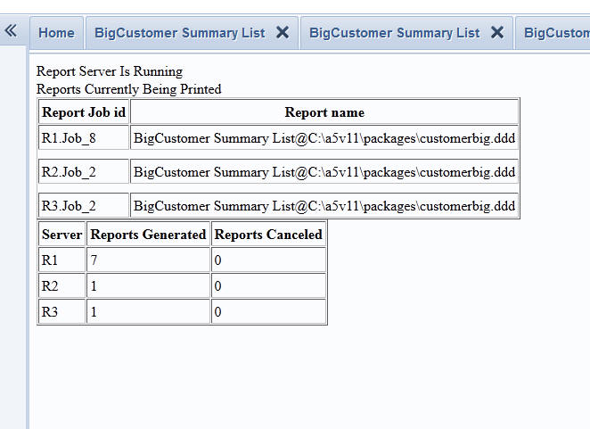
Now, a short while later if we refresh the Report Server info page, we see that all reports have now been completed. There are no reports being printed and that each Report Server instance has handled 1 additional report.
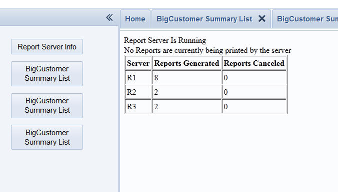
Running a Component or Report in a User Defined Ajax Callback or in a <%a5..%> Code Block
Action Scripting has always provided powerful techniques for displaying a Component in a pop-up window, or a div. In addition, the UX component allows you to embed Components and Reports directly in the UX component.
While these existing techniques are extremely powerful, it is difficult to add certain types of customization logic.
For example, your UX component might have a button that opens 'Grid1'. It has not been easy to make a button that opens 'Grid1' under one condition, and 'Grid2' under a different condition.
Also, if you put a free form region in a Grid, it has not easy to embed a Component into that free form region.
Three powerful new Xbasic functions have been added to allows you to run Components and Reports under full Xbasic control.
These functions are:
Note: The a5_xb_runReport() function cannot be used in a <%a5...%> code block if the initial view of the report has been set to 'HTML'.
Watch videos: Video 1, Video 2, Video 3
For example, assume you have a Grid with a free-form edit region below the Grid. You would like to display a Grid in this free-form region.
Here is the html (with included Xbasic codeblock) that you might use:
<b>An embedded Grid will be shown here.</b>
<%a5
delete p
dim p as p
p.gridName = "MyGrid"
p.alias = "MYGRID1"
p.thisComponentAlias = "{grid.componentname}"
dim xb as c
xb = a5_XB_RunGridComponent(p)
?xb
%>
NOTE: Because 'p.div' property was not specified in the above example, the Grid is emitted 'in-line'. Had p.div been specified, the Grid would have been shown in the div specified by p.div.
In the above example, you might ask how is this different from defining a Linked Content Section for the Grid? There are two subtle differences.
In this next example, we show how the a5_xb_runGridComponent() could be used in a user defined Ajax callback. Assume that you have a button on a component (UX or Grid) that does a user-defined Ajax callback. The Ajax callback is defined to call an Xbasic function called (say) 'xbRunGrid'. Here is how the 'xbRunGrid' function could be defined:
function xbRunGrid as c (e as p)
delete p
dim p as p
p.gridName = "Grid_SalesPeople"
p.alias = "SALESPEOPLE1"
p.thisComponentAlias = "{dialog.componentname}"
p.div = "grid1"
p.override = <<%txtsettings%
rows = 2
%txtsettings%
dim xb as c
xb = a5_XB_RunGridComponent(p)
xbRunGrid = xb
end function
Notice that in this example, we have specified the p.div property as 'grid1'. This means that when the Ajax callback completes, the Grid will be rendered inside the the DIV with an id of 'grid1'.
Also notice that in this example, we have specified the 'p.override' property to override settings in the Grid when it is rendered. We have changed the number of rows to 5.
Using Action Scripting to define a button that does an Ajax callback to show a Grid in a div has always been easy, so you might ask, how is the technique described above different from simply using Action Scripting. On the surface, there is little difference. The results are the same. But the technique described above is more flexible because you can use Xbasic code to make conditional settings. For example, assume that the UX component has a dropdown control called 'GridName'. When the Ajax callback occurs the value in the 'GridName' control will be submitted. The code in the Xbasic function that handles the callback could be modified as follows:
function xbRunGrid as c (e as p)
dim gridName as c
gridName =
e.dataSubmitted.gridName
delete p
dim p as p
p.gridName = gridName
p.alias = "MYGRIDALIAS1"
p.thisComponentAlias = "{dialog.componentname}"
p.div = "grid1"
p.override = <<%txtsettings%
rows = 2
%txtsettings%
dim xb as c
xb = a5_XB_RunGridComponent(p)
xbRunGrid = xb
end function
A5_xb_runGridComponent() Function - Generates the HTML and Javascript for a Grid component.
See the section 'Running a Component or Report in a User Defined Ajax Callback or in a <%a5..%> Code Block' for a general discussion of this function.
Watch videos: Video 1, Video 2, Video 3
Syntax
c output = A5_xb_runGridComponent(p inputProps)
The inputProps dot variable defines the Grid to run and various properties of the Grid.
| inputProps.gridName | Name of the Grid component to run |
| inputProps.alias | Alias for the Grid component. This must be a unique value. No spaces. Try to keep alias as short as possible. |
| inputProps.thisComponentAlias | (Optional) The alias of the parent component. If the parent is a Grid, you can typically set to '{grid.componentName}'. If the parent is a UX, set to '{dialog.componentName}'. If this property is not set the {grid.object}.getParentObject() method (called from this Grid) will fail. |
| inputProps.div | (Optional when function is called from an A5 codeblock). The ID of the div where the Grid component should be rendered. If the a5_xb_runGridComponent() function is in an <%a5..%> codeblock and you omit this property, the Grid is shown inline. |
| inputProps.userFilter |
(Optional) A filter to apply to the Grid. The
filter must use either SQL or DBF syntax,
depending on the data source for the Grid. The
filter can use literal values of arguments.
Arguments are recommended. A user filter can be removed when the user clicks the Clear Search button in the Search Part. Contrast this with the Base Filter, which cannot be removed by the user. When the user searches in the Grid, the user filters are in addition to the base filter. A filter using literal values: STATE = 'MA' A filter using arguments: STATE = :whatState If the filter uses arguments, you can set the argument values in the arguments property. |
| inputProps.userOrder |
(Optional) An order expression to apply to the
Grid. The order must use either SQL or DBF
syntax, depending on the data source for the
Grid. For example: SQL Syntax: LASTNAME, SALARY DESC DBF Syntax: LASTNAME +invert(SALARY) |
| inputProps.baseFilter | (Optional) Applies a base filter to the Grid. A base filter cannot be removed by the user. See userFilter above for additional comments. |
| inputProps.arguments |
(Optional) Needs to be specified if the
userFilter or baseFilter properties
use arguments. You can specify the values of as many arguments as you want. The argument values are specified in a CR-LF delimited string. Each line in the string defines the value of a single argument. The syntax for each line is: ArgumentName|Data Type|Value For example, the following string defines the value of three arguments: inputProps.arguments = <<%txt% name|character|Smith amountDue|numeric|1000 dateOfBirth|time|1/1/1972 %txt%
|
| inputProps.linkDefinition |
(Optional) Allows you to specify that the Grid
is 'linked'. Linking a Grid is similar to
filtering it. However, when a Grid is linked and
new records are added, the linking fields in the
new record are automatically set to the linking
values. The syntax for specifying the link definition is a CRLF delimited list of linking fields and their corresponding values. Each line in the string has this format: LinkingField(type:value) For example, say you wanted to link on the firstname and lastname fields with corresponding values of 'Cathy' and 'Hite', you would use this definition: inputProps.linkDefinition = <<%txt% firstname(c:Cathy) lastname(c:Hite) %txt% |
| inputProps.override | (Optional) A CRLF delimited string that allows you to override settings in the component. This string can be used to override many properties in the component. It is typically used to set the style of the component to match the style of the parent component. |
Examples:
In the following example the a5_xb_runGridComponent() function is run in a <%a5..%> codeblock:
<b>An embedded Grid will be shown here.</b>
<%a5
delete p
dim p as p
p.gridName = "MyGrid"
p.alias = "MYGRID1"
p.thisComponentAlias = "{grid.componentname}"
dim xb as c
xb = a5_XB_RunGridComponent(p)
?xb
%>
The above example can be modified to ensure that the target Grid component uses the same style as the parent component by setting the p.override property. For example:
p.override = "style_name = \"{grid.style}\""
In the following example the a5_xb_runGridComponent() function is run in an Xbasic function that handles an Ajax callback:
function xbRunGrid as c (e as p)
delete p
dim p as p
p.gridName = "Grid_SalesPeople"
p.alias = "SALESPEOPLE1"
p.thisComponentAlias = "{dialog.componentname}"
p.div = "grid1"
p.override = <<%txtsettings%
rows = 2
%txtsettings%
p.override =
p.override + crlf() + "style_name = \"{grid.style}\""
dim xb as c
xb = a5_XB_RunGridComponent(p)
xbRunGrid = xb
end function
A5_xb_runGenericComponent() Function - Generates the HTML and Javascript for a UX, PageLayout or Custom component.
See the section 'Running a Component or Report in a User Defined Ajax Callback or in a <%a5..%> Code Block' for a general discussion of this function.
Syntax
c output = A5_xb_runGenericComponent(p inputProps)
The inputProps dot variable defines the Component to run and various properties of the Component.
| inputProps.componentName | Name of the UX, PageLayout or Custom component to run. |
| inputProps.alias | Alias for the component |
| inptutProps.settings.__parentComponentAlias | (Optional) The alias of the parent component. If the parent is a Grid, you can typically set to '{grid.componentName}'. If the parent is a UX, set to '{dialog.componentName}'. If this property is not set the {dialog.object}.getParentObject() method (called from this UX) will fail. |
| inputProps.settings.__argumentValues |
If the component has any arguments, set the
value of the arguments. The property is a CRLF
delimited string. The syntax for each line in
the string is: argumentName=argumentValue For example: inputProps.__argumentValues = <<%str% arg1=John arg2=Smith %str% |
| inputProps.settings.__overrideSettings | (Optional) A CRLF delimited string that allows you to override settings in the component. This string can be used to override many properties in the component. It is typically used to set the style of the component to match the style of the parent component. |
| inputProps.div | (Optional when function is called from an A5 codeblock). The ID of the div where the component should be rendered. If the a5_xb_runGenericComponent() function is in an <%a5..%> codeblock and you omit this property, the component is shown inline. |
| inputProps.panelRootId | (Optional) If the target component is a UX component that uses Panels, you can specify the ID of a element into which the Panels are inserted. If this property is not specified, the Panels are inserted in the BODY tag. If you want the Panels to be inside an element (such as another Panel Card, or a Window), you should set this property to the ID of the container (e.g. Window or Panel Card). |
| Specific to the UX Component | |
| inputProps.settings.__populateDialog | (Optional) If the UX component that you are loading has been bound to database tables, then you can populate the controls in the UX with data. Set this property to .T. if you want to populate the controls. If this property is .T., then you must set the inputProps.settings.__PKValue property. |
| inputProps.settings.__PKValue | The primary key value of the record you want to retrieve to populate the UX component with. If the primary key is multi-column, specify the key as a single value with each segment delimited with 3 pipes. For example: john|||smith. |
Examples:
In the following example the a5_xb_runGenericComponent() function is run in a <%a5..%> codeblock.
The example runs two UX components. The first UX component ('Mysql_customer_embedded') has been bound to a table and the UX is populated with data from that table, showing the data from the record with a primary key value of '10'.
The second UX component ('UX_arguments') has two arguments, 'arg1' and 'arg2'. The values for these arguments is defined by setting the the settings.__argumentValues property.
<p>This is a free-form HTML container
with an a5 codeblock.</p>
<%a5
dim p as p
p.componentName = "Mysql_customer_embedded"
p.alias = "MYDLG"
p.settings.__populateDialog = .t.
p.settings.__PKValue = 10
dim xb as c
xb = a5_XB_RunGenericComponent(p)
?xb
%>
<p>This is another UX component....</p>
<%a5
dim p2 as p
p2.componentName = "UX_arguments"
p2.alias = "MYDLG2"
p2.settings.__parentComponentAlias = "{dialog.componentname}"
p2.settings.__argumentValues = <<%str%
arg1=John
arg2=Smith
%str%
p2.settings.__overrideSettings = "style_name = " +
s_quote("{dialog.style}")
dim xb2 as c
xb2 = a5_XB_RunGenericComponent(p2)
?xb2
%>
A5_xb_runReport() Function - Generates the HTML and Javascript to display a report.
See the section 'Running a Component or Report in a User Defined Ajax Callback or in a <%a5..%> Code Block' for a general discussion of this function.
Syntax
c output = A5_xb_runReport(p inputProps)
The inputProps dot variable defines the Report to run and various properties of the Report.
| inputProps.reportName |
The fully qualified report, label or letter
name. For example: Report1@myworkspace.alb |
| inputProps.initialView | Can either be 'HTML' or 'PDF'. Specify if you want to see a PDF or HTML view of the report. HTML is recommended as it is substantially faster. If the user wants a PDF version of the report, they can click the 'PDF' button on the report toolbar. |
| inputProps.filter |
Report filter. In the case of a report based on
.dbf tables, filter can use Xbasic functions.
The .filter can use arguments. For
example: country = :whatcountry In the case of a report based on SQL data, it is recommended that you use the .sqlFilter property rather than the .filter property. If you do specify a .filter property for a SQL report, Alpha Five will try to convert the .filter to a SQL filter. If the filter cannot be converted, the filter will be applied to the data after it has been loaded into a temporary .dbf table from the SQL database. |
| inputProps.order |
Order for the report. In the case of a report based on SQL data, it is recommended that you use the .sqlOrder property rather than the .order property. |
| inputProps.sqlFilter |
WHERE clause for a report based on SQL data. The
sqlFilter can use arguments. For example: country = :whatcountry It is recommended that you use arguments in the filter rather than literal values. The argument values can be passed in in the .arguments property. (See below) |
| inputProps.sqlOrder | Order clause for a report based on SQL data. |
| inputProps.arguments |
Argument values must be supplied if the report
filter uses arguments. A CR-LF delimited string indicating each argument, its type and value. For example: inputProps.arguments = <<%str% arg1|c|John arg2|n|23 arg3|d|12/18/1952 %str% |
| inputProps.componentAlias | Alias of the component. Only needed if the report initial view is HTML. |
| inputProps.reportDiv | The name of the DIV where the report will be shown. |
| inputProps.width | Width of the report |
| inputProps.height | Height of the report |
| inputProps.styleName | Only needed for HTML reports. Specify the style name (e.g. iOs, etc) for the style of the HTML controls in the HTML Report Viewer. |
| inputProps.pdfOptions | (Optional). In the case where the initial view is PDF, a crlf delimited list of PDF options. |
| Controlling Buttons on the HTML Report Toolbar | By default, all of the buttons on the HTML Report View toolbar are turned on. These buttons are: Export as PDF, Export as Excel, Export as Word, Export as Text and Print HTML. You can optionally control whether a button is shown and you can control properties of each button (such as text, icon, style and bubble help) |
|
inputProps.buttons.pdf inputProps.buttons.excel inputProps.buttons.word inputProps.buttons.text inputProps.buttons.printHTML |
(Applies only when initialView is HTML) Set to .t. or .f. to control whether or not the button appears on the Toolbar. If you omit the property, the default is .t. |
| inputProps.buttons.<buttonType>.text |
<buttonType> must be: pdfButton,
excelButton, wordButton, textButton, or
printHTMLButton, depending on what type of
button you are configuring. Allows you to
specify the text label for the button. For
example,
inputProps.buttons.pdfButton.text = "PDF" |
|
inputProps.buttons.<buttonType>.buttonType |
Allows you to specify the button style. Options are: Text only, Image only, Text followed by Image, Image followed by text, Image above text, Text above image. |
| inputProps.buttons.<buttonType>.imageName |
Allows you to specify the image for the button
(if the image is configured to show an image).
If using a built in image, use this syntax: "images/$$application.adobe.pdf.png.a5image" |
| inputProps.buttons.<buttonType>.bubbleHelp | Allows you to specify the bubble help for the button. |
In this (somewhat contrived) example we show how you can create a UX component that allows a user to select a report and then click a button to print the report.
Assume that the UX component has these controls:
In this example, the button will make an Ajax callback to a function (called say 'printReportXB'). Here is how the printReportXB function would be defined.
function printReportXB as c (e as p)
delete p
'the p object we are going to define now is passed into
'a5_xb_runReport() to define the report we want to print
dim p as p
dim report as c
'the name of the report that the user selected is in the
'e.datasubmitted.whatreport variable
report = e.datasubmitted.whatreport
'convert the short report name to a
fully qualified report name
if report = "customer" then
p.reportName = "CustomerReport@MyAppWorkspace.alb"
p.SQLFilter = "State = :whatstate "
'set the value of the arguments property to define any arguments used
' in the filter
p.arguments = "whatState|c|"
+ e.datasubmitted.stateName
else
p.reportName = "Invoice@MyAppWorkspace.alb"
p.sqlfilter = "invoice = :whatInvoice"
'set the value of the arguments property to define any arguments used
' in the filter
p.arguments = "whatInvoice|n|"
+ e.datasubmitted.invoiceNumber
end if
'set the initial report view to HTML. Can also set to PDF
p.initialView = "html"
'since we are using HTML reporting we specify the alias of the host component
p.componentAlias = e.tmpl.alias
'the id of the div where the report
will be shown
p.reportdiv = "rep1"
'the size of the report
p.width = "12in"
p.height = "4in"
'the style to use for the HTML Report Viewer. We want the style to match the
'style of the host component, so we
pass in the style name used by the UX component
p.styleName = e.tmpl.style_name
'Turn off the 'Export to Text' button
on the Report Toolbar
P.buttons.text = .f.
'Set the bubble help for the 'Print HTML' button to some text that uses
'language tags
P.buttons.printHTMLButton.bubbleHelp = "<a5:r>Print</a5:r>"
dim js as c
'Passing in tmpl and rtc is optional. however, if you
don't then language tags
'in the buttons will not be evaluated.
'In this case, we used a language tag
in the bubble help for one of the buttons
js = a5_xb_runReport(p, e.tmpl, e.rtc)
printReportXB = js
end function
| UX Component | Edit-combo and Auto-suggest | Edit-Combo and Auto-Suggest controls now expose a new
method to allow you to call Javascript to dynamically
style the data shown in the list.
Watch video
Watch video 2 Note: Also applies to the Grid component. |
| UX Component | Very Basic Programming Concepts - The 'Hello World' Example |
Many books that teach programming languages
start with the ubiquitous 'Hello World' example
in which they teach you how to put some text on
the screen. In this video we show you how you
can write text to a label control on the UX
component. The example is very simple, and you
can think of it as the 'Hello World' example of
the UX component. The video then goes a little further and shows how data can be read from a List control to compose the message that is put in the label. Watch Video - Part 1 Watch Video - Part 2 |
| UX Component | Tutorial Explaining Panel Layouts, Panel Navigators and Panel Cards |
'Panels' are the essential building blocks for
mobile applications. The UX Component builder
allows you to add three types of Panels to your
components - Panel Layouts, Panel Navigators and
Panel Cards. This video is a tutorial explaining the concepts behind these new UX component controls. Watch Video - Part 1 Watch Video - Part 2 Watch Video - Part 3 Watch Video - Part 4 Watch Video - Part 5 |
| UX Component | Chart Control | Charts - You can now control data point colors at the individual data series
level. For example, if a chart plots more than one data series, you can define
data point colors for each data series in the chart. Watch Video Read Transcript Download Component Note: Also applies to Reports |
| UX Component | Pop-up Javascript Windows | Pop-up Javascript Windows - You can now specify that pop-up Javascript windows
should be docked to a side of the screen. Docked windows remain visible even
when the page is scrolled. An example of where docked windows might be useful is in a shopping application where the docked window shows the shopping cart and remains on the screen as the user scrolls on the page to add items to the shopping cart. Another example would be to display instructions that must always be visible as the user scrolls the page. Note: Also applies to the Grid component. Watch video Read Transcript |
| UX Component | Mobile Window Styles - Action Sheets and Panel Windows | UX Component - Specialized Window Styles for Mobile Applications - When building
mobile applications a common pattern is to create 'Action Sheets' and 'Panel
Windows'. These types of windows are easily created using the standard
Javascript Window object in the Grid and UX component builders. When you are
working in the Window builder a genie allows you to quickly configure the window
so that it exhibits specialized behaviors. Watch Video Read Transcript |
| Grid Component | Image Upload |
The Image Upload action in Action Javascript now
allows you to upload images to the New Record
row. Previously, you could only upload images to
existing rows. Also, you can now specify an
image to show if there is no image associated
with a record. You can embed images directly in the HTML (as base64 encoded values) and you can scale images on the server before rendering the HTML. Watch Video Read Transcript Discussion of significance of embedding images in HTML - Watch Video Read Transcript |
| UX Component | Data Bound Images |
Previously, in a UX Component that was bound to
a table, you could not bind image fields to
images in the table. This is now possible. There are several important options available to you when you bind an image field to a table. You can specify that the image data should be embedded directly in the HTML (as a base64 encoded value), and you can scale images on the server before rendering the HTML. Watch Video Read Transcript Images in Repeating Sections can also be data bound. Watch Video Read Transcript |
| UX Component | Image Upload |
Previously, the UX Component did not support
Image Upload. (Image Upload was only supported
in the Grid Component). Now, the UX Component has a powerful Image Upload feature. Watch Video Images can even be uploaded to Image fields in Repeating Sections. Watch Video |
| UX Component | Image Upload to an Image Control that is Not Data Bound |
When you upload an image in a UX component, you
often are uploading to a 'data-bound' image
control. However, it is not required that the
Image control to which you upload be data bound.
In fact there are many use cases where you want
to upload an image and then in your
AfterDialogValidate event handler, process the
uploaded binary data as you see fit. In this video we show how you can upload images to a non-data bound image control. Watch Video - Part1 Watch Video - Part 2 |
| UX Component - List Control | List Control - Introduction |
This List Control is a powerful new control type
that can be added to the UX component. The List
Control is extremely powerful and versatile. It
is used extensively in applications that are
designed for Mobile devices, but is also
extremely useful in Web applications. The List control has much of the functionality of a read-only Grid component. In this video, we introduce the List control. In subsequent videos we will explore the full richness of his extremely versatile new control. Watch Video Read Transcript |
| UX Component - List Control | List Control - .SetValue and .GetValue Methods of the UX Component |
The List control is just like other data
controls that you place on the UX component in
that it submits a value (just like a textbox,
radio button etc.) does when the UX component is
submitted. Also, the standard Javascript methods (.getValue() and .setValue() ) of the UX object can be used to set and get the 'value' of the variable that bound to the list. Watch Video Read Transcript |
| UX Component - List Control | List Control - Multiple Data Sources - SQL, DBF, Static Data, Custom (Xbasic) and Javascript |
The List control can be populated from multiple
data sources, such as static data, SQL queries,
custom Xbasic code, custom Javascript code, etc. In this video we explore these different data sources for the List control. Watch Video - SQL and DBF Data Source Read Transcript The 'Custom' data source allows you to define an Xbasic function that returns the data to be shown in the List control. In the this video we show how a call can be made to the Yahoo Web Service to retrieve stock price data which is shown in the List control. Watch Video - Custom Data Source - Part 1 Read Transcript Watch Video - Custom Data Source - Part 2 Read Transcript |
| UX Component - List Control | List Control - Columnar vs. Freeform Layout - |
The data shown in the List control can be
displayed in either a columnar or free-form
layout. In this video we show how to use both columnar and free-form layouts. You can switch at run-time from one layout to another layout. The video also shows how a 'Layout Picker' can be placed on the component to select the active layout at run-time. The ability to specify more than one Layout for a List control is particularly useful for Mobile applications where you might want the appearance of the List to change when the orientation of the Mobile device is changed from portrait to landscape. Watch Video Read Transcript |
| UX Component - List Control | List Control - Flex Column Widths |
A powerful feature of the List control is the
ability to specify column widths using either
absolute or relative dimensions. For example,
you can specify that column one's width is
'flex(2)' and column two's width is 'flex(1)'.
This means that column one will always be twice
the width of column two and that the total width
of the columns will automatically expand to fill
the width of the List control. Watch Video Read Transcript |
| UX Component - List Control | List Control - Multiple Layout |
When you design a List control, you can specify
multiple Layouts. A Layout is just the manner in
which the data in the List is shown. You can
switch from one layout style to another at
run-time. Watch Video Read Transcript Download component |
| UX Component - List Control | List Control - Dynamic Image |
You can easily add images to the List. The
particular image to be shown in any row is
dynamically computed based on other data in the
row. In this video we show how one icon is shown
if the customer is from the USA and another icon
is shown if the customer is not from the USA. Watch Video Read Transcript Important Note: Dynamic images should not be confused with 'data-bound' images, which are discussed in another video. In a 'data-bound' image, the image to show in the List is specified in one of the fields in the record that is the data source for the List. |
| UX Component - List Control | List Control - Custom Control Columns |
Just as the Grid component allows you to define
a 'Custom Control' control type, the List allows
you to define 'Custom Controls' to compute
values to be shown in the List. The 'custom control' is defined by an Xbasic function that will return the HTML to show in the List. The Xbasic function takes as its input an object that allows the function to see all of the data in the current row of the List. In this example, we define a very simple Custom Control field for the List that combines data from the 'firstname' and 'lastname' columns in the List. Watch Video Read Transcript |
| UX Component - List Control | List Control - Computed Columns |
The List control allows you to define computed
columns. A computed column displays a value that
is computed from other data in the current row.
Computed columns can be calculated server- side
(in which case Xbasic functions can be used in
the calculation), or they can be computed
client-side (in which case Javascript functions
can be used in the calculation). To define a server-side computed column, you would actually define a 'Custom Control' as shown in the previous video. In this video we show how a client-side computed column can be added to the List. Watch Video Read Transcript |
| UX Component - List Control | List Control - Inserting Buttons into the List |
In addition to displaying data and images, each
row in the List can include buttons. When
clicked, these buttons execute Javascript code
that you have defined. When you define the Javascript that gets executed by the button, you can use Action Javascript or you can write you own Javascript code. In this video, we show how you can place a button in the List and when the button is clicked, another UX component is opened, showing more data for the current row in the List. View Video Read Transcript |
| UX Component - List Control | List Control - Working with Images - Data Bound Images |
The images that you display in a list can be
'data bound'. For example, if the List control
is populated from a SQL query, the table that
you are querying might have image fields. The
data in the image fields can either be binary
data (i.e. the jpg or png data for an image), or
a character field that contains the filename of
an image. This video shows how you can include data bound images in a List. When working with data bound images, you have the option of actually embedding the image data into the HTML (as base64 encoded data). You can also scale the image on the server before rendering it. Watch Video 1 Read Transcript Watch Video 2 Read Transcript Watch Video 3 Read Transcript |
| UX Component - List Control | List Control - Conditional Styling - Server Side and Client-side |
The data in the List can be conditionally styled
at both the row level and the column level. For
example, you might want to display a row in red
if the 'AmountDue' is above a certain level. Or,
you might want to display a particular field in
bold if the value in some other field had a
certain value. Conditional styling can be computed either on the server or on the client. While the result of a server-side or client-side computation might be the same, the way in which it works is very different. In the case of server-side conditional styles, the computation is done on the server, and therefore the conditional expressions are Xbasic expressions. In the case of client-side conditional styles, the computation is done in the browser, using Javascript, and therefore you can use Javascript code in your expressions. Another key difference between server-side and client-side conditional styles is that for server-side conditional styles, the style information is embedded into the data that is sent from the server to the browser. This makes server-side conditional styles slightly less 'efficient' than client-side conditional styles because the 'payload' (the amount of data sent from the server to the browser) is slightly larger. Watch Video 1 Read Transcript Watch Video 2 Read Transcript Download Component |
| UX Component - List Control | List Control - Client-side Conditional Styling - Using the onItemDraw Event |
Dynamic, conditional styling, of the data shown
in a List can also be done using the onItemDraw
event in the List control. This is the most
flexible and powerful way for applying dynamic,
conditional styling, to a List because you have
the full power of Javascript to express your
'conditional styling rules'. The onItemDraw event fires after each row in the List has been rendered, and you can use this event to make any modifications to the data show in the row. In this video we show how the onItemDraw event can be used to set alternating row colors, set the background color of a button and set the text on a button. Watch Video Read Transcript Download Component |
| UX Component - List Control | List Control - Conditionally Showing Items in a Row |
The data in each row of the List can be
conditionally shown or hidden. For example, in
this video, we only show the button in the List
row if the ContactTitle field is 'Owner'. Watch Video Read Transcript |
| UX Component - List Control | List Control - Pagination Methods |
When you display a List that is based on a SQL
or .dbf table, you can choose how many rows of
data to show in the List. You can efficiently
display a much larger number of rows in a List
than in a Grid component. However, when working
with tables with a very large number of rows,
you will want to paginate the List and then
provide a means for fetching additional rows of
data from the server. In this video we show two different pagination methods: Navigation Buttons - which allow you to put First, Previous, Next and Last buttons on the UX component to control the navigation in the list, and a 'Fetch More' row which appears at the end of the List. When you click on the 'Fetch More' row, more data is retrieved from the server. (In the next video we should a third navigation method - 'AutoFetchMore'). Watch Video Read Transcript |
| UX Component - List Control | List Control - Pagination - Navigation Buttons |
When you turn on pagination for a List control
and you set the Pagination Method to 'Navigation
Buttons' you can define pagination buttons that
operate 'page at a time' or 'record at a time'
as shown in this video. Watch Video Read Transcript |
| UX Component - List Control | List Control - Continuous Scrolling - 'AutoFetchMore' Pagination Method |
In this video we demonstrate how the 'AutoFetchMore'
pagination option can be used to give the
illusion that the entire list has been loaded
into memory. In the video we show how even though only 20 rows of data are loaded into the list, it scrolls continuously as if the entire list has been loaded. That's because the 'AutoFetchMore' option automatically fires the Ajax callback to fetch more rows of data as you scroll toward the end of the data that is currently loaded. Watch Video Read Transcript |
| UX Component - List Control | List Control - Grouping |
You can insert group breaks into the data that
is displayed in a List control. The text shown
in the Group Headings can be completely
customized and can include summary data (showing
for example, the count of the number of records
in the group, or the total sales for the
customers in the group). (Note: Summary data only available for lists based on SQL data). In addition, if the List is paginated and you are using buttons to navigate from page to page, you can indicate in the Group Heading if the group is continued from the previous 'page' of data. Watch Video - 1 Read Transcript Watch Video - 2 Read Transcript |
| UX Component - List Control | List Control - Grouping - Lookup Dictionary for Break Value |
Often, when creating a List that has group
breaks, the value in the break field is simply a
code (e.g. 1, 2, 3) and is not really meaningful
to display in the Group Header. Instead, you
would like to display a meaningful value by
'looking' up the coded value in some
'dictionary'. In this video we show how this can
be done. Watch Video Read Transcript |
| UX Component - List Control | List Control - Cascading Lists |
When you define multiple List controls on a UX
component, you can specify that a List has a
'parent' List. If a List has a 'parent' List,
the data shown in the List is automatically
refreshed and filtered every time the current
selection in the parent List is changed. There
is no limit to the depth of cascading Lists that
you can define. In this video we show how you can define two Lists - one for Countries and one for Cities and how the data in the Cities list is automatically filtered when the selected Country changes. We then add a third list for Companies, showing the companies in the selected City. Watch Video - Part 1 Read Transcript Watch Video - Part 2 Read Transcript |
| UX Component - List Control | List Control - Methods - Populating List, Moving Data from One List to Another - Moving Rows Up and Down |
The List control in the UX component is highly
programmable. It has methods that allow you to
add rows, insert rows, delete rows, move rows
and reorder rows. In this video we give an
extensive tour of some of the method available
to you for programming the List control. Watch Video - 1 Read Transcript Watch Video - 2 Read Transcript Watch Video - 3 Read Transcript Watch Video - 4 Watch Video - 5 Watch Video - 6 Download component used in this video. |
| UX Component - List Control | List Control - Server-side Searching - Search Part Style and Keyword Style |
When a List is populated from a SQL or DBF data
source, or a custom data source, you can perform
server-side searches on the List data source in
much the same way that a Grid component can have
a 'Search Part'. To create a 'search form' for a List, you place controls on the UX where the user will enter search criteria and then you add a button that makes an Ajax callback to create a filter expression from the submitted data. This can all be done automatically using Action Javascript. To help you debug your searches, you can display the filter expression computed by Alpha Five from the data your submit in the search fields. You can also display the record count showing the number of records that satisfied the search condition. In this video we show how server-side searching (filtering) is added to a List control. Watch Video - Part 1 Watch Video - Part 2 |
| UX Component - List Control | List Control - Server-side Searching -Specify an Explicit Filter |
In the previous videos, the user fills in search
values into controls on the UX component and
then when the search button is clicked, the data
in those controls are submitted to the server
where a filter expression is computed from the
submitted data. There may be situations where you would prefer to generate the filter expression yourself, rather than have Alpha Five generate the filter expression from the submitted data. This video shows how you can filter the data in the List using an explicit filter expression. Watch Video |
| UX Component - List Control | List Control - Client-side filtering |
Just as searching in the List can be done
server-side, or client-side, filtering of the
List data can also be performed client-side or
server-side. In previous videos, we have
demonstrated how server-side filtering can be
done. In this video we show how client-side filtering can be used to filter the data in the List. In the case of Lists that are based on static data, client-side filtering is the only option. In the case of Lists that are based on a Custom data source, client-side filtering will be must easy to set up than server-side filtering. Watch Video |
| UX Component - List Control | List Control - Sorting Data - Server-side vs. Client-side |
When you sort a List that is based on a SQL,
a DBF or a Custom data source, sort can be
performed server-side or client-side. If you
perform a client-side sort, no Ajax callback is
required. However, for large lists, sorting the
data client-side can actually be slower than
sorting server-side. There are several factors that you need to consider when configuring your List to use server-side or client-side sorting. If you List is paginated, then you must use server-side sorting (because a client-side sort will only sort the currently visible page of data). In this video we demonstrate the difference between client-side and server-side sorting and how server-side sorting is set up. Watch video |
| UX Component - List Control | List Control - Horizontal Scrolling |
A List control is laid out vertically by
default. However, in many applications, you
might want a List control that is laid out
horizontally. When you set a List control use
horizontal layout, the list will scroll
horizontally if there is more data than can be
displayed in the List. All of the options for
List pagination (e.g. FetchMore, AutoFetchMore,
etc.) can still be used. The 'Horizontal' scrolling option is only appropriate if the List layout is set to 'Freeform'. Horizontal layout is meaningless in the case of a Columnar List. In this video we show how a List can be configured to scroll horizontally. We also show how the List can be paginated using both the FetchMore and AutoFetchMore pagination methods. Watch Video |
| UX Component - List Control | List Control - Snaking Column Layouts |
'Snaking' layout displays the List data in a
'grid' of cells that flow from left to right,
then top to bottom. For example, consider the
'products' page on Amazon.com when you search
for a product. The number of 'cells' per row in
the List depends on the List width and the size
of each 'cell'. The 'Snaking' layout option is only appropriate if the List layout is set to 'Freeform'. Snaking layout is meaningless in the case of a Columnar List. If there is more data than can be displayed at once, the list will scroll vertically. All of the options for List pagination (e.g. FetchMore, AutoFetchMore, etc.) can still be used. In this video we show how a List can be displayed using a 'snaking' layout. Watch Video |
| UX Component - List Control | List Control - Snaking Column Layout using CSS and Media Queries |
Rather than using the built-in 'snaking' layout
option (as shown in the previous video), it is
possible to set the List control layout to
'snaking' by using a custom CSS class for the
List data item. In this video we show how CSS can be defined that uses CSS media queries to set the number of columns in the 'snaking grid' based on the width of the List control. While the technique shown in this video is certainly more complex than simply setting the layout style to 'Snaking' (as shown in the previous video), you get more control over how the snaking Layout is defined. Watch Video Download component used in this video. |
| UX Component - List Control | List Control - 'RawData' Control Type |
The 'RawData' control type returns the data
'as-is' from the data source. No HTML mark up is
automatically added, as is the case when you
choose the 'Label' or 'Image' control type. Use
the 'RawData' control type when you want
complete control over how the HTML for the field
should be created. When you use the 'RawData'
control type, you must put the HTML markup in
the template. For example, say you have a field called 'MyImage' that contains an Image URL. If you set the control type to Image, then in the template, you would simply place this placeholder: {MyImage}. But, if you set the control type to 'RawData', the template would then be: <img src="{MyImage}" /> Watch Video |
| UX Component - List Control | List Control - Populating Data Bound UX Component controls when the selection in the List is changed. |
A common use pattern is to put data bound
controls on a UX component and a List control
that is also bound to the same table. When the
user makes a selection in the List you would
like to populate the data bound controls with
the selected record. Additionally, if the user
makes an edit in one of the data bound controls
and commits the change, you would want the
corresponding row in the List to be refreshed. (Contrast the techniques shown in this video with the build in behavior of the 'Primary Key Navigation List' as shown in video number FP11_DLGNAV1.) Watch Video - Part 1 Watch Video - Part 2 Watch Video - Part 3 Watch Video - Part 4 Download component used in video. |
| UX Component - List Control | List Control - Adding a 'Row Expander' to the List |
A common use case in a List is to be able to
expand the current row to show additional
information. The additional information can be
pre-loaded, so that when the row is expanded, no
callback is necessary to get the additional
data, or the additional data can be fetched from
the server using an Ajax callback. In this video we show how a 'row expander' can be added to a List control to show some additional pre-loaded information for the current row. Watch Video - Part 1 Watch Video - Part 2 Download component used in video. |
| UX Component - List Control | List Control - 'Row Expander' - Populating the row expander using an Ajax Callback |
In the previous video, we showed how a List
control could have a 'row expander' that was
populated with pre-loaded information. In this
video we show how the List control's 'Row
Expander' section can be populated with the
results of an Ajax callback. Watch Video - Part 1 Watch Video - Part 2 Download component used in video. |
| UX Component - List Control | List Control - Geography Searches |
If the List control is based on a SQL database
that supports the Geography data type (SQL
Server, MySQL, Oracle, DB2 all do), then you can
perform 'geography' searches on the data in the
List. For example, you can find all records that
are within (say) 10 miles of your current
location. The 'current location' can be
automatically supplied by the device. Alternatively, you might want to know which records are within a specified radius of a certain point (that you can specify by latitude/longitude value), or by address. In addition, when the results of the search are displayed in the List you might want to group the data in 'logical' groups. For example, the first group might be 'Records within 1 mile of your current location', the next group might be 'Records between 1 and 5 miles from your current location' and so on. In this video we show how this is easily done. Watch Video - Part 1 Watch Video - Part 2 Watch Video - Part 3 Download Component (This component uses the sample SQL Server Airports database. You can download this database.) |
| UX Component - List Control | List Control - Geography Searches - Mobile |
Searching data to show records that are near the
current location of a mobile device is an
extremely common need in mobile applications.
For example, the well know iOS application,
Yelp, shows all restaurants that are near you.
In this video we build on the example show in the previous video and we show how a simple mobile application can be build that does a 'geography' search on data in a List control. Watch Video |
| UX Component - List Control | List Control - Freeform List Template - Pre-defined Templates |
The List control allows for a great deal of
flexibility in how the data in the List is
rendered. You can configure the List to use
either 'tabular' or 'free-form' layouts. For
mobile applications, the 'free-form' layout is
most commonly used. When designing a free-form
layout, you can select from a list of
pre-defined templates. In this video we show how you can create a great looking List by selecting one of the pre-defined templates. Watch Video Download component |
| UX Component - List Control | List Control - Understanding Event Propagation When Clicking on Elements in a List Row |
When you have items in a List control row that
have onClick events defined (such as a button or
an image), and you also have defined events at
the row level (for example, onClick, or onSelect),
you might want to suppress the row level events
from firing if you click on an element in the
row that has its own onClick event. This video shows how this is easily done. Watch Video Download Component |
| UX Component - List Control | List Control - Free-form Layout - Conditionally Hide/Show a Div in the Free-form Template |
When you create a List control with a free-form
template, you might want to use Javascript
(typically in the onItemDraw event) to
conditionally show/hide elements in the List.
This is easily done by putting the elements you
want to show/hide in a div, giving the div an id
and then using Javascript to show/hide the div. It is important, however, that in each instance of the row, the div has a unique ID. In this video we show the div is given a unique ID for each row in the List and how the onItemDraw event is used to control the visibility of the div. Watch Video Download Component |
| UX Component - List Control | Using a Custom List Control to Navigate the Current Record in a Data Bound UX Component |
When a UX component has been 'Data Bound' you
can navigate from record to record by clicking
on navigation buttons, or (optionally) by moving
the pointer in a slider control, or by clicking
on a row in a special List control that shows
the primary keys that were retrieved in the
server-side 'Load Primary Keys' action. When you configure the server-side action to load the primary keys for the table to which the UX has been bound, you can optionally specify that a List control should be shown where the user can see the primary key values and then click on a row in the list to fetch a particular record. This List control is a special 'system generated' list and it does not offer the full range of features that the standard List control offers. In this video we show how a custom List control can be configured to act as a record navigator and how this custom List can be used in place of the system generated 'record navigation list'. Watch Video - Part 1 Watch Video - Part 2 Watch Video - Part 3 Download Component (Note: Before running the component you will need to edit the connection string and point to the sample Northwind database.) |
| UX Component - List Control | List Control - Populate controls on a UX Component with Data from Current Row in a List Control |
When working with a List control, a common
requirement is to populate other controls on the
UX component with data from the current row in
the List. This is easily accomplished using a
built in action in Action Javascript. This video shows how this is done. Watch Video |
| UX Component - List Control | Complex Example of Cascading List Controls |
This video shows a more complex example of using
cascading List controls and dynamically
populating controls on a UX component from a
database when a user clicks on a row in a List. Watch Video - Part 1 Watch Video - Part 2 Watch Video - Part 3 Download Component |
| UX Component - List Control | Placing List Controls inside Panel Cards - Options To Fill or Not Fill the Panel Card |
When you place a List control in a Panel Card
you can specify that the List should completely
fill the Panel Card. In many cases this is
likely to be the option that you want. But there
are cases where you will want to place a List
control on the Panel Card along with several
other controls (including, possibly, other List
controls). In this case you will not want the
List control to completely fill the Panel Card
that it is on. This video shows how this is
easily done. Watch Video Download Component |
| UX Component - List Control | Getting Data from the Selected Row in a List and Finding out the Row Number of the Selected Row |
When you write Javascript code that goes against
a List control you will often need to be able to
get the value of columns in the selected row(s)
of the List, or from arbitrary rows in the List.
In this video we look at the .selection and .selectionData properties of the List object and the List object's. getData() method, which are useful for getting information about the selected data in the List. Watch Video - Part 1 Watch Video - Part 2 |
| UX Component - List Control | Why Setting List Height to a Percentage Fails and How to Solve the Problem |
A common requirement in mobile applications is
to design a Panel Card that contains a List
control in addition to some other controls. The
requirement is for the List control to grow and
shrink in height as the orientation of the
device changes. The other controls in the Panel
have a fixed height. One might think that the way to solve this problem is to assign a percentage height (e.g. 80%) to the List height property, but this will not work because a percentage height is meaningless in this context. The solution is to use a Panel Layout, as shown in this video. Watch Video |
| UX Component - List Control | Using a List Control to select a PDF File to Display in a Panel Card |
In this video we show how PDF files can be
displayed in a Panel card. The actual pdf to
display is controlled by making a selection in a
List control.
Watch Video - Part 1 Watch Video - Part 2 Download Component |
| Application Server | Report Server |
When a long running report is run in a web
application, it can affect the throughput for
other users because the App Server resources are
tied up printing the report. The Report Server allows you to offload report printing to a separate process, thereby improving the throughput for all users of your application. This video shows how throughput is improved when a report is printed. Watch Video |
| UX Component | Text Dictionary Tags |
Previously, language tags were used to
internationalize a component. For example, by
setting a control label to: <a5:r>Label1</a5:r> you could look up the string replacement for Label1 from a "Language Definition" that was stored as part of the component. Now, in addition to the 'language' tag, a new type of tag is available, the 'text dictionary' tag can be used to lookup the tag definition in a SQL table - the 'Text Dictionary Table'. This makes it much easier to internationalize your application. Note that text dictionary tags are not limited in their use to internationalizing applications. They can be extremely useful for displaying dynamic content in an application. The content shown in the application is retrieved at run-time by querying the SQL Text Dictionary database. Watch Video - Part 1 Watch Video - Part 2 Editing Text Dictionary Entries Watch Video Note: Also applies to the Grid component. |
| UX Component | Locator icons for Panel Navigator |
When using a Panel Navigator, a common practice
is to display small icons that represent your
position in the navigator. For example, the
icons indicate which Panel in the Navigator
currently has focus. Watch Video |
| UX Component | In-control buttons for Textbox Controls |
Textbox controls can have 'in-control' buttons
and icons. This is a very common pattern seen in
mobile applications, but is also quite useful in
desktop web applications. Watch Video |
| UX Component | Deleting a Record in a Data Bound Component |
In a UX component that has been bound to one or
more tables, you can now delete a record from
the primary table to which the UX component has
been bound. Watch Video |
| UX Component | 'Conditional Object' - Displaying a different set of controls on the UX component based on a condition. |
A common requirement when building a user
interface is to display one set of controls in a
region of the screen if a condition evaluates a
particular value, another set of controls in
the same region on the screen if the
condition evaluates to another value, and so on.
Using the 'Tab control' , and configuring the 'method for selecting the active Pane' to 'Automatic', this is easily achieved. Watch video |
| UX Component | Fixed Position Content when Using Panels - 'PanelOverlay' Containers |
Normally all controls in a UX component are
positioned 'relatively'. However, when using
Panels, there may be situations where you would
like some content to be positioned in a fixed
position. This is easily achieved by placing the
content into a Container and then setting the
container type to 'PanelOverlay'. A 'PanelOverlay'
always 'floats above' the rest of the content on
the screen and has a fixed position relative to
the top, left, bottom and right of the visible
Panel. Watch video Download component |
| UX Component |
Understanding the 'Injectible Content' Container
Type - Moving Controls To A Different Location
on the Screen Placing a search box in a List Header |
By placing controls in container and then
setting the container type to 'Injectible
Content', you can easily move controls in a UX
component from the location where they would
normally render to a completely different
location on the screen. This technique is very useful when you want to put controls in the 'Data Header' section of a List control, as shown in this video. Watch Video Download components |
| UX Component | Tree Control |
The UX component supports a very powerful tree
control. The tree can be populated statically
(with a items defined at design-time), or
dynamically by executing an Xbasic script that
generates the tree values. This video shows how you can add a tree control to a UX component and it shows the various method for populating the tree. Watch video - 1 Watch video - 2 Watch video - 3 |
| UX Component | Tree Control - Understanding how the tree control has a 'value' that can be set and read like other Data Controls |
The tree control is like other 'data' controls
(such as textbox, radiobutton, checkbox etc). in
that it is bound to a variable and by using the
.getValue() and .setValue() methods on the
variable, you can control the current selection
in the tree. Watch Video |
| UX Component | Tree Control - How to Dynamically Repopulate on an Ajax Callback |
The tree control can be dynamically re-populated
at any time by calling the tree object's
.populate() method. In this video we show how an
Ajax callback can be made to compute new data
for the tree and how the Ajax callback sends
back the Javascript commands to repopulate the
tree. Watch video In this next example, we populate the tree with data from the Customers table in Northwinds. Watch Video |
| UX Component | Menus - Displaying pop-up menus when the user clicks a button |
When the user clicks on a button, you can
display an pop-up menu with different choices.
The menu can be arbitrarily complex, with
multiple levels. Each node in the menu can
execute a Javascript script when clicked. This
video shows how Action Javascript can be used to
define an action to display a pop-up menu. In this video, the choices in the menu are defined at design-time using the Menu Builder. The Menu Builder provides an easy to use editor for constructing your menus. There are other ways in which the menu contents can be defined. These alternative methods (which are well suited to dynamically generating menu definitions) are discussed in subsequent videos. Watch Video - 1 Watch Video - 2 Note: Also applies to the Grid component. |
| UX Component | Populating Menus using a JSON String or an Xbasic Function |
The choices in the menu can be specified by a
JSON string that defines the menu or by
executing an Xbasic function that dynamically
computes the menu choices. In this video we show how these two options can be used. Watch Video Note: Also applies to the Grid component. |
| UX Component | Menus - Advanced features - Menus can include forms, buttons, etc. |
Menus can be much richer than just a list of
items. For example, menus can include forms,
buttons, radio and check items, etc. In order to create a menu that uses these advanced features, you must use the JSON method of populating the menu. This video gives a tour of the various options that are available. Video1 Video2 Video3 |
| UX Component | Button List Control |
The Button List control is extremely useful in
mobile applications. It displays a set of
buttons in either a vertical or horizontal
orientation. The user can select one or more
buttons in the list. The buttons in the Button List can either be statically defined at design time, or can be populated with the results of a database query. In this video we show how the Button List can be placed on a UX component and how the choices in the Button List are defined. Watch video - 1 Watch video - 2 |
| UX Component | Button List Control - Setting the Active Pane in a Tab Control |
A common use for a Button List control is to use
it to set the active pane in a Tab Control. This
pattern is very similar to the way in which
tabbed content is shown in iOS applications. In this video we show how a Button List is used in a UX component with a Tab Control. By selecting a button in the Button List, the active tab pane is set. Watch video |
| UX Component | RadioButton and Checkbox Controls - Displaying as Button Lists |
In mobile applications, the standard HTML
radiobutton and checkbox controls are not
optimal for touch events. The UX builder makes
it very easy to use the Button List control
instead of a the standard HTML controls. In this video we show how this is easily done. Watch Video |
| UX Component | Synchronous Script Execution |
Ajax callbacks execute 'asynchronously'. That
means that if you have defined an Action
Javascript script with a series of actions (such
as 'open grid 1', 'open grid 2', etc.), the
actions run in parallel, not sequentially. In
many cases you will want the actions to run
sequentially, and this video demonstrates how
you can easily convert an Action Script from
asynchronous execution to synchronous execution. Watch Video Note: Also applies to the Grid component. |
| Tabbed UI Component | Integrated Login and Session Timeout Warning |
Many developers use the Tabbed UI as the 'home'
page for their applications. It therefore makes
sense to integrate Login/Logout functionality
directly into the Tabbed UI components. In this video we show how easily Login/Logout functionality can be integrated into the Tabbed UI, eliminating the need for a separate Login component. Another common requirement is to provide a user advance warning that their session is about to expire - allowing the user to 'do something' to extend the session. This functionality is now also built into the Tabbed UI. Watch Video - Part 1 Watch Video - Part 2 Watch Video - Part 3 Watch Video - Part 4 Watch Video - Part 5 |
| Tabbed UI Component | Integrating a 'Change Password' feature when Integrated Login is Used |
If you are using the integrated Login feature in
the Tabbed UI, you can allow the user to change
their password by designing a UX component that
allows the user to change their password, and
integrating this UX into the TabbedUI. Watch video |
| Tabbed UI Component | Center the Component on the Page (Horizontally) |
By default, the Tabbed UI consumes the full
width of the browser window in which it is
rendered. As the browser window is resized the
Tab UI also resizes. But if you check the
'Center TabbedUI on page' property you can
specify a width property. Watch video |
| UX Component | Pop-up windows - Pointers |
When a pop-up widow is displayed (for example to
show a Grid, UX component, Report, Menu, etc.),
you can specify that the pop-up window has an
icon that 'points' to the element that opened
the window. Watch video Note: Also applies to the Grid component. |
| UX Component | Understanding the a5_xb_runGridComponent() Function |
The a5_xb_runGridComponent() Function is a new
technique for running a Grid component on an
Ajax Callback or in a <%a5..%> codeblock in a
component. The video describes what the function
does and how it is different from using standard
Action Javascript techniques for running a Grid
component. Video 1 Video 2 Video 3 Note: Also applies to the Grid component. |
| UX Component | Understanding the a5_xb_runGenericComponent() Function |
The a5_xb_runGenericComponent() Function is a new
technique for running a UX, or PageLayout component on an
Ajax Callback or in a <%a5..%> codeblock in a
component. The video describes what the function
does and how it is different from using standard
Action Javascript techniques for running a UX or
PageLayout
component. Watch video Note: Also applies to the Grid component. |
| UX Component | Understanding the a5_xb_runReport() Function |
The a5_xb_runReportt() Function is a new
technique for running a Report on an
Ajax Callback or in a <%a5..%> codeblock in a
component. The video describes what the function
does and how it is different from using standard
Action Javascript techniques for running a
Report. Watch video Note: Also applies to the Grid component. |
| UX Component | Google Visualization Controls |
You can now easily use the Google Visualization
API in a UX component. For example, in this
video we show how to put a gauge and geomap on a
UX component. Watch video Read Transcript Download component |
| UX Component | Lookup Grid - Dynamically Specifying the Name of the Lookup Grid at Run-time |
The Lookup Grid feature is a powerful way of
displaying the available options for a user to
select from when filling in a field in a UX
component. Previously the name of the Lookup
Grid had to be specified at design time. Now,
you can specify a Javascript function that will
be called at run-time to return the name of the
Grid to show in the Lookup Window. Watch Video |
| UX Component | Testing on a Phone or Tablet |
This video shows how you can test the component
that you are designing on a remote device (e.g.
a phone or tablet). Watch Video Note: Also applies to the Grid component. |
| UX Component | Quick Panel Genie |
The Quick Panel Genie allows you to quickly
create complex Panel Layouts. Watch Video |
| Reports | HTML Reporting |
When you add a Report to a Tabbed UI, or you
display a report when a button is clicked, you
now have the option of setting the 'initial
view' of the report to HTML. HTML Reporting is
significantly faster than PDF reporting because
it does not use the Amyuni printer driver. Also,
another significant benefit of HTML reporting is
the ability to export the report to Excel or
Word. You can also generate a PDF report from an
HTML report if you still want a PDF version of
the report. In this video we show how HTML reporting can be used in a Tabbed UI and when a button in a Grid is clicked to show a report. Watch Video - Part 1 Watch Video - Part 2 Watch Video - Part 3 Note: Also applies to the Grid and UX Component. |
| Reports | Using HTML Reporting in a Mobile Application |
HTML Reporting is ideal for Mobile Applications
because the HTML report can easily be displayed
in one of the 'Panels' in a UX component. In this video we show how a UX component with a Panel Navigator is built. The Panel Navigator has two Panel Cards. The first Panel Card has buttons to print various reports. The second Panel Card is used to display the HTML report. Watch Video Note: Also applies to the UX Component. |
| Reports | HTML Reporting - Reports with Bookmarks |
When you design reports, you can turn on the
'bookmarks' and 'table of contents' features.
The 'bookmark' feature creates a tree control of
all of the 'bookmarks' in the report and allows
you to navigate to any section of the report by
clicking on a appropriate item in the 'bookmark
tree', which is displayed to the left of the
report itself. The 'table of contents' section,
on the other hand, is shown before the first
page of the report. You can also navigate to any
particular section of the report by clicking on
an entry in the table of contents. In HTML reports, the 'bookmarks' tree is automatically rendered in a Panel as is shown in this video. In a mobile application, the Panel Card that contains the bookmark tree is automatically hidden if there is not enough space on the device. In the case where it is hidden, a button is automatically added to the Panel Header to reveal the bookmarks. Watch Video Note: Also applies to the Grid and UX Component. |
| Reports | Converting Free-form Reports to Layout Table Reports |
There are several advantages that Layout Table
reports have over Free-form reports, especially
when it comes to generating HTML output from the
report, or exporting the report to Excel or
Word. In this video we show how a free-form
report can be converted to a Layout Table report
automatically. Watch Video |
| UX Component | Map Control - Action Javascript Actions |
New actions have been added to Action Javascript
to allow you to perform actions on a map control
without having to write your own Javascript
code. In this video we show how you can add a marker to a map. Watch video Watch video2 In this video we show how you can add bulk markers to a map. When the user selects a state from a dropdown box, we show how to put a marker on the map for each airport in the selected state. Watch video |
| UX Component | Drag scrolling In a Section of the Screen |
Drag-scrolling is central to mobile
applications. A common design requirement is to
display long content in a scrollable section of
the screen. In this video we show how you can put content in a Container control and then turn on drag-scrolling for the Container. Watch Video |
| UX Component | Advanced Export - Using Report Definition |
Prior versions of Alpha Five have supported
exporting data from a Grid component to either
Excel or Ascii files. The data was exported as a
simple, unformatted table of raw data. Now, a new type of export is available. You can use a Report Definition to specify the format for an export operation. Data can be exported to Excel, Word, Ascii, HTML or PDF. Watch video Note: Also applies to the Grid component. |
| UX Component - Mobile | Plot My Position on a Map |
Integrating a mobile device's ability to return
location information and a Map are common
requirements in a mobile application. In this
video we show how a button can be clicked to
retrieve the current location of the device, and
plot that location on a map control. Watch Video - Part 1 Watch Video - Part 2 Download component used in video Postscript: The actions shown in this video are now easier because the Action Javascript action to add a marker to a map now has a new option to use the device current location. Watch Video Download component |
| UX Component - Mobile | Aligning Controls in a Panel Card - Using Containers and the Tab Stop Control. |
A common design requirement is to align control
(for example buttons) in a Panel Card so that
the control is always centered, left aligned, or
right aligned, even after an orientation change. If buttons are in a Header or Footer section, then the Tab Stop control can be used to align the buttons. This video shows how this is easily done. Watch Video Download component |
| UX Component - Mobile | List Control - Automatically Changing the List Layout on an Device Orientation Change Event |
The List control allows multiple layouts to be
designed. For example, you might have one layout
design that you would like to show when the
device in in landscape mode and another when the
device is in portrait mode. In this video we show how you can automatically switch from one List layout to another when the device orientation is changed. Watch Video Download component |
| UX Component - Mobile | Automatically Changing the Entire Layout of the UX Component on a Device Orientation Change Event |
A common design pattern in mobile applications
is to have completely different screen layouts
depending on the device orientation. In this video we should how the Panel Navigator can be used to easily do this. Watch Video Download component |
| UX Component - Mobile | Conditionally Showing Content Based on the Device Orientation |
A common design requirement in mobile
applications is to automatically show or hide
certain control based on the orientation of the
device. Typically in in the UX component, controls are shown or hidden automatically by defining client-side show/hide expression. In this video we show how the special system field - 'dialog.orientation' can be use to automatically show/hide controls when the device orientation is changes. We also show how the onOrientationChange client side event can be used. Watch Video Download Component |
| UX Component | Styling Controls using Sub-Themes |
When you select a style for a component (for
example 'iOS'), all of the controls (e.g.
buttons, labels, etc) are styled in a certain
way. The style definitions actually contain
multiple different definitions for certain
controls. For example, a button can be styled as
a 'confirm', 'deny', 'navigate back', or
'navigate next' button, simply by selecting the
appropriate 'sub-theme'. It is also possible to add your own 'sub-themes' to a style definition. In this video we introduce the concept of style 'sub-themes'. Watch Video - 1 Watch Video - 2 |
| UX Component | A 'behind the scenes' Look at Sub-Themes |
This video is for advanced developers who are
interested in how sub-themes are actually
implemented. Knowing how sub-themes are
implemented makes it very easy to add you own
sub-themes to a component style. Watch Video |
| UX Component | CRUD Operations (CReate, Update, Delete) in an Unbound UX Component |
The built-in Server-Side action to save data to
table(s) when a UX component is saved is very
powerful, but it requires that the UX component
first be 'data bound'. In some types of application you may want to submit some fields to one table and other fields to another table, and so on. In this case, you could not use the built-in server-side 'Save Submitted Data to Table(s)' action. A new action in Action Javascript allows you to perform Update, Inserts and Delete operations against any table, without requiring that the UX be 'data bound'. This video explains the 'Update, Insert or Delete data' action. Watch video |
| UX Component | Using CSS to Control Padding and Spacing |
When a UX Component (that uses 'container width'
layout mode, which is the default mode) is
rendered, every control in the component is
wrapped in a DIV with a class name of
'A5CWLayout'. This special class is essential to
the way in which the controls all 'flow' from
left-to-right, then top-to-bottom, creating
powerful, 'fluid' layouts that automatically
adjust to changes in the window size. The default padding on the A5CWLayout class is set globally in a property in the UX builder. There are situations, however, as described in this video, where you would like to selectively control the padding on the A5CWLayout class. NOTE: This video is aimed at users with an understanding of CSS selectors. Watch Video - Part 1 Watch Video - Part 2 Download Component |
| UX Component | How to Vertically Center Text in a Panel Header or Footer |
This video shows how you can apply one of the
built in class names to vertically center text
in a Panel header or footer. Watch Video |
| UX Component | Spin List Control |
The Spin List control is ideal for mobile
applications. It is an alternative to a Dropdown
control or an Edit-combo and can be used when
the user must select from a pre-defined list of
values. Watch Video - Part 1 Watch Video - Part 2 Download Components |
| Grid Component | Tree Navigator - Applying the Grid Filter to the Tree Navigator |
The Tree Navigator is an ideal control to
navigate the records in a Grid. A common
requirement is to filter the records in the tree
when the user applies a filter to the records in
the Grid. In this video, we show how this is easily done. Watch Video |
| UX Component - PhoneGap | Accessing the Camera |
A common requirement in Mobile applications is
to access the camera or photo library so that a
picture can be taken and then uploaded to the
server, where the picture will be stored in a
binary field in a table, or in a folder on the
server. This is easily done using the built-in 'Image Upload' action in Action Javascript. There are two methods for accessing the camera. You can use HTML5 (if the browser on the native device support HTML5 camera access), or Cordova/PhoneGap (if your application is running in a native shell that uses Cordova). This video shows how the Image Upload action in Action Javascript can be used to create a button to access the camera. Watch Video |
| UX Component - Mobile | Adding Custom Swipe Events to Panels |
Swipe gestures are extremely common in mobile
applications. The ability to add your own swipe
events to the various Panels (Panel Cards,
Navigators and Layouts) in your application is
critical in order to create an authentic mobile
experience. In this video we show how you can add your own swipe events to the Panels in a UX components. Watch Video |
| UX Component | Storing Current Location when Saving Data to a Table |
When you edit the data in a record using a UX
component, a common requirement, especially in
mobile applications, is to record the current
location of the user who is editing the record. This is easily accomplished by setting some properties in the 'Save Submitted Data to Tables' server-side action, as shown in this video. Watch Video |
| UX Component | Populate Controls with Data from a Table - UX Component is not 'Data Bound' |
A common use case in a UX component is to
populate certain controls on the component with
data that is retrieve by doing a database query. In this video we show how the 'Populate controls in an UNBOUND UX Component' action can be used to populate controls in a UX component with data from a table. Watch Video Download Component |
| UX Component | Image Upload - Creating Thumbnails of the Uploaded Image |
When you use the 'Image Upload' action in Action
Javascript to upload an image (which, in the
case of a mobile application is likely to have
been obtained by using the camera on the
device), you might want to automatically create
thumbnail versions of the image that was
uploaded. This video shows how this is easily done by setting a property in the 'Image Upload' action in Action Javascript. Watch Video |
| UX Component | Panel Navigator - Overview of Different Methods of Navigating Panel Cards in a Panel Navigator |
The Panel Navigator is a fundamental building
block of mobile applications. It is used to
select the Panel that has focus. The Panel
Navigator has several different methods for
selecting the active Panel. These include:
carousel, programmatic, tab buttons, tab band,
list and orientation change. In this video we demonstrate these different methods, and discuss the use case for each method. Watch Video - Part 1 Watch Video - Part 2 Watch Video - Part 3 Watch Video - Part 4 Download Components |
| UX Component - Mobile | Using Absolute Position to Control the Placement of Elements |
In previous videos we have shown how you can
center and right align buttons in the header or
footer of a Panel using either the [TabStop]
control, or by putting controls into Containers. In this video we show how a button can be right aligned in a Panel Header by placing the button in a container and then setting the Container position to be absolute. Watch Video Download Component |
| UX Component - Mobile | Split View |
A common design pattern in mobile application is
the 'split view'. The split view divides the
screen into two logical sections: A left-hand
Panel that contains a 'menu' and a right-hand
panel that contains the 'detail view'. If the screen is wide enough (for example, when the device is in landscape mode), the menu panel and the detail panel are both shown. But if the screen is not wide enough (for example, when the device is in portrait mode), the menu panel is automatically hidden (i.e. 'docked'). In this video we should how to create a UX component that is configured to show a 'split view'. Watch Video Download Component Addendum: Creating a 'split-view' component is now easier because you can use the built-in 'split-view' template. Watch Video - Part 1 Watch Video - Part 2 Watch Video - Part 3 |
| UX Component | Displaying Pop-Up Windows and Overlays using the 'Window' Container Sub-type |
Displaying content in pop-windows (also
sometimes called 'overlays') is a common
requirement in web and mobile applications. This is easily done by wrapping the content you want to show in the pop-up window in a container with a sub-type of 'Window'. In this video we show several examples of how this technique is used to show pop-up lists, maps and forms. Note: In addition to the techniques shown in this video, you can also use the 'Open a Pop-Up Ajax Window/Overlay' action in Action Javascript to display content in pop-up windows. Watch Video - Part 1 Watch Video - Part 2 Watch Video - Part 3 Download Component (Note: Before running the component you will need to edit the connection string and point to the sample Northwind database.) Contrasting the technique shown in this video with the 'Open a Pop-up Ajax Window' action in Action Javascript. Watch Video |
| UX Component | Dynamically Adding Panels to a Panel Navigator |
When you create a UX component that uses a Panel
Navigator, you typically define the Panels
(Cards, Layouts and child Navigators) that this
Panel Navigator controls at design-time. However, it is possible to dynamically add new Panels to a Panel Navigator at run-time by calling the .addPanel() method of the Panel Navigator object. Similarly, you can remove Panels from a Panel Navigator at run-time. In this video, we show how this is done. Watch Video - Part 1 Watch Video - Part 2 Down Component |
| Reports | Exporting Layout Table Reports to Excel - Live Excel Formulae |
Layout Table reports can be exported to Excel.
When you design the Layout Table Report you can
set properties in the report definition so that
when the report is exported, the Excel file has
live formulas in it. In this video we show how a simple report with a calculated field in a column, a calculated group summary value and a calculated report summary value can be exported into a 'live' Excel spreadsheet. Watch Video - Part 1 Watch Video - Part 2 Watch Video - Part 3 |
| UX Component | Sample 'Notes' Application - Using CSS to Customize the Appearance of a List Control |
The sample Notes application is an advanced
example of how CSS and Javascript can be use to
completely customize the appearance of a List
control in a UX component. In this video we show
how the List control that shows the notes in the
sample Notes application was customized. Watch Video - Part 1 Watch Video - Part 2 Watch Video - Part 3 Watch Video - Part 4 Watch Video - Part 5 Watch Video - Part 6 Watch Video - Part 7 Watch Video - Part 8 Download Component |
| UX Component | Automatically Displaying a 'Wait' Message on an Ajax Callback |
In mobile applications, where network
connections are often slow, it becomes important
to let the user know that there will be a delay
while an Ajax callback completes. This is easily
done with a global setting in the UX Component. Watch Video |
| UX Component - PhoneGap | How to Build PhoneGap Projects |
Introduction to using PhoneGap to create your own
native shell for a mobile application. Watch Video - iOS Watch Video - Android |
| UX Component | Dynamically Re-populate a Checkbox Control that is Configured to Display as a ButtonList |
Checkbox controls can be configured to display
as ButtonLists. This is ideal for mobile
applications where a standard checkbox control
is not commonly used. In many applications it
will be necessary to dynamically repopulate the
choices in the Checkbox control (i.e. the
ButtonList). In this video we show how this is easily done by performing a query on a SQL database to dynamically populate the choices in the ButtonList. Watch Video - Part 1 Watch Video - Part 2 Watch Video - Part 3 Download Component
|
| UX Component | Chart Control - Resizing the Chart at Run-time |
The Chart control in a UX component is a
server-side control. That means that a bitmap of
the chart is generated on the server and the
bitmap is sent to the client. Because it is a
server-side control, it is not possible to use
Javascript to resize the control at run-time, as
is possible with other control types. In this video we should how the .refreshChart() method has been enhanced to allow size information to be passed back to the server, so that when the chart is refreshed, its size can also be changed. Watch Video Download Component A practical use case for this functionality is in mobile applications where a chart is displayed in a Panel and you would like the chart to fill the Panel and to automatically resize itself on an orientation change. In this video we show how a chart can be resized automatically when the orientation of a device is changed. Watch Video Download Component |
| UX Component | Refreshing a UX Component That is Embedded Into a Parent UX Component |
A common pattern when building large UX
components is to break the component up into
smaller pieces and then embed a child UX
component into a parent UX component using the
[Embedded Object] control on the UX Component
toolbox. When you use this technique, you may want to refresh the child UX component when certain values in the parent UX component change. In this video we show how this is easily done. Watch Video - Part 1 Watch Video - Part 2 Download Components |
| UX Component | How to Use Multiple Sub-Components when Designing a Mobile Application |
When designing a large mobile application some
developers tend to design a single very large UX
component. However, a better approach is to
break the component into multiple
sub-components. In this video we show techniques for dividing a UX component into multiple sub-components. Watch Video - Part 1 Watch Video - Part 2 Watch Video - Part 3 Watch Video - Part 4 Watch Video - Part 5 Download Components |
| Reports | Reports - Using the IN Clause in the Report Filter - Understanding 'Array Arguments' |
When you use Action Javascript to display a
report, you specify the report filter. In the
case of reports that are based on SQL data
sources, you can now use the SQL IN clause in
your filter expression. When you use the IN
clause, the arguments you pass into the SQL
statement must be configured as an 'array
argument'. In this video, we show how you can easily configure the Action Javascript to display a report to use an IN clause and how you can make your argument into an array argument. Watch Video Download Component (Requires a connection string called 'Northwind' to sample Northwind database) Note: Also applies to the Grid and UX Component. |
| Grid Component | Edit-combo and Auto-suggest | Edit-Combo and Auto-Suggest controls now expose a new method to allow you to call Javascript to dynamically style the data shown in the list. Watch video Watch video 2 |
| Reports | Chart Control | Charts - You can now control data point colors at the individual data series
level. For example, if a chart plots more than one data series, you can define
data point colors for each data series in the chart. Watch Video Read Transcript Download Component |
| Grid Component | Pop-up Javascript Windows | Pop-up Javascript Windows - You can now specify that pop-up Javascript windows
should be docked to a side of the screen. Docked windows remain visible even
when the page is scrolled. An example of where docked windows might be useful is in a shopping application where the docked window shows the shopping cart and remains on the screen as the user scrolls on the page to add items to the shopping cart. Another example would be to display instructions that must always be visible as the user scrolls the page. Watch video Read Transcript |
| Grid Component | Text Dictionary Tags |
Previously, language tags were used to
internationalize a component. For example, by
setting a control label to: <a5:r>Label1</a5:r> you could look up the string replacement for Label1 from a "Language Definition" that was stored as part of the component. Now, in addition to the 'language' tag, a new type of tag is available, the 'text dictionary' tag can be used to lookup the tag definition in a SQL table - the 'Text Dictionary Table'. This makes it much easier to internationalize your application. Note that text dictionary tags are not limited in their use to internationalizing applications. They can be extremely useful for displaying dynamic content in an application. The content shown in the application is retrieved at run-time by querying the SQL Text Dictionary database. Watch Video - Part 1 Watch Video - Part 2 Editing Text Dictionary Entries Watch Video |
| Grid Component | Menus - Displaying pop-up menus when the user clicks a button |
When the user clicks on a button, you can
display an pop-up menu with different choices.
The menu can be arbitrarily complex, with
multiple levels. Each node in the menu can
execute a Javascript script when clicked. This
video shows how Action Javascript can be used to
define an action to display a pop-up menu. In this video, the choices in the menu are defined at design-time using the Menu Builder. The Menu Builder provides an easy to use editor for constructing your menus. There are other ways in which the menu contents can be defined. These alternative methods (which are well suited to dynamically generating menu definitions) are discussed in subsequent videos. Watch Video - 1 Watch Video - 2 |
| Grid Component | Populating Menus using a JSON String or an Xbasic Function |
The choices in the menu can be specified by a
JSON string that defines the menu or by
executing an Xbasic function that dynamically
computes the menu choices. In this video we show how these two options can be used. Watch Video |
| Grid Component | Pop-up windows - Pointers |
When a pop-up widow is displayed (for example to
show a Grid, UX component, Report, Menu, etc.),
you can specify that the pop-up window has an
icon that 'points' to the element that opened
the window. Watch video |
| Grid Component | Understanding the a5_xb_runGridComponent() Function |
The a5_xb_runGridComponent() Function is a new
technique for running a Grid component on an
Ajax Callback or in a <%a5..%> codeblock in a
component. The video describes what the function
does and how it is different from using standard
Action Javascript techniques for running a Grid
component. Video 1 Video 2 Video 3 |
| Grid Component | Understanding the a5_xb_runGenericComponent() Function |
The a5_xb_runGenericComponent() Function is a new
technique for running a UX, or PageLayout component on an
Ajax Callback or in a <%a5..%> codeblock in a
component. The video describes what the function
does and how it is different from using standard
Action Javascript techniques for running a UX or
PageLayout
component. Watch video |
| Grid Component | Understanding the a5_xb_runReport() Function |
The a5_xb_runReportt() Function is a new
technique for running a Report on an
Ajax Callback or in a <%a5..%> codeblock in a
component. The video describes what the function
does and how it is different from using standard
Action Javascript techniques for running a
Report. Watch video |
| Grid Component | Testing on a Phone or Tablet |
This video shows how you can test the component
that you are designing on a remote device (e.g.
a phone or tablet). Watch Video |
| Grid Component | HTML Reporting |
When you add a Report to a Tabbed UI, or you
display a report when a button is clicked, you
now have the option of setting the 'initial
view' of the report to HTML. HTML Reporting is
significantly faster than PDF reporting because
it does not use the Amyuni printer driver. Also,
another significant benefit of HTML reporting is
the ability to export the report to Excel or
Word. You can also generate a PDF report from an
HTML report if you still want a PDF version of
the report. In this video we show how HTML reporting can be used in a Tabbed UI and when a button in a Grid is clicked to show a report. Watch Video - Part 1 Watch Video - Part 2 Watch Video - Part 3 |
| UX Component | HTML Reporting |
When you add a Report to a Tabbed UI, or you
display a report when a button is clicked, you
now have the option of setting the 'initial
view' of the report to HTML. HTML Reporting is
significantly faster than PDF reporting because
it does not use the Amyuni printer driver. Also,
another significant benefit of HTML reporting is
the ability to export the report to Excel or
Word. You can also generate a PDF report from an
HTML report if you still want a PDF version of
the report. In this video we show how HTML reporting can be used in a Tabbed UI and when a button in a Grid is clicked to show a report. Watch Video - Part 1 Watch Video - Part 2 Watch Video - Part 3 |
| UX Component - Mobile | Using HTML Reporting in a Mobile Application |
HTML Reporting is ideal for Mobile Applications
because the HTML report can easily be displayed
in one of the 'Panels' in a UX component. In this video we show how a UX component with a Panel Navigator is built. The Panel Navigator has two Panel Cards. The first Panel Card has buttons to print various reports. The second Panel Card is used to display the HTML report. Watch Video |
| Reports | HTML Reporting - Reports with Bookmarks |
When you design reports, you can turn on the
'bookmarks' and 'table of contents' features.
The 'bookmark' feature creates a tree control of
all of the 'bookmarks' in the report and allows
you to navigate to any section of the report by
clicking on a appropriate item in the 'bookmark
tree', which is displayed to the left of the
report itself. The 'table of contents' section,
on the other hand, is shown before the first
page of the report. You can also navigate to any
particular section of the report by clicking on
an entry in the table of contents. In HTML reports, the 'bookmarks' tree is automatically rendered in a Panel as is shown in this video. In a mobile application, the Panel Card that contains the bookmark tree is automatically hidden if there is not enough space on the device. In the case where it is hidden, a button is automatically added to the Panel Header to reveal the bookmarks. Watch Video |
| UX Component | HTML Reporting - Reports with Bookmarks |
When you design reports, you can turn on the
'bookmarks' and 'table of contents' features.
The 'bookmark' feature creates a tree control of
all of the 'bookmarks' in the report and allows
you to navigate to any section of the report by
clicking on a appropriate item in the 'bookmark
tree', which is displayed to the left of the
report itself. The 'table of contents' section,
on the other hand, is shown before the first
page of the report. You can also navigate to any
particular section of the report by clicking on
an entry in the table of contents. In HTML reports, the 'bookmarks' tree is automatically rendered in a Panel as is shown in this video. In a mobile application, the Panel Card that contains the bookmark tree is automatically hidden if there is not enough space on the device. In the case where it is hidden, a button is automatically added to the Panel Header to reveal the bookmarks. Watch Video |
| Grid Component | HTML Reporting - Reports with Bookmarks |
When you design reports, you can turn on the
'bookmarks' and 'table of contents' features.
The 'bookmark' feature creates a tree control of
all of the 'bookmarks' in the report and allows
you to navigate to any section of the report by
clicking on a appropriate item in the 'bookmark
tree', which is displayed to the left of the
report itself. The 'table of contents' section,
on the other hand, is shown before the first
page of the report. You can also navigate to any
particular section of the report by clicking on
an entry in the table of contents. In HTML reports, the 'bookmarks' tree is automatically rendered in a Panel as is shown in this video. In a mobile application, the Panel Card that contains the bookmark tree is automatically hidden if there is not enough space on the device. In the case where it is hidden, a button is automatically added to the Panel Header to reveal the bookmarks. Watch Video |
| Grid Component | Advanced Export - Using Report Definition |
Prior versions of Alpha Five have supported
exporting data from a Grid component to either
Excel or Ascii files. The data was exported as a
simple, unformatted table of raw data. Now, a new type of export is available. You can use a Report Definition to specify the format for an export operation. Data can be exported to Excel, Word, Ascii, HTML or PDF. Watch video |
| UX Component | Reports - Using the IN Clause in the Report Filter - Understanding 'Array Arguments' |
When you use Action Javascript to display a
report, you specify the report filter. In the
case of reports that are based on SQL data
sources, you can now use the SQL IN clause in
your filter expression. When you use the IN
clause, the arguments you pass into the SQL
statement must be configured as an 'array
argument'. In this video, we show how you can easily configure the Action Javascript to display a report to use an IN clause and how you can make your argument into an array argument. Watch Video Download Component (Requires a connection string called 'Northwind' to sample Northwind database) |
| UX Component | Slider Control - Date and String Values |
The slider control by default allows you to
select a numeric value in a range of numbers.
But it can also be configured to select a date
value from a range of date values, or a string
value from a pre-defined list of choices (e.g.
Poor, Average, Good). This video shows how the Slider can be configured as a numeric, character or date slider. It also shows how the range of allowed values (numeric and date sliders) or the list of choices (character sliders) can be dynamically changed at runtime. Watch Video - Part 1 Watch Video - Part 2 Download Component |
| UX Component | Abstract Events and Using the $e.add() and $e.removeGroup() Methods |
This video is aimed at advanced developers who
want a better understanding of how abstract
events (such as click, downHold, etc) are
implemented in the UX component and how the $e.add()
and $e.removeGroup() methods can be used. Watch Video Download Component |
| UX Component | Chart Control - Dynamically Changing Chart Properties at Run-time |
In some applications, you might want to
dynamically change certain properties of the
chart (for example, whether the chart is 3D or
2D, or whether the chart is a Pie or a Bar, etc)
at run-time. You might want to read the value
for these dynamic chart properties from controls
on the UX component. In this video we show how
you can bind chart control properties to
controls on the UX component and make run-time
changes to the chart's appearance. Watch Video - Part 1 Watch Video - Part 2 Download Component |
| UX Component | Chart Control - Dynamically Changing the Chart Appearance by Changing the Stylesheet |
In the previous video we showed how aspects of
the chart appearance could be changed at
run-time. In this video we show how a dynamic
stylesheet can be applied to the chart to
control even more aspects of the chart
appearance. Watch video Download Component TIP: To get started creating a custom stylesheet for a chart, you should start with the style builder, then convert to CSS. See video. |
| UX Component | User-defined Sub-themes to Style UX Component Controls |
Many of the controls on a UX component allow you
to specify a sub-theme. The sub-theme controls
various aspects of a control's appearance and
also behavior. For most of the controls there
are several built-in sub-themes to chose from.
For example, buttons have sub-themes that can
make the button look like a 'back' or 'next'
button. A powerful aspect of sub-themes is the
fact that it is very easy for developers to
create their own sub-themes to create highly
customized appearances for controls on a UX. In this video we show how a custom sub-theme for a window can be created and used. Watch Video - Part 1 Watch Video - Part 2 Download Component |
| UX Component | Getting a Pointer to a Parent or Child Component So You Can Call Methods of the Parent or Child Component |
The ability to re-use components and open a
child component in a window, div, TabbedUI pane,
Panel, or embed into a parent component is one
of the most powerful aspects of the Alpha
Anywhere architecture. When you open a component from a parent component, you will often want to get a pointer to the child component so you can manipulate it in your Javascript code in some way. For example, you might want some code in the parent component to read a control in the child, or set a value in the child. Similarly, you might want some code in the child component to read or set a control in its parent. The .getParentObject() and .getChildObject() methods are used to get pointer to an object's parent or child objects. In this video, we show how this is done. Watch Video - Part 1 Watch Video - Part 2 Download Component |
| Grid Component | Putting the Search Part in a Pop-up Window |
In this video we show how the Search part of a
Grid component can be shown in a window. By
default, the Search part is shown on the page
directly above the Grid part, but by showing the
Search Part on in a window, you can save space
on the page. Watch Video Download Component (requires a connection string called 'Northwind' that points to the sample Northwind.mdb files database in the MDBFiles folder). |
| UX Component | Example App Showing How to Synchronize an Embedded UX Component when a Value in a Parent UX Component Changes |
A common pattern when building mobile
applications is to break the application into
multiple sub-components and then embed child
components into the parent component. Using this
pattern, you break your application into
manageable pieces. However, when you follow this
pattern, it is often necessary to synchronize
the embedded child component when a value in the
parent component changes. In this video we show a sample application that shows customers in the sample Northwind database. An embedded UX component shows the orders for the selected customer. When the user selects a different customer, the embedded 'Orders' UX component is synchronized. Watch Video - Part 1 Watch Video - Part 2 Watch Video - Part 3 Download Components (requires a connection string called 'Northwind' that points to the sample Northwind.mdb files database in the MDBFiles folder). |
| UX and Grid Component | Handling Missing Images |
When a UX or Grid component displays images,
there is a possibility that an image referenced
in an image tag is missing. A new onImageError
client side event allows a developer to
programmatically handle this situation and
decide what image to display in place of the
missing image. Watch Video |
| UX Component - List Control | Custom Layout - Setting a List Item Size to Fill the Screen - Understanding the 'Fill' Option for List item size and Custom Scrolling Options. |
When you are working with a List control that
uses a free-form layout for the List, you can
set the height (and width in the case where the
List is set to scroll horizontally) of each
'row' (i.e. 'item') in the List. In addition to
setting an explicit size (say 200px) for an item
height or width, you can also use the special
'fill' keyword to indicate that the item should
fill the viewport. When you use the 'fill' option, it is often desirable to customize the way in which the List scrolls, so that it scrolls in discrete amounts (for example the size of the viewport) rather than scrolling continuously. By setting the item size to use the 'fill' keyword, and by customizing the List scrolling, it is possible to make a List behave much like a Panel Card in a Panel Navigator. In this video we show how these options are used. Watch Video - Part 1 Watch Video - Part 2 |
| UX Component | Signature Capture Control |
A common requirement in mobile applications is
the ability to capture a signature and store the
signature in a database. In this video we show
how this is easily achieved by placing a
Signature Capture control on a UX component. Watch Video - Part 1 Watch Video - Part 2 |
| Reports | Printing QR Codes |
Video shows how to print a QR Code on a report. Watch video Note: The next video shows another technique for printing QR codes in reports. This newer technique is only available for Layout Table reports. Watch Video |
| UX Component | Using a UX Component to Create a Login Component for a Mobile Application |
A common requirement for any application, Mobile
included, is to authenticate users before they
can interact with the application. There are
several ways in which authentication can be
performed in Alpha Anywhere. These include using
the standard Login component, or using the
AppLauncher. In addition to the above two
techniques, you can also build a UX component
for performing the authentication. The advantage of building the Login screens using a UX component is that you can make a much richer UI for the login and it can include standard mobile elements like Panel Headers, etc. In this video we show how an authentication layer has been added to a mobile application. Watch Video - Part 1 Watch Video - Part 2 Watch Video - Part 3 Watch Video - Part 4 Watch Video - Part 5 Download Web Project Used in Videos - Note: To use the project, create a new, empty Web Project, then click the 'Open Project Folder in Windows Explorer' button and paste these files into the folder. The passwords for the sample accounts are: a@a.com - aalpha, s@a.com - salpha m@a.com - malpha |
| UX Component | Storing and Restoring the 'state' of a UX Component with multiple Panels |
UX Components can use complex layouts that
involve multiple Panel Cards inside Panel
Navigators and Panel Layouts. You might want to
persist the state of the Panel (i.e. remember
which Panel Card in a particular Panel Navigator
is active and which Panels in a Panel Navigator
have been docked) so that you can later restore
this state. This video shows how this can be
done. Watch Video Download Component |
| UX Component | Preventing a Panel from Losing Focus |
A common design pattern in a mobile application
is to have multiple Panel Cards inside a Panel
Navigator. If one of the Panel Cards contains a
form, you might want to prevent the user from
navigating to another Panel Card if the form has
been edited, but not yet been saved. In this video we show how this is easily done using the Panel Navigator's onBeforePanelActivate event. The same techniques can be used in a PanelLayout. Watch Video Download Component |
| UX Component | Responsive Design - Dynamically Resizing Controls on Orientation or Window Size Change - Understanding the FlexLayout Container |
A common requirement when designing a UX
component is to have a control dynamically
resize when the orientation of a mobile device
changes or when the window size (in a desktop
browser) changes. This is easily accomplished
using the FlexLayout container on a UX. Any of the controls in a FlexLayout container can have their width specified as a 'relative' size (relative to the size of the other controls in the FlexLayout container). This video shows how to use the FlexLayout container type. Watch Video - Part 1 Watch Video - Part 2 |
| Reports | Printing Data that Contains HTML Markup |
In some cases the data in a report you are
printing might contain HTML markup. You might
want to print the HTML markup in its rendered
form, rather than its raw form. In this video we
show how you can configure the report editor to
print HTML markup as rendered HTML. Watch Video |
| UX Component | Image and File Upload - In Depth Look at What Happens Behind the Scenes When a File is Uploaded |
When you upload a file or image in the UX
component, the binary data that is uploaded is
stored in temporary session storage until the
user commits the record they are editing. This
video discusses what happens when a file is
uploaded and what happens when the record you
are editing is committed. The video also shows how you can write Xbasic to modify the filename that is stored on disk when the Camera is used to capture an image on a mobile device. Watch Video - Part 1 Watch Video - Part 2 Watch Video - Part 3 Watch Video - Part 4 Download Component |
| UX and Grid Component | Understanding Component Aliases and the Use of Placeholders in Javascript Code |
When you write your own Javascript code in a
Grid or UX component, you often use
'placeholders' (such as {Dialog.object} ) in
your code. In this video we explain in depth how
these placeholders work and we discuss the
concepts of a component 'alias'. Watch Video - Part 1 Watch Video - Part 2 Watch Video - Part 3 Watch Video - Part 4 Watch Video - Part 5 |
| UX Component | Consolidate Multiple Ajax Callbacks into a Single Callback |
This video is aimed at advanced developers. It
shows how the a5_ux_action() utility function
can be used to optimize certain types of UX and
List control actions into a single Ajax
callback. Watch Video - Part 1 Watch Video - Part 2 Download Component |
| Xbasic | Working with XML Documents |
Xbasic has always had a powerful XML parser, but
the new *property_from_xml() function and the
new XML document viewer make it ever easier to
work with XML documents. Watch Video |
| UX and Grid Component | Image Upload to a Character Field |
When you upload images in either the Grid or UX
component, the target field can either be a
binary field or a character field. In the case
of a character field, the filename of the image
is stored in the field and the image file itself
is stored in a file in the specified 'upload
folder'. The filename of the image that is stored in the target character field can be a fully qualified filename, or more likely, you will store the 'shortfilename' (i.e. a relative filename). If you choose to store the 'shortfilename', then you must configure an image path property so that the image filename can be resolved. This video discusses this issue. Watch video |
| UX Component | Responsive Layout - Modifying the Design of a Component Automatically Based on the Device and Screen Orientation |
'Responsive' is the term used to refer to
a design that automatically changes its layout
based on the device on which it is running, the
device orientation and the window size (for
desktop browsers). The UX component has very
powerful tools for implementing responsive
layouts. In this video we show how the Responsive Layout Genie can be used to build highly responsive UX component designs. Watch Video - Part 1 Watch Video - Part 2 Watch Video - Part 3 Advanced settings Watch Video Download Components |
| UX Component | List Controls/Data Series - Using an IN Clause with Array Arguments in a SQL Statement |
List controls, Charts and Data Series in a UX
can all be based on a SQL query. In some cases
you might want to use an IN clause in the SQL
query and reference an argument value to get the
values for the IN clause. This video shows how you can use arrays in a SQL::argument object and then reference the argument in a SQL IN clause. Watch Video Download Component |
| UX Component - List Control | Using the Server-side AfterQuery Event - Computing a Column Total |
For List controls that are based on a SQL query,
the server-side AftterQuery event fires after
the query to get the List data has been
executed. This event is typically used to
compute some Javascript code to return to the
browser. In this video we show how the event can be used to return the total for a column in the List. Since the List is paginated, all of the data in the List query is not currently shown in the List and therefore the calculation of the total must be done on the server. Watch Video - Part 1 Watch Video - Part 2 Watch Video - Part 3 Download Components |
| UX Component | Computing a List Column Total using Client-side Calculations |
In cases where the List data is not paginated
(and therefore the List contains all of the data
in the List query), column totals can be
computed client-side. In this video we show how the data in a column in the List is computed using Javascript. Watch Video Download Components |
| UX Component - List Control | Adding Dynamic Bubble Help (tooltips) to a Field in a List |
In this video we show how you can add dynamic
bubble help to a field in a List control using
some Javascript in the onItemDraw event. Watch Video Download Component |
| UX Component | Embedded UX Components - Understanding the onPanelActivateEvent |
A common practice when designing mobile
applications is to break a large application
into multiple smaller UX components and then
embed components in Panel Cards in the 'master'
UX component. When you do this, it is useful to
be able to execute code whenever a child UX
component gets focus. In this video we show how the onPanelActive client-side event in a child UX will fire whenever the Panel Card in which it is embedded gets focus. Watch Video Download Components |
| UX Component | Annotating an Image using the Signature Capture Control |
The signature capture control can be used for
more than capturing images. In this video we
show how a medical application can use the
signature capture control to annotate an image
of the body to indicate affected areas. Watch Video Download Component |
| UX Component - List Control | Server-side Summary Values |
For List controls that are based on SQL data,
you can specify that summary data (e.g. total,
avg, count, min and max) should be computed for
certain columns in the List control. The summary
computations are based on the List query (not on
the rows actually visible in the List). In the
case of a paginated List, there may be more rows
in the query than are visible in the List. For
example, the query might have 1,000,000 rows,
but the list might show 20 rows at a time. This video shows how a List control is configured to compute summary values, and then how the afterServerSideSummaryCompute event in the List is used to update a label on the UX component showing the summary values. Watch Video |
| Grid Component | Locking the Screen while a Long Running Ajax Callback is Executing |
If a Grid or UX component makes an Ajax callback
that takes a long time to complete, you might
want to display a message to the user telling
them to wait and also you might want to 'lock'
the screen to prevent them from firing other
callbacks until the current callback has
completed. In this video we show how this is easily done using a custom modal window. Watch Video |
| Grid Component | Storing State Information |
Both the Grid and the UX allow you to store
'state' variables that are available on both the
client and server-side. The UX has always allowed you to set state variables on the server side (in any server-side event or an Ajax callback) by setting variables in the 'e._state' object. Previously, to set state variables on the server side in the Grid you had to generate Javascript code. Now, you can also set variables in the e._state object on Grid server side events. This video shows how this is done. Watch Video - Part 1 Watch Video - Part 2 |
| UX and Grid Component | Overview of How to Localize a UX or Grid Component |
In this video we give a brief overview on how a
Grid or UX component can be localized so that
the same component can be used for different
languages. The technique involves using either
Language tags (<a5:r>) or Text Dictionary tag
(<a5:t>) around text strings that need to be
localized. Watch Video - Part 1 Watch Video - Part 2 For certain languages, the text flow direction is 'right to left' (e.g. Hebrew, Arabic). In this video we show how you can execute Javascript to change the text flow direction for the whole page. The Javascript is added to the component's render complete event. It sets the text direction using this code: document.body.style.direction= 'rtl' Watch Video - Part 3 |
| UX Component | Show/Hide Buttons in Panel Header/Footer Without Messing Up Button Alignment |
A common pattern in mobile applications is to
have buttons in a Panel header or footer and to
space the buttons so that some are left
justified, some centered and some right
justified. Then you might show/hide one or more
of the buttons, but you don't want the spacing
on the buttons to be affected. This video shows how this can be done. Watch Video |
| UX Component | Building a Menuing System in a UX Component Using Docked Panels in a Panel Layout |
In mobile applications is it common to build
menus that slide in from the right or left of
the screen. In this video we contrast how this
is accomplished in jQuery mobile and Alpha
Anywhere. The approach we have taken in this
video for Alpha Anywhere shows how the menus can
be placed in Panel Cards that are docked inside
a Panel Navigator. Watch Video - Part 1 Watch Video - Part 2 Watch Video - Part 3 Watch Video - Part 4 Watch Video - Part 5 Download Components |
| UX Component | How to Dynamically Change the Code on a Button |
(Advanced Javascript Developers) This video
shows how you can dynamically change the code
associated with a button on a UX component by
'unbinding' the existing code and then 'binding'
new code. Watch Video |
| UX Component - List Control | Edit the Current Row in a List Control in another UX Component |
The Grid component has an option in Action
Javascript to edit the current row in a Grid
using a UX component (that is data bound to the
same table that the Grid is based on). This
option also allows you to add a new record to
the Grid using a UX component. The action for
the Grid is called: "Open a UX component to Edit Current Record in Grid, or add a new Record" Now an analogous action is available in Action Javascript to edit the current row in a List control (for Lists that are based on SQL or DBF data sources) using another UX component that is data bound to the same table that the List is based on. The action for the UX is called: "Open a UX component to Edit Current Record in List Control in a UX, or add a new Record to a List Control in a UX" Watch Video |
| UX Component - Mobile | Panel Layout - Understanding the Different Ways in Which a Docked Panel Can Be Shown - 'Over', 'Slide' and 'Push' |
Using Panel Layouts that contain multiple child
Panels is common when building mobile
applications. One or more of the child Panels
that are shown in a Panel Layout can be 'docked'
(i.e. hidden). Panels can either be explicitly
docked, or conditionally docked (for example, on
an orientation change). Panels that have been docked can be shown (typically by clicking on a 'controller' button in a Panel Header). When a docked Panel is shown, you can specify the method use to show the Panel. This method discusses the various methods - Over, Slide and Push Watch Video |
| UX Component - Mobile | Overview of Different Methods for Specifying the Size of a Panel in a Panel Layout |
When using a Panel Layout you can optionally
specify the size of each Panel that is displayed
within the Panel Layout. When you specify the
size of a Panel, you can use either an absolute,
percentage or relative size. This video
discusses the various options. Watch Video |
| UX Component | Embedding Reports into a UX Component and Dynamically Filtering the Report |
Reports can be 'embedded' into the UX component
and then dynamically filtered based on values
that the user enters into controls on the UX.
This allows for powerful interactive dashboard
type applications where users can interact with
reports. This video shows how this can be done. Watch Video |
| UX Component | Custom Styling for RadioButton and CheckBox Controls |
The standard way in which browsers render
checkbox and radiobutton controls is pretty
drab. In this video we show how the UX component
allows you to apply a rich set of styling
options to radiobutton and checkbox controls. Watch Video - Part 1 Watch Video - Part 2 Watch Video - Part 3 Download Component |
| UX Component | Positioning Controls at Absolute Locations on the Screen using the WYSYWIG Builder - Understanding the AbsoluteLayout Container |
By default, the UX component lays out the
controls that have been placed on the component
automatically, 'flowing' the controls from left
to right, top to bottom. All controls are
perfectly aligned. However, there are times when
you want more precise control over the placement
of controls. This is especially true when you
want to use an image (for example, an image
of a PDF form you might have) as the backdrop to
a form and then place your UX component controls
at precise locations exactly over the 'fields'
in the image. This video shows how you can place controls in an an AbsoluteLayout container and the set the absolute position and size of each control. Watch Video - Part 1 Watch Video - Part 2 Watch Video - Part 3 Watch Video - Part 4 Watch Video - Part 5 Watch Video - Part 6 Watch Video - Part 7 |
| UX Component | Understanding the 'NoFloat' Container Type |
By default, all controls in a UX component are
wrapped in a DIV with a class name of
A5CWLayout. This class adds a CSS float and
padding so that the controls 'flow'
automatically, left to right, top to bottom
across the page. If a control has a 'break'
after it, a new 'line' is started. This
automatic lay out of the controls on a UX makes
it very easy to design attractive, perfectly
aligned forms. However, there are cases when the padding that is automatically added to all controls gets in the way of the effect that you are trying to achieve and in these cases you can wrap controls in a special 'NoFloat' container. This video explains how the 'NoFloat' container works. Watch Video |
| UX Component | Adding a 'Flow Collapse' Button to Panels in a Panel Layout to Hide/Show Panels |
Panels in a PanelLayout can be hidden or shown
by adding a 'flow collapse' button to a Panel. A
common reason for doing this is to create a
'full screen' view for the 'primary' Panel in a
PanelLayout. This video shows how this is done. Watch Video Download Component |
| UX and Grid Component | 'NotInList' Event for Auto-Suggest and Edit-Combo Controls |
The 'NotInList' event fires when the user enters
a value into an Auto-suggest or Edit-combo
control and the value entered is not is the list
of available choices for the control. Watch Video |
| UX Component | Displaying QR Codes on a UX Component |
A common requirement, especially in mobile
applications, is to display data encoded as a QR
code. The UX component has a built-in QR Code
control that makes it very easy to display any
data in the form of a QR Code. This control uses
Javascript to generate the QR Code. Because it
is a pure Javascript control, no Ajax callback
is required and therefore it is very fast.
However, you can also generate QR codes on the
server. This video shows how QR codes can be shown on a UX component using both client-side and server-side techniques. Watch Video - Part 1 Watch Video - Part 2 Download Component |
| Reports | Absolute Positioning of Objects in a Layout Table Report - Using a Form Image as Report Background |
In a previous video we have shown how the UX
component supports absolute positioning of
controls over a bitmap image of a form
(typically a PDF form). Layout Table reports also offer the ability to also use an image of a form as the report background and to then position the report fields directly over the 'fields' on the background image. This video shows how this is done. Watch Video - Part 1 Watch Video - Part 2 Watch Video - Part 3 |
| UX and Grid Component | Accordion Control - Changing the Background Color of the Pane Selector |
When you define the properties of an Accordion
control you can specify class names to apply to
the Title Band when the band is opened, closed,
or disabled. This can be used to change the
appearance of the title band depending on its
state. In this video we show how the background color and font title of the title band can be dynamically controlled through custom CSS classes. Watch Video |
| UX Component | Using Google Charts as an Alternative to the Built-in Chart Controls |
The UX component contains a powerful built-in
chart control (based on the Microsoft .Net
visualization library). This is a 'server-side'
control (meaning that the chart is rendered on
the server and then the resulting image is sent
to the browser. However, there may be times when
you want 'client-side' charting (i.e. charts
that are rendered using Javascript). The Google
Chart API is perfect for this. (Note: There are
number of high quality open source Javascript
libraries that you can choose from). In this video we show how you can use the Google Chart API to add client-side charts to a UX component. Watch Video - Part 1 Watch Video - Part 2 Download Component TIP: See 'Downloading a Google Chart as a Bitmap' for information on how to add a button to your UX to download the chart image. |
| UX Component | Using SQL data in a Google Chart |
In previous videos we have shown ho easy it is
to use Google Charts in a UX component by simply
copying code from the Google Charts API
documentation. However, in all of the example in
the Google Chart API documentation, the data
plotted by the chart is static (i.e. it is hard
coded into the Javascript). Of course, in a real application, it is likely that you will want to query a SQL database to get the data to be plotted on the chart. In this video we show an example of how this can be done. Watch Video - Part 1 Watch Video - Part 2 Watch Video - Part 3 Download Component |
| UX Component | Control Behavior Overrides - Customizing The Data Picker and Edit-Combo Behavior on a Phone |
The UX component allows you to customize the
behavior of certain controls based on the screen
size of the device. For example, normally, the
'picker' for a date control, or an edit-combo
control opens in a drop-down window, immediately
under the control. However, on a phone, which
has a narrow screen, there is not enough room to
display the control's 'picker' in a dropdown
window. Instead, you are likely to want the
control to appear in a window that is docked to
the bottom of the screen, centered horizontally. In this video we show how you can define Javascript to override the behavior of certain controls, depending on the screen size. Watch Video |
| UX and Grid Component | E-mailing a Report |
A common pattern in both the UX and Grid
component is to place a button on the component
to print a Report and display the Report in a
window, div or TabbedUI pane. However, instead
of displaying the Report, you might want to send
it as an email. The Action Javascript action to Print a Report has an option to call an Xbasic function when the Report has printed. In this video we show how you can use this option to e-mail the report using the Mandrill e-mail service. (Note: The sample function prototype shown in the video is only available in build 4241 or above.) Watch Video - Part 1 Watch Video - Part 2 |
| UX Component | Cross-domain Ajax Callback |
A cross-domain Ajax callback is a callback that
takes places to a server that is in a different
domain than the domain from which the component
was loaded. In this video we show how a callback is made to the Apple iTunes store and we contrast the difference between making the callback directly to the Apple site versus making a callback to the Alpha server first and then having the Alpha server make the call to the Apple site. Watch Video - Part 1 Watch Video - Part 2 Watch Video - Part 3 Download component |
| UX and Grid Component | Using CSS Icons from the Font-Awesome Icon Font Library |
The Font-Awesome CSS Icon library (http://fontawesome.io) is bundled with Alpha
Anywhere and can be used in the UX, Grid and TabbedUI
components. In this video we show how to use the Font-Awesome font library and CSS icons in general. Watch Videos - Part 1 Watch Videos - Part 2 Watch Videos - Part 3
|
| UX and Grid Component | Using 3rd Party Icon Font Libraries (CSS Icons) |
There are many 3rd party Icon Font (CSS Icons)
libraries that can be used with Alpha Anywhere.
In this video we show how you can go to a source
of icon fonts (http://www.fontello.com/)and
download a font library that can then be
installed into Alpha Anywhere. Watch Video |
| UX Component | Using CSS Icons in a List - List Menus |
A common pattern in mobile applications is to
use a List control as the menu. This list
control is then displayed in a Panel Window that
animates in from the left side of the screen.
Icons are typically displayed for each menu
choice. CSS Icons are ideal for these types of
icons. In this video we show how a List can be
easily configured to display a menu. Each item
in the List has a CSS Icon in it. Watch Video |
| UX Component - Mobile | Creating a 'Split-View' using the Pre-Defined 'Split-View' Template |
A common pattern in mobile application is the
'split-view' which shows a menu on the left and
a work area on the right. On a phone, were space
is limited, the menu is hidden and only shown on
demand, but on a tablet, the menu is always
shown. In this video we show how you can quickly
create a UX component that implements a
split-view by selecting one of the pre-defined
'split-view' templates. We then explain some of
the concepts behind the component. Watch Video - Part 1 Watch Video - Part 2 Watch Video - Part 3 |
| UX Component | Split Buttons |
A split button is displayed as a regular button
and a smaller button with a dropdown icon. You
can have different event handlers for the
dropdown button portion of the button and the
regular portion of the button. When space is
constrained, you can use a single split button
to perform many tasks, while still giving the
user single click access to the last selected
task. In this video we show how you can use split buttons in your applications. Watch Video - Part 1 Watch Video - Part 2 Watch Video - Part 3 Download components |
| UX Component | List Control - Lookup Columns |
The List control allows you to define 'lookup
columns' where the data in the column is 'looked
up' either by calling a Javascript function
(that you define), or by looking up the value in
some other List. A typical use case for this is a List that shows Order Details. Each row in the list has a 'productId' field. You would like to display the product name for each product id. In this video we show how to define Lookup Columns in a List. Watch Video Download Component (You will need to change the connection string for both lists to point to the sample Northwind database). |
| UX Component | List Control - Client-side Grouping and List Navigator |
Group breaks can be inserted into the List
control. The group breaks can be 'server-side'
group breaks, or 'client-side' group breaks. The
advantage of 'client-side' group breaks is that
they can be dynamically applied to the data in
the List. That means you can easily switch from
grouping the data by 'Lastname' to grouping by
'City', etc. You can also display summary values
in the group headers and footer. For lists that have group breaks (regardless of whether the group breaks were computed server-side or client-side), you can also display a List Navigator, which allows the user to easily scroll a long List. In this video we give an overview of client-side group breaks and the List Navigator. Then, we go into depth on setting up client-side grouping using Action Javascript (to apply the group breaks after the List is initially rendered) and in the List definition itself (so that when the List is initially rendered, the group breaks are shown). We also show how summary data can be inserted into a List header or footer. Watch Video - Overview Watch Video - Part 1 Watch Video - Part 2 Watch Video - Part 3 Watch Video - Part 4 Download components |
| UX Component | List Control - Using Native SQL For List Data |
When you create a List control that is based on
SQL data, you must use Alpha Anywhere 'portable'
SQL. If you want to base you List on 'native'
SQL (which includes stored procedures), you must
define a 'custom' data source for the List and
then in the Xbasic function that returns the
data, you can use your native SQL. In this video we show how this can be done. Watch Video - Part 1 Watch Video - Part 2 Download Component |
| UX Component | Drag and Drop - Dragging Rows from a Source List to a Target List |
A common design pattern in applications is to
allows users to drag items from one List to
another. The Alpha Anywhere Javascript library contains powerful drag and drop functions that allow you to easily enable this type of functionality. In this video we show how you can create a UX with two List controls and drag rows from one List to the other. Watch Video In this video we explain the Javascript code that enables this functionality: Watch Video - Part 1 Watch Video - Part 2 Watch Video - Part 3 Watch Video - Part 4 Download component (does not work on mobile) Addendum. The previous videos show drag/drop on a List using a mouse. However, the previous examples do not work on some mobile devices because on iOS (for example), the 'up' event fires on the element that initiated the 'down' event (and not on the element on which the up event took place, as you might have expected). The next video explains how the component shown in the previous videos can be slightly rewritten so that it works on a mobile device (and as a bonus, also allows re-ordering of the rows within a List). Watch Video Download component (works on mobile) |
| UX Component | List Control - Range Searches |
The List control has a built-in action in Action
Javascript to filter the List. An Ajax callback
to the server is made and the query that
populates the List is executed with a filter
that is computed based on values in the search
control on the UX. Now, you can easily perform
'range' searches, as shown in this video. NOTE: Another way to perform a 'range' search is to use a single search control, turn on the 'Allow QBF' option and then enter the search value as a range using the .. (two dots) synax. For example, to search for quantity between 10 and 20, you would enter 10..20 in the search control. Watch Video |
| UX Component | Absolute Layout Container - Save as PDF |
The Absolute Layout container in a UX allows you
to place controls at absolute locations,
typically using a bitmap image of a form as a
background. You can use an action in Action
Javascript to save the contents of the Absolute
Layout container as PDF file and then download
the PDF to the client, or call some Xbasic
function to process the PDF file. This video shows how this is done using Action Javascript. Watch Video |
| UX Component | Internationalization - Language and Text Dictionary Tags |
Language or Text Dictionary tags are typically
used to internationalize the strings in a UX
component. However, adding the tags to a large
component can be tedious. This video shows how
the Internationalization Helper can be used to
automate this task. Watch Video |
| UX Component | Client-side Formatting for Numeric Data and Templates |
You can use format directives in the Templates
that the UX component List control uses to
display data. This allows you to easily format
numbers (for example show thousands separated by
commas with 2 decimal places) and apply
templates to strings (for example, show
'5551234567' as (555) 123-4567) The video shows how you can insert a format directive into a List template using the Number Format Genie. Watch Video |
| UX Component | Using a List Control to Display Detail Information (in Field/Value Pairs) for a Record |
A common pattern in mobile applications is to
display a List of records and then when the user
clicks on a row in the List to display a list of
fields and corresponding values for the row the
user clicked on, with one field/value pair per
line. In this video we show how a second List can be used to display the field/value pairs and how this List can be dynamically populated when the user clicks on a row in the main List of records Watch Video - Part 1 Watch Video - Part 2 Download component Addendum: In this video we show how you can enhance the UX by showing a message in the Detail List when no record is active in the primary List. Watch Video |
| UX Component | Dynamically Populating a List with Data from a SQL Database |
Populating a List dynamically with data from a
SQL database is a very common pattern in
application development. In this video we show
how this is easily done. In the video we show how a List control on a UX can be populated with customers in a country. The country is selected from a dropdown control. Watch Video - Part 1 Watch Video - Part 2 Download component |
| UX Component | Transform Data Type of List Data |
By default, the data type for each field in a
List is a Javascript string. In some cases you
might want the data type for a column to be a
Javascript date or number object. A benefit of transforming dates into true Javascript date objects is that you can then use date formatting in the template for the List. For example, when displaying a field called OrderDate in the the List, instead of specifying {OrderDate} in the template, you might specify {OrderDate:date('yyyy-MM-dd')} Watch Video Download component |
| UX Component | List Virtualization - Optimizing the List for Large Number of Rows |
When you are working with List controls that
contain a large number of rows (say several
thousand rows), it is advisable to turn on the
List's 'virtualization' feature. With
virtualization turned on, the List will only
render a small number of rows at a time (the
visible rows and some additional rows above and
below the visible rows). Turning on List Virtualization will dramatically reduce both the time taken to load the List and the amount of memory consumed by the List. Watch Video Download component |
| UX Component | Using the List Scroller to Move Through the Rows in a List |
When working with virtualized Lists, it is
possible to have Lists that have a very large
number of rows. Navigating a very large List by
drag scrolling on the List body could be
cumbersome. To facilitate navigating large
Lists, a 'List scroller' can be added to the
List. The scroller shows a message while you are
dragging on it showing which row in the List
will be shown if you were to stop dragging on
the scroller. Using the scroller, you can very quickly navigate to any row in the List. The List Scroller is not limited to virtualized Lists. It can also be used with non-virtualized Lists. In this video we show how to add a List Scroller to a List and we show how you can quickly navigate to the last row in a virtualized List that contains 100,000 row of data. Watch Video Download component |
| UX Component | List Control - Modeless Preview Window in List Builder |
When you are designing a List control in a UX
component, the List Builder is a modal dialog.
This means that you need to first close the List
Builder before you can preview the UX component
to see how your List control looks. However, while you have the List Builder open, you can click the Preview button to open a modeless preview window which you can keep open whiel you are working in the List Builder. Simply clicking on the Preview button will quickly refresh the preview shown in the window. Watch Video |
| UX Component | Action Javascript - Merge Data into Template |
Alpha Anywhere has a very powerful client-side
template engine that allows you to merge
Javascript data into templates to produce HTML
output that can then be displayed on your
component. This functionality is exposed in the 'Merge data into client-side template' action in Action Javascript. NOTE: Other videos explain the template syntax in more detail. Watch Video Download Component |
| UX Component | Using the Template Tester to Help Design Templates - Tutorial on Template Syntax |
The client-side template engine in the UX
component is very powerful, but to be able to
take full advantage of its power it is necessary
to understand the syntax used in the templates. In this video we demonstrate how to use the Template Tester and we walk through the various examples that are built into the Template Tester. The video gives an extensive overview of the template syntax. Watch Video - Part 1 Watch Video - Part 2 Watch Video - Part 3 Watch Video - Part 4 Watch Video - Part 5 Watch Video - Part 6 Watch Video - Part 7 Watch Video - Part 8 |
| UX Component | List Control - Column Resizing |
The List control allows you to specify that
columns in the list are resizable. This video shows how you can set the resizable property at the individual column level. Watch Video Download Component |
| UX Component | Destroy Child UX Component |
A common pattern when building large mobile
applications is to break the app into multiple
sub-component which are called from a master
component. Once the child component is no longer needed, it is useful to be able to delete the component from memory in order to conserve the limited memory available in the browser. The {dialog.object}.destroyChildComponent() method can be used to delete child UX components from memory, as shown in this video. Watch Video Download Components |
| UX Component | Generate a component at run-time using Xbasic |
In most cases, the UX components that your
application uses will be built at design-time.
However, there may be use cases for UX
components that are generated dynamically at
run-time using Xbasic. The a5wcb_createDialogUsingXbasic() allows you to generate a UX component using Xbasic. In this video we show how a button on a UX makes an Ajax callback to generate a UX on the fly. Another button then opens this dynamically generated UX component. Watch Video Download Component |
| Grid Component | Opening a UX from a Button on a Grid and Passing Information Into the UX |
You can open a UX component from a button on a
Grid using several different actions in Action
Javascript. For example, there are built-in
actions to edit the data in the current row of a
Grid using a UX. But sometimes you want to simply open a UX and pass information from the current row in the Grid to the UX. In this video we show how this is easily done by defining arguments in the UX component and then automatically setting the value of these arguments when the UX is opened. Watch Video - Part 1 Watch Video - Part 2 Download Component |
| UX Component | Multi-select List Control - Icon to Indicate Selected Rows |
The Button List control (and the Checkbox
control - configured to render as a Button List)
can show an icon on selected items. The List
control can also be configured to allow multiple
selections (like a Button List or Checkbox), but
it does not show an icon on the selected rows to
indicate the row has been selected (it shows
selected rows using a different row color). In this video we show how you can easily display an icon on the selected rows. The technique uses a custom CSS class. Watch Video - Part 1 Watch Video - Part 2 Download Component |
| UX Component | Making a TextArea Fill a PanelCard |
Controls such as Lists and Maps have a 'Fill
container' property that allow you to
automatically cause the List or Map to fill the
Panel Card in which the control is contained.
Other controls, such as Text Areas, do not have
this property. In this video we show how you can configure the UX so that the Text Area control automatically fills the Panel Card in which it is contained. Watch Video Download Component |
| UX Component | Tree Control - Populating Data using Javascript |
The data in a tree control on a UX component can
easily be set using Javascript. In this video we
show how to repopulate the entire tree, or
dynamically add a node to an existing tree. Watch Video Download Component |
| UX Component | Submitting all of the Data in a List Control on an Ajax Callback |
When an Ajax callback is made, the data in the
variables on the UX are submitted, but the data
in List controls are not submitted. There may be
situations where you want to submit all of the
data that are currently in a List control to the
server. In this video we show how you can 'harvest' the data that is in a List control and then submit that data to the server when you make an Ajax callback. Watch Video - Part 1 Watch Video - Part 2 Download Component |
| UX and Grid Component | Using Chrome for Working Preview - Debugging Javascript using the Chrome Debugger; |
When you are in the Component builders, the
Working Preview window now allows you to choose
whether you want to use Internet Explorer or
Chrome. Using Chrome has several benefits, including the ability to 'detach' the Working Preview window so that it can be moved to a second monitor and be kept open while you continue to design your component. You can also use the Chrome Debugger to debug your Javascript or inspect elements on the page. Watch Video - Part 1 Watch Video - Part 2 |
| UX Component | List Control - Custom Control - Client-side |
When you define a List control in a UX
component, one of the 'control types' that you
can insert into the List is a 'Custom Control'.
A 'custom control' is computed with an Xbasic
function. Because Xbasic is used to render the
custom control, it means that the custom control
is rendered server-side when the List is
initially rendered. If your UX component has
code that modifies data in the List, the
server-side custom control is obviously not
re-rendered. Therefore, you might want to define your custom control using client-side Javascript. This video shows an approach to creating client-side custom controls in a List component. Watch Video Download Component |
| UX Component - List Control | Vertically Justifying Data in a Row |
By default, data in a columnar List control is
vertically top justified. In a Grid, on the
other hand, data in a Grid row is vertically
middle justified. In a Grid this is easily done
because the generated HTML for a Grid uses an
HTML table. The generated HTML for a List is not
based on an HTML table, and so middle justifying
the data is a little trickier. In this video we show how you can vertically middle justify data in a List row. Watch Video Download Component |
| UX Component - List Control | Displaying Data From Twitter |
The Twitter API returns data in JSON format. The
List control on a UX component is easily
populated with JSON data. The Twitter API,
however, is a little tricky to work with because
it requires an OAuth authorization before you
can call the API functions. Xbasic contains two
built-in functions that simplify this. In this example we show how you can easily build a List control that displays Tweets that are retrieved by making a REST API call to Twitter. In the example we use built-in Xbasic functions to get a 'bearer token' from Twitter. Once we have this token, we can make calls to the Twitter API to get data in a JSON format that is used to populate the List control. IMPORTANT: The video shows selecting the Twitter List from the 'Defined Controls' section of the UX builder toolbox. This has been changed. You should now select the 'Twitter_Display_Tweets_in_a_List_Control' sample UX Component template in the dialog that appears when you create a new UX component. Watch Video - Part 1 Watch Video - Part 2 Watch Video - Part 3 Watch Video - Part 4 |
| Reports | Suppressing Blank Rows in a Layout Table Report |
The Layout Table report editor exposes a
property that you can set for each row in the
Layout Table to suppress the row if it is blank. In this video we show how blank lines in a Layout Table Report are suppressed. We also discuss how the report writer determines that a row is 'blank'. Watch Video |
| UX Component | Setting Content of Scrollable Containers/Windows |
Normally, you can set the content of an element
in a component by simply getting a pointer to
the element and then setting the element's .innerHTML
property. However, if the element whose content
you are setting has been configured to allow
drag scrolling, setting the .innerHTML directly
will destroy the drag scroll settings and the
new content will no longer be scrollable. The solution to this problem is to use the A5.u.element.setContent() function to set the element's content. Watch Video - Part 1 Watch Video - Part 2 Download Component |
| UX Component | Edit-Combo Control - Specifying a Different Stored Value from the Display Value |
Dropdownbox controls allow you to specify that
the stored value is different from the display
value. For example, the control might display a
'ProductName' but the stored value in the
control might be the 'ProductId'. Edit-combo box controls can now also be configured to store a different value than their display value, just like a Dropdownbox control. The benefit of using an Edit-combo control over a Dropdownbox control is that you can display multiple columns of data in the choice list and you can dynamically populate and filter the choices in the list with an Ajax callback every time the control is opened. In this video we show how to configure an Edit-combo control to store a different value from its display value. Watch Video |
| Interactive Window | Executing Shell Commands Directly from the Interactive Window |
You can now execute shell commands directly from
the Interactive Window. You no longer have
to open a separate CMD window to execute shell
commands. This can be a very useful time saver
for developers. For example, when building an application that uses REST APIs, it is common for the API documentation to show how you can use CURL to execute the REST command. Using the Interactive Shell, CURL commands can be executed directly from the Interactive Window. Watch Video - Part 1 Watch Video - Part 2 |
| UX Component | Dynamic Images - Client-Side |
When you add a 'Dynamic Image' column to a List
control to display an image in the List that is
based on other data in each List row you can
specify if the computation of what image to show
should be server-side, or client-side. If
server-side, your expressions that define the
conditional tests are specified in Xbasic. If
client-side, your conditional expressions are
expressed in Javascript. The benefit of client-side dynamic images is that the image will be automatically recomputed when the data in a List row is updated. In this video we show how client-side Dynamic Images can be defined and then we show another technique for creating client-side Dynamic Images using the List's Computed Columns feature. This second technique has the advantage of offering more flexibility. Watch Video - Part 1 Watch Video - Part 2 Download Components |
| UX Component | Client-side Template Tutorial |
Client-side templating allows you to generate
HTML for display by merging a data object into a
template. The client-side template library in
Alpha Anywhere is extremely powerful and can be
compared with similar functionality in 3rd party
templating libraries, such as Mustache.js and
Handlebars.js. In this video we show how a complex template can be designed to display data (a list of Orders with OrderItems for each order) in a richly formatted display. The video shows how the templating system can compute values, including summary values. Watch Video - Part 1 Watch Video - Part 2 Watch Video - Part 3 Watch Video - Part 4 Watch Video - Part 5 Watch Video - Part 6 Watch Video - Part 7 Watch Video - Part 8 Watch Video - Part 9 |
| UX Component - PhoneGap | Displaying .PDF, .XLSX, .DOCX Files |
Unlike desktop browsers, the browsers on mobile
devices typically do not have built-in handlers
for displaying .pdf, .xlsx, .docx and certain
other types of files. If your mobile application is wrapped using PhoneGap you can easily use the built-in native document viewer on both Android and iOS devices. In this video we show how to build a PhoneGap app that can display .pdf and Microsoft Office files. Watch Video |
| UX Component - PhoneGap | Using Native Transitions |
If you wrap a UX component in a PhoneGap shell
you can now use native transitions to animate
certain Panel Cards in your app into view. This
feature relies on the Native Transitions
PhoneGap plugin (iOS only). In this video we show how the Native Transitions plugin can be called. Watch Video |
| Web Security Framework | Alternative Logins - Logging into an Application using Google, Facebook, LinkedIn or Twitter |
When the Application Server Security Framework
is turned on you can require that a user must
log into an application before they can use it.
A user will enter the userid and password
associated with their account in the Security
Framework in order to log into the application.
You can provide an option for a user to login to their account using the credentials from a social network as an alternative to their account userid/password. You can also allow someone to log into an application using social network credentials and then automatically create a new account in the Application Server Security Framework for that user. These videos demonstrate this functionality. If you have not yet read the documentation on Alternative Login, it is recommended that you read the documentation before watching the videos. Click here to read the documentation. Video 1 - Setting up the Providers Video 2 - Creating Named Providers Video 3 - Configuring Web Security Video 4 - Adding Alternative Login to a UX Component Video 4 - Testing Alternative Login |
| UX Component - List Control | Dialing a Phone Number Shown in the List |
When running on a phone, it is a common
requirement to be able to dial a phone number
that is displayed on screen. For example, you
might have a List control showing contact names
and for each name you have an associated phone
number. In this video we show how you can configure a hyperlink control in the List to dial a phone number. Watch Video |
| UX Component - List Control | Displaying a Custom Message in the List if the List has No Records |
A common requirement in a List is to show a
custom message if the List has no records. The List control has built-in properties to make this easy. You can also automatically center the message horizontally and vertically in the List. Watch Video |
| Video Finder | Finding Videos in the Video Library |
There are a large number of videos that have
been recorded to demonstrate and explain various
features in Alpha Anywhere. The Video Finder
application (accessed from the Help menu) allows
you to search for videos. In Alpha Anywhere V3,
the Video Finder application has been completely
rewritten to make finding videos even easier and
faster. The new Video Finder application has been implemented as a UX component with two List controls - one for the list of categories, and one to list the videos in each category. This video discusses the new Video Finder application. Watch Video |
| UX Component - Mobile | Saving and Restoring the State of Panels |
In a complex UX component with multiple nested
Panel Layouts, and Panel Navigators, the user
might have navigated to a particular
Panel Card in a Panel Navigator and you want to
save the 'state' of the Panels so that the state
can later be restored. Using the Panel Object's .getState() and .setState() methods, this is easily done. In the video we show how the state is saved to a global variable, but in a more realistic case, the state would likely be saved in Local Storage. Watch Video |
| UX Component - List Control | Introduction to the List Control Detail View |
The List control can have an associated Detail
View. The Detail View allows you to see details
for the currently selected row in the List. The
Detail View can be updateable, allowing you to
update data that is in the List. In this video we show how you can add a Detail View to a List. We show two different genies that you can use - one for setting up a List with a Detail View, and another for adding a Detail View to an existing List. IMPORTANT: Lists with Detail Views are the essential building block for applications that can work while you are disconnected. For more information about the features of Lists with Detail Views, see the videos in the 'UX Component - Disconnected Applications' category. Even if you do not need to build mobile applications that work while disconnected, the information regarding Lists and Detail Views in these videos will be relevant. Watch Video - Part 1 Watch Video - Part 2 Date Added: 2014-09-07 |
| UX Component - List Control | Contrasting Data Binding at the UX Level with Data Binding at the List Level to Update a SQL Database |
When you want to update data in a SQL database
using a UX component you previously could define
Data Binding properties for the UX component,
then define a server-side action that loaded the
primary keys of the records you wanted to edit
and another server-side action to save the edits
back to the SQL database. Now, using a List control with an updateable Detail View, you can perform edits on a SQL database using the List and its associated Detail View. In this video we contrast the two methods of performing CRUD (create, read, update, delete) operations on a SQL database using Data Binding and List controls. Watch Video - Part 1 Watch Video - Part 2 Download Components Date Added: 2014-09-07 |
| UX Component - List Control | List Control Search Part |
The List control has a built-in Search Part that
allows you to perform searches on the database
that is used to populate the List. (This is very
much like the Search Part in a Grid component). The Search Part in the List can be configured in three different ways: - individual fields for the Search Part (allowing the user for example to enter criteria in a Name, City or Country field) - a single keyword field (allowing the user to enter criteria in a single field then then searching for matches in multiple fields) - query by form (allowing the List's Detail View to be used to enter the search criteria) In this video we show how the various options can be used to search a List. Watch Video - Part 1 Watch Video - Part 2 Watch Video - Part 3 Watch Video - Part 4 Download Components Date Added: 2014-09-07 |
| UX Component - Disconnected Applications | Introduction |
You can build applications that are designed to
work when you are disconnected. The UX component
and the List control are the fundamental
building blocks of these types of applications. In this video overview we show how a UX component is built using a List control with an associated Detail View to display and edit data, how the data in the List is persisted to Local Storage and then how the edits made to the List data are synchronized with the server. We also show how your disconnected data can be 'hierarchical' - i.e. a list of customers, with orders for each customer and order details for each order. Watch Video 1 - Setting up a List with a Detail View using the Quick Setup Genie Watch Video 2 - Editing Data and Persisting Data to Local Storage Watch Video 3 - Introduction to Hierarchical Data Structures For more information on building disconnected applications, click here. Date Added: 2014-09-07 |
| UX Component - Disconnected Applications | Editing Data While Offline and then Synchronizing the Data |
When you build an application for disconnected
operation, the List control is the basic
building block for the application. The List
control is used as the 'offline' data storage.
The data in the List control can be thought of
as an in-memory table. Edits to this data are
persisted to Local Storage and then are pushed
to the server to synchronize with the server
database when a connection is available. In this video we look at how data in the List are edited and then synchronized with the server database. Watch Video Date Added: 2014-09-07 |
| UX Component - Disconnected Applications | Editing Data While Offline - Behind the Scenes - What Data are Stored in the List |
In order to get a better understanding of how
the data in a List control are stored to support
disconnected operation, this video shows how you
can debug into the internal data that is stored
in the List when the user edits, enters and
deletes records. Watch Video Date Added: 2014-09-07 |
| UX Component - Disconnected Applications | Synchronization Errors - Validation Errors |
When a user synchronizes edits to data that were
made while they were offline, there is the
possibility of synchronization errors. These errors can typically result because the user entered a value in a field that was rejected by some server-side validation logic, because of a write conflict, or because the database rejected the edit. In this video we show how synchronization errors that result from server-side validation errors and database errors are handled. Watch Video - Part 1 Watch Video - Part 2 Date Added: 2014-09-07 |
| UX Component - Disconnected Applications | Synchronization Errors - Write Conflicts |
When a user synchronizes edits that were made
while they were offline, there is the
possibility that some other user edited and then
synchronized the same data before the user had a
chance to synchronize his/her edits. If this happens a write conflict will occur and the user will be notified that the synchronize operation could not be completed. The user will have to choose how to resolve the conflict. The developer also has the option of handling write conflict errors programmatically. In this video we show how write-conflict errors are handled. Watch Video - Part 1 Watch Video - Part 2 Watch Video - Part 3 Date Added: 2014-09-07 |
| UX Component - Disconnected Applications | Synchronization Events |
When data in a List control is synchronized with
the server database there are a number of events
that fire (on both the client-side and the
server-side) that give you a lot of control over
the process and allow you to inject custom code
to be executed. In this video we discuss some of the events that fire when data are synchronized. Watch Video Date Added: 2014-09-07 |
| UX Component - Disconnected Applications | Custom Synchronization Handlers |
When the user synchronizes a List that is based
on a SQL database, Alpha Anywhere automatically
generates the SQL statements to perform the
various CRUD (create, read, update, delete)
operations. However, if your List is based on a custom datasource (for example, a web service), then you must write your own functions to handle synchronization of the data. In this video we show an example of how custom handlers can be written to synchronize data. Watch Video - Part 1 Watch Video - Part 2 Watch Video - Part 3 Download Component Date Added: 2014-09-07 |
| UX Component - Disconnected Applications | Incremental Refresh |
After a List has been populated with data from
the server you can perform incremental refreshes
on the List data to retrieve any edits that have
been made to server data. Unlike a full refresh,
only rows that have been edited are sent to the
client, resulting in a much smaller payload
being sent to the client compared to a full
refresh of the List data. You can also set a 'synchronization policy' in the List definition to specify that every time edits to the List data are synchronized with a server an incremental refresh of the List should also be performed. Watch Video Date Added: 2014-09-07 |
| UX Component - Disconnected Applications | Geographic Data - Capturing Location Information when the User Edits Data |
You can configure a List so that every time the
user enters a new record, or edits a record, the
user's location will be stored. This allows you
to create applications where you capture the
location of the device at the time a record was
edited or entered. In this video we show how this is done. Watch Video - Part 1 Watch Video - Part 2 Download Component Schema for MySQL Table Used in Component Date Added: 2014-09-07 |
| UX Component - Disconnected Applications | Geographic Data - Capturing Location Information when the User Synchronizes Data |
In a previous video we show how location
information can be captured at the time the user
edits a record in the List. But you can also
capture location information at the time the
user synchronizes the data. In this video who show how to configure the List to submit location information at the time the user synchronizes the List. Watch Video Download Component Schema for MySQL Table Used in Component Date Added: 2014-09-07 |
| UX Component - Disconnected Applications | Geographic Data - Geocoding Data |
In order to perform geography searches on your
data (for example, find all records that are
within 5 miles of my current location), you need
to geocode the data in your table. For example,
if you have captured the address for the record,
when the record is synchronized, you can make a
call to a geocoding service to get the
latitude/longitude for the record. Then when the
record is written to the database you can also
compute the location field value so that
geography searches are possible. In this video we discuss the features that the List control exposes to support working with geographic data. Watch Video Download Component Schema for MySQL Table Used in Component Date Added: 2014-09-07 |
| UX Component - Disconnected Applications | Setting Default Values for Fields in New Records |
When you enter a new record in a List with a
Detail View you might want to set default values
for certain of the fields in the Detail View. The List builder allows you to execute Javascript code to compute the default value for each field in the List. This allows for sophisticated computations for the default value, including setting the default value for a field to the value that was just entered into the previously entered record. Watch Video Date Added: 2014-09-07 |
| UX Component - Disconnected Applications | Synchronizing Data in Batches |
If the user has made a large number of edits
while they were offline you might want to
synchronize the data in batches, rather than
sending all of the edits to the server at once.
In this video we show how you can configure the synchronization process so that data are sent to the server in batches. Watch Video Download Component Date Added: 2014-09-07 |
| UX Component - Disconnected Applications | Delaying Populate List Till Active Search |
In an application designed for disconnected
usage, the user will typically load a subset of
the database onto their mobile device while they
have connection. This is usually done by adding a Search Part to the primary List control in the component and specifying the the List should not be populated until the user has performed a search to retrieve the 'records of interest'. TIP: For more information on how to set up the Search Part for a List control see the video titled 'List Control Search Part'. Watch Video Date Added: 2014-09-07 |
| UX Component - Disconnected Applications | Settings Maximum Number of Records that a Search Can Return |
In an application designed for disconnected
usage, the List controls in the UX component
hold the data that will be available while the
user is offline. These Lists are populated when
the user does a search to retrieve the 'records
of interest' that they want to have available to
them while they are on-line. Since the amount of data that can be held on a mobile device is limited, you will typically want to ensure that the user does not enter search criteria that retrieve too many records. In this video we show how you can set limits on how large a result a user search is permitted to return. Watch Video Date Added: 2014-09-07 |
| UX Component - Disconnected Applications | Persisting Data to Local Storage |
When you build an application for disconnected
operation you need to be sure that the data in
the application is persisted to Local Storage so
that edits that are made to any data are not
lost if the application is restarted before the
user has had a chance to synchronize the data
with the server. Watch Video - Part 1 Watch Video - Part 2 Watch Video - Part 3 Date Added: 2014-09-07 |
| UX Component - Disconnected Applications | Working with Hierarchical Data |
The data for disconnected applications are
stored in List controls. In many types of
applications the data you need to work with is
hierarchical. For example, you might have a list
of customers. Each customer has orders and each
order has order details. In a connected application, you can make an Ajax callback to the server when a user selects a different customer to fetch to orders for that customer. However, in a disconnected application you cannot make callbacks to the server, so when the user selects a customer, the orders for that customer must already have been retrieved from the server so that the data can be shown without making an Ajax callback. The List control can easily be populated with hierarchical data. In this video we explain how a List control is populated with a customers, each customers' orders, and each order's details. Watch Video - Part 1 Watch Video - Part 2 In this follow on video we show how new records can be added to child tables and how the new records are automatically linked to their parent. In the video we show how a new order is added for the selected Customer record and then how new order detail records are added for the new order. When the data are synchronized, the linking fields are automatically filled in - the customer Id is filled into the new order record and the order id is filled into the new order detail records. Watch Video - Part 3 Download Component Date Added: 2014-09-07 |
| UX Component - Disconnected Applications | Managing Local Storage |
When you build an application that is designed
for offline use (i.e. a disconnected application), the data in
the List controls, and the variables in the UX
component are persisted to Local Storage. In this video we show how you can manage the data in Local Storage using the built-in Local Storage manager and using methods of the UX component. Watch Video - Part 1 Watch Video - Part 2 Date Added: 2014-09-07 |
| Tabbed UI Component | Using Alternative Login |
The 'Alternative Login' feature allows a user to
log in to an application using their credentials
from a social network, such as Google, Twitter,
LinkedIn, etc. The UX component allows you to build Login dialogs that allow users to log into an application using an Alternative Login. The integrated login feature in the Tabbed UI, however, does not allow you to expose Alternative Logins. Therefore, if you want to allow a user to login into an application that uses the Tabbed UI, you must use a UX component in the Tabbed UI to do the log in. In this video we show how this can be done. Watch Video Date Added: 2014-09-11 |
| UX Component | Downloading a Google Chart as a Bitmap |
In the video 'Using Google Charts as an Alternative to the
Built-in Chart Controls' we showed how you can
use Google Charts in a UX component. In this
video we show how you can add a button to the UX
to download a Google chart as a bitmap image.
The user can then save the image to disk, or
print the image. Note: Not all Google chart types support this feature. Watch Video - Part 1 Watch Video - Part 2 Download Component Date Added: 2014-09-13 |
| Xbasic | Working with SQL Databases |
A common requirement in server-side events
handlers (including custom Ajax callbacks) is to
write some Xbasic code that manipulates data in
a SQL database. Xbasic has a very powerful set of objects (called AlphaDAO) for interacting with SQL databases. In this video we give a quick overview to using Xbasic to work with SQL databases. (For a full introduction and tutorial on using Xbasic to work with data in SQL databases, go to the Help, Open Documentation menu command and type 'Using Xbasic with SQL Tables' in the filter box.) Watch Video - Part 1 Watch Video - Part 2 Watch Video - Part 3 Watch Video - Part 4 Date Added: 2014-09-17 |
| Xbasic | Calling Into Node.JS from Xbasic |
Node.js is a popular technology for implementing
server-side utilities. Xbasic has very tight
integration with Node and it is possible to
create Node services that can be called from
Xbasic. In this video we show how a Node service can be defined and then called from Xbasic. Watch Video - Part 1 Watch Video - Part 2 Watch Video - Part 3 Date Added: 2014-09-24 |
| UX Component | Tutorial - Uploading Files using the File Upload - User Defined Action |
There are two different actions in Action
Javascript for uploading files from a UX
component. If the UX component has been 'data
bound' then the 'File Upload' action is
appropriate. But if the UX component is not data
bound, or if you want to write your own handler
for the binary data that was uploaded to the
server, the 'File Upload - User Defined' action
should be used. When you use the File Upload - User Defined action, an Xbasic function that you define is called after the file (or multiple files if you choose to allow multiple files to be uploaded) has been uploaded. Your Xbasic function is free to process the uploaded data in any way. In this video we show how the File Upload - User Defined action can be used to save the uploaded data to a file on the server. Watch Video - Part 1 Watch Video - Part 2 Download Component Date Added: 2014-10-02 |
| UX Component | Tutorial - Uploading Files and Images to a Data Bound UX Component |
When you upload a file or an image to a data
bound UX component, the assumption is that you
want to store the uploaded image or file in the
record to which the UX component is bound. You
can either store the binary data that was
uploaded in a field in the record, or you can
save the binary data that was uploaded into a
file on the server and then store the filename
of the file in a character field in the record. In this video we show how image upload and file upload to a data bound UX component can be done. Images and files are uploaded to both binary and character fields in the record. Introduction Watch Video - Part 1 File Upload to a Character Field Watch Video - Part 2 Watch Video - Part 3 Watch Video - Part 4 File Upload to a Binary Field Watch Video - Part 5 Watch Video - Part 6 Image Upload to a Character Field Watch Video - Part 7 Watch Video - Part 8 Image Upload to a Binary Field Watch Video - Part 9 Download Component (Note: The zip file also contains the MySQL SQL script to create the table that the UX component is based on.) Date Added: 2014-10-02 |
| UX Component | Using the CSS Calc() Function Instead of Flex Layout Containers to Create Dynamically Sized Controls |
A common requirement when building UX components
is to create a row of controls where some of the
controls are fixed size and the other controls
dynamically contract or expand to consume the
remaining space on the row. Typically, the Flex Layout container is used to achieve this design goal, but the built-in CSS calc() function is an alternative (and simpler) way for achieving the same result. The drawback of the calc() function is that not all versions of the Chrome browser on older Android devices support the CSS calc() function. In this video we contrast the use of Flex Layout containers and the CSS calc() function. Watch Video Download Components Date Added: 2014-10-12 |
| UX Component | Getting the Display Value in a DropdownBox Control |
When you define the choices in a Dropdownbox
Control you can specify both the display value
and the stored value for each choice in the
control. When you read the value from the
control (using the .getValue() method), the
stored value is returned. In some cases you
might want to read the 'display' value. In this video we show how you can write a small amount of Javascript to read the dropdownbox control's display value. Watch Video Download Component Date Added: 2014-10-13 |
| UX Component | Intro to JSON |
JSON is ubiquitous in Web application
development. Having a good understanding of JSON
is very helpful in building web applications. In
this series of videos we introduce you to
various ways in which you can work with JSON on
the server side (using Xbasic) and on the
client-side (using Javascript). We show how JSON is the ideal way for sending complex data from the client to the server, or from the server to the client (in an AJAX callback). Using Xbasic on the server-side to work with JSON Watch Video - Part 1 Watch Video - Part 2 Watch Video - Part 3 Using Javascript on the client-side to work with JSON Watch Video - Part 1 Watch Video - Part 2 Using JSON to send complex data to the server from the client Watch Video - Part 1 Watch Video - Part 2 Using JSON to send complex data from the server to the client Watch Video - Part 1 Watch Video - Part 2 Watch Video - Part 3 Advanced example - sending complex data from the server and formatting the data for presentation on the client side using a template Watch Video - Part 1 Watch Video - Part 2 Watch Video - Part 3 Watch Video - Part 4 Download component Date Added: 2014-10-15 |
| UX Component - Disconnected Applications | Showing Which Fields Have Been Edited |
When you have a List with an associated Detail
View and you edit the data in one of the rows of
the List, an icon (whose appearance you can
customize) is shown in the List row to indicate
that the List row has data that has been edited,
but not yet synchronized. In this video we show how you can indicate the dirty fields in a List row that has been edited. You can specify a custom CSS class to apply to the Detail View control if the field value has been edited. Watch Video Download Component Date Added: 2014-10-18 |
| UX Component - Mobile | Panel Navigator with a Button Bar To Select Active Panel - QuickStart Templates |
A common design pattern when building mobile
applications is to use a button bar in the
footer of the screen to select the active 'page'
in the application. The selected button should
be highlighted so the user knows which button
corresponds with the current page. In this video we show how you can use a built-in template to get a quick start on your application if you want to use this pattern. We explain what's going on behind the scenes so that you understand how the component works. Watch Video - Part 1 Watch Video - Part 2 In the next video we show how the component can be extended to allow for more navigation buttons that can been seen at once on a phone. The user can drag scroll horizontally on the button bar to see the other buttons. Watch Video Date Added: 2014-10-28 |
| UX Component | Video Player Control |
The UX Component now includes a Video Player
control. Previously, to include videos in the UX
component, you created a Video Player component
and embedded the Video Player component in
a UX control. Using the new Video Player control
is much easier.
In addition, there are new actions in Action
Javascript that allow you to perform actions on
the Video Player control. Watch Video Download Component Date Added: 2014-11-15 |
| UX Component | Embedded Components - Delay Render - Techniques |
(This video is aimed at advanced developers.) A
common pattern in large applications is to
design a UX component that has several embedded
components. The embedded components are
typically on different Panel Cards that are all
wrapped in a Panel Navigator. The embedded
components all have their 'Delay render till
visible' property set to true so that the
initial load of the parent UX is not slowed
down. However, while the user is working on PanelCard 1 (for example), you might want to fire off a Ajax callback to load PanelCard2's embedded components in the background so that when the user does eventually navigate to PanelCard 2, the embedded component has already been loaded and the user does not perceive any delay. This video shows how this can be done. Watch Video Download Components Date Added: 2014-11-19 |
| UX Component - List Control | Using a 'Slider' to Display the Value in a Numeric Field |
In a List control that display numeric values,
instead of displaying the number, you might
instead want to use a 'slider' to represent the
numeric values. This video shows how the template for the numeric field can be easily modified to display the number using a 'slider'. Watch Video Download Component Date Added: 2014-11-19 |
| UX Component - List Control | Displaying a Google Map in Each Row of a List |
In this video we show how you can add a Google
Map to each row in a List to display the
position of a point in the current row on a map. Watch Video Download Component Date Added: 2014-11-19 Addendum: Using a genie to generate the HTML template: Watch Video Date Added: 2015-05-08 |
| UX Component | Printing a Report Using Same Filter/Order as a List Control |
A common pattern in Grids is to have a button on
a Grid that prints a report showing the same
records that are in the current Grid query. Now
you can use a similar pattern for List controls
on a UX component. In this video we show a UX with a List control. The List control is based on a SQL query and the UX has a button that allows you to perform a server-side filter on the List (for example, search for all records in France or Denmark). The UX has a button that prints a report that is based on the same SQL tables as the List and automatically uses the same filter for the report as the List. Watch Video Date added: 2014-11-27 |
| Javascript | Javascript File Editor |
When you edit a Javascript File from the Web
Projects Control Panel, the editor used to edit
the file was previously a modal editor. It has
now been rewritten to use a MDI window, which
means you can leave the editor open while you
work on other files. Also, the editor has an
integrated Interactive Window that allows you to
test Javascript code. Watch Video Date added: 2014-11-30 |
| UX and Grid Component | Xbasic Function Library |
When a component makes an Ajax callback, an
Xbasic function that you define handles the
callback. This function is typically defined
within the component (in the Xbasic Function
Declarations section). This means that the
function definition cannot be used in some other
component. By defining the function in an Xbasic Function Library that is linked into the component, you can now easily define Xbasic functions that can be shared among multiple components. NOTE: Xbasic Function Libraries are an alternative to compiling your functions into an .aex file. Watch Video Date added: 2014-11-30 |
| Xbasic | Xbasic Modules |
An Xbasic Module is a file that contains Xbasic
function and class definitions. The code defined
in a module can be made available to other
Xbasic code by using the require() function. This video demonstrates how Xbasic Modules can be used. Watch Video Date added: 2014-11-30 |
| UX Component - Mobile | Create a Responsive Two-Panel UX Component |
A typical pattern in mobile application design
is to divide the screen into two main panels. On
wide screen devices, both Panels are visible.
But on narrow screen devices (or when a device
is in portrait mode), only the left hand Panel
is visible and the user must perform some action
(such as clicking on a row in a List) to bring
the second Panel into view. In this video we show how you can easily create responsive two-Panel layouts in the UX component. NOTE: When you create a new UX component you can select this Layout from the pre-defined templates. Watch Video - Part 1 Watch Video - Part 2 Addendum: Additional information about configuring the 'Back' button. Watch Video - Addendum Download Component Date added: 2014-12-16 |
| UX Component - List Control | Setting the display format for data/time fields |
Working with different data formats in an
application can be tricky, especially if you
have users in different locations, some of whom
prefer to see dates in MM/dd/yyyy format while
others prefer to see dates in dd/MM/yyyy format. In this video we show how you can configure the client-side display format for date/time fields in a List so that each user can see dates in their preferred format. Watch Video Date added: 2014-12-16 |
| UX Component - List Control | Image Capture Using the Camera in the List Detail View - Disconnected Applications |
A common requirement in a mobile application is
to be able to capture images using the camera on
the device. It is also a common requirement that
the application work when it is disconnected
(i.e. there is no internet connection
available). In this video we show how to build a disconnected mobile application that supports image capture. Watch Video - Part 1 Watch Video - Part 2 Watch Video - Part 3 Watch Video - Part 4 Watch Video - Converting the app to a mobile layout - Part 1 Watch Video - Converting the app to a mobile layout - Part 2 Download Component Date added: 2014-12-18 |
| UX Component | Dynamically Re-populate the Choices in an Edit-Combo using Javascript |
The choices shown in an edit-combo can be
dynamically repopulated at run-time using
Javascript. Watch Video Date added: 2014-12-21 |
| UX Component | Constraining an UX that has Panels to an Element Rather Than Entire Window |
When a UX component that uses Panels is
rendered, by default it consumes the entire
window (only true if UX uses Panels). That means
that if you have created an .a5w page to render
the component and placed HTML markup on the page
that you would like to be rendered in addition
to the UX component, that markup will be
overwritten by the UX. An advanced property of
the UX now allows you to specify that the UX
should be constrained to an element, rather than
the entire window. In this video we show how an .a5w page can be defined with a DIV to contain the UX and how the UX can be configured so that it is constrained to this DIV element. (Requires build 4411 or above). Watch Video Download Component Date added: 2014-12-22 |
| UX Component | File Upload to Amazon S3 Storage |
Amazon S3 is a popular service for storing
files. In this video we show how you can build a
UX component that allows a user to upload files
from their machine directly to S3 storage. Watch Video - Part 1 Watch Video - Part 2 Download Component Date added: 2014-12-31 In this next vide we show how you can make an Ajax callback after all of the files have been uploaded. By making an Ajax Callback this action can be used as a replacement for the 'File Upload - User Defined' action in Action Javascript: Watch Video - Part 1 |
| UX Component | Hiding/Showing/Enabling/Disabling Buttons in a Button List Control |
You can use Javascript to dynamically hide,
show, enable and disable buttons in a Button
List control on a UX component. You can also
dynamically add and remove buttons from the
Button List. In this video we show the Javascript to dynamically alter the Button List. Watch Video Download Component Date added: 2015-01-30 |
| UX Component | Applying Security Client-Side |
A common pattern in applications is to control
the visibility (or enabled state) of certain
controls on a page based on the 'role' that the
user has in the application security framework.
For example, a button might only be visible to
users in the 'Administration' role. Typically, the security settings are enforced server-side. But in some situations you might want to enforce the security rules on the client-side. In this video we show how controls in a UX can be shown/hidden client-side based on the user's role. Watch Video - Part 1 Watch Video - Part 2 Download Component Date added: 2015-02-06 |
| UX Component - List Control | Exporting Data in List to Excel or Ascii Files |
A popular feature in the Grid component is the
ability to export the data in the Grid query to
an Excel or Ascii file. The UX component List
control also allows the data in the List to be
exported to Excel or Ascii. When you export data
from a List you can either export the data
currently shown in the List, or the data in the
query that the List is based on. Setting up the
code to export the List data is easily done
using Action Javascript. In this video we show how the data in a List and in a List query can be exported to Excel. Watch Video Download Component Date added: 2015-02-09 |
| UX Component | 'File Upload' Action in Action Javascript |
This video shows how you can configure the UX
component to upload a file to the Alpha Anywhere
server and then store the filename of the
uploaded file in a character field in the table
to which the UX component is data bound. Watch Video - Part 1 Watch Video - Part 2 Date added: 2015-02-15 |
| UX Component | 'File Upload' Action in Action Javascript - Uploading to Amazon S3 |
This video shows how you can configure the UX
component to upload a file to Amazon S3 storage
and then store the object name of the S3 object
in a character field in the table to which the
UX component is data bound. TIP: It is recommended that you watch these videos (Watch Video - Part 1 Watch Video - Part 2 ) which discuss uploading files to the Alpha Anywhere server (as opposed to Amazon S3) before watching this video. Watch Video - Part 1 Watch Video - Part 2 Date added: 2015-02-15 |
| UX Component | File Download from Amazon S3 |
This video shows how you can use the File
Download action in Action Javascript to download
files that were previously uploaded to Amazon S3
storage. The video discusses the two different download modes - 'Indirect' (in which the Alpha Anywhere server retrieves the file from S3 and then sends it to the client) and the much more efficient 'Direct' mode (in which the file is downloaded to the client directly from Amazon S3 storage, thus placing minimal load on the Alpha Anywhere server). Watch Video - Part 1 Watch Video - Part 2 Date added: 2015-02-15 |
| UX Component | File Upload to Amazon S3 Storage - Ajax Callback On Complete |
When all files have been uploaded to S3 a
Javascript event is fired, but there is no
property in the builder that allows you to
specify the name of an Xbasic function to
execute. In this video we show how an Ajax callback can be made after all of the files have been uploaded to S3. The Xbasic function that handles the callback gets passed an array with the names of all of the files that were uploaded. A typical use case for this technique would be to store the name of the files that were uploaded in some database on the server. Watch Video - Part 1 Date added: 2015-02-18 |
| UX Component | Stripe Checkout |
The Stripe API allows you to use the popular
Stripe service to process credit card
transactions. Watch Video Download Component Date added: 2015-04-01 |
| UX Component - List Control | Client-side Summary Values - Aligning Summaries with List Columns |
The List control allows you to insert
client-side group breaks in a List and to
display summary values in the group headers and
footers. In a columnar List layout you typically
want to align these summary values with the
appropriate List columns. In this video we show how a genie can generate the necessary Javascript to make it easy to align the summary data with the corresponding List column. Watch Video Download Component Requires build 4465 or above Date added: 2015-04-07 |
| Reports | Linked Reports |
The Alpha Anywhere report writer lets you create
'Linked reports'. A linked report is a report
that is embedded inside a parent report and
linked on some common fields. Linked reports can
themselves also contain other linked reports. In this video we take a simple database that has a 'customer', 'orders' and 'payments' table and create reports on each of these tables. We then link the 'orders' and 'payments' reports into the parent 'customer' report. When you use linked reports you will often want to reference fields values in the linked reports from the parent report. The video shows how this is done by computing the net amount due for each customer, which is the total for their orders minus the total for their payments. Watch Video - Part 1 Watch Video - Part 2 Watch Video - Part 3 Watch Video - Part 4 Download Files Requires build 4469 or above Date added: 2015-04-17 |
| UX Component - List Control | Using the a5-item Template Item Attribute to Add Custom Event Handler to the List Row Template |
Each row in a List control is rendered by
merging data into a row template. The row
template is standard HTML which you are free to
edit. You can include events in the HTML, but
adding onClick and other events directly into
the HTML template is not efficient and does not
work well on touch enabled devices. A much
better solution is to use 'template items' to
add custom events to the HTML template. In this video we show how the a5-item attribute can be added to the HTML template and how you can define event handlers for these 'template items'. Watch Video Requires build 4473 or above Date added: 2015-04-17 |
| UX Component - List Control | Field Level Events - Adding Events for Click, Double Click and Right Click on a Field in a List |
The List control has several events that fire
when the user clicks, double clicks, taps, etc.
on a List row. Now there are additional events
that fire when the user clicks, double clicks or
right clicks on individual fields in a List. The
onFieldClick event fires when the user click on
a column in a particular row of the List. The
event handler that get called is passed an
object with the row number of the row, the name
of the field and the value of the field that was
clicked. Watch Video Requires build 4473 or above Date added: 2015-04-17 |
| Grid Component | Master Template - Tabs - Controlling Active Tab with Javascript |
When you build a Grid component you can specify
that the Grid parts (Search, Grid and Detail
View) should be shown in a Master Template.
There are several pre-defined Master Templates
that you can choose from. For example, you can
choose a template that puts each Grid part in
its own tab. In this video we show how you can use Javascript to automatically control which tab has focus. For example, after the user does a search you would want the Grid tab to have focus. After the user clicks on a row in the Grid to show the Detail View for that row, you would want the Detail View tab to have focus. Watch Video Download Component (requires a connection string called Northwind that connects to the sample Northwind database). Date added: 2015-04-28 |
| Grid Component | Adding 'Genie-Style' Tabs to the Detail View |
When you build a Grid component you can specify
that the Detail View fields should be shown in a
Tab Control. A common design pattern with tabs
is to hide the tab buttons and instead display
Next and Previous buttons that allow the user to
step through the tabs one at a time. This style of moving from tab pane to pane by clicking Next and Previous buttons is called 'Genie-style' tabs. The Grid does not have a built-in option for creating 'Genie-style' tabs (unlike the UX, which does), but with a small amount of Javascript you can add this feature to the Grid, as shown in the video. Watch Video Download Component (requires a connection string called Northwind that connects to the sample Northwind database). Date added: 2015-04-28 |
| Application Server - IIS | Using Custom Providers with IIS |
This video shows how you can use the Oracle
Custom Provider when using the Alpha Anywhere
server under IIS. Watch Video - Part 1 Watch Video - Part 2 Watch Video - Part 3 Watch Video - Part 4 Date added: 2015-06-01 |
| UX Component - List Control | Disconnected Applications - Compressing Data Before Storing it in Local Storage |
When you build applications that are designed to
work while disconnected, the data in the List
controls in your UX component are persisted to
Local Storage. There is a limit to the amount of
data that can be put into Local Storage. The
limit varies by browser, but it typically in the
5MB range. By compressing the data before it is put into Local Storage you can store more data. In this video we show how to turn the compression feature on and how to measure the impact of data compression. Watch Video Date added: 2015-06-01 |
| UX Component | Using Date Variables in Client-side Calculated Fields |
When you define a client-side calculated field
expression in a UX and a fields in the
expression is a 'Date' type field, it is
important to understand what goes on behind the
scenes. Alpha Anywhere converts the date string
into a Javascript date object, which enables
date calculations in your client-side calculated
expression. This video explains some of the subtleties when working with 'Date' type fields in client-side calculated fields. Watch Video - Part 1 Watch Video - Part 2 Addendum. In the video we describe how the formatDate() function should be defined. Under some circumstances the formatDate() function, as defined in the video, will give an error because the code that adds the .toFormat() method to the date object has not yet executed. The modified version of the formatDate() function, shown below, can be used instead: function formatDate(dt) { var fmt = A5.__dtfmt + ' ' + A5.__tfmt; try{ return dt.toFormat(fmt); } catch(err) { } } Date added: 2015-06-26 |
| UX Component - List Control | Capturing Photos in a Disconnected Application when using PhoneGap |
If your disconnected application runs in a
PhoneGap shell then you can capture a large
number of photos while you are disconnected
without being constrained by the amount of Local
Storage available on a device. You can also load
photos onto your device so that they are
available while you are disconnected. In this video we show how photo capture works in a PhoneGap application when the option to use the file system on the device is enabled. Watch Video - Part 1 Watch Video - Part 2 Watch Video - Part 3 We also show how the List control is configured to use PhoneGap and the file system on the device: Watch Video - Part 1 Watch Video - Part 2 Watch Video - Part 3 Date added: 2015-07-07 |
| UX Component | PhoneGap - Storing Large Amounts of Data for Off-line Use in Files on a Device |
When you build an application for disconnected
usage, the data you want to have available while
you are disconnected is stored in List controls
in the UX which are persisted to Local Storage
on the device. Local Storage is, however,
limited in size. In some cases your application
will need to have a large amount of read-only
data available (such as price lists, etc.) and
instead of storing this information in Local
Storage you would like to store the data in
files in the file system of the device. If your application is a PhoneGap application, then you can store large amounts of data in files on the device as shown in this video tutorial. Watch Video - Part 1 Watch Video - Part 2 Watch Video - Part 3 Watch Video - Part 4 Watch Video - Part 5 Watch Video - Part 6 Watch Video - Part 7 Watch Video - Part 8 Watch Video - Part 9 Download Component Date added: 2015-08-01 |
| UX Component | PhoneGap Shell |
Building and testing PhoneGap applications can
be tedious because every time you want to test a
change to your application you have to submit
the application to the PhoneGap build service
and then load the app onto your device for
testing. This process can be dramatically shortened by building a PhoneGap shell application and then testing your application inside the shell. Every time you make a change to the component you are working on, you no longer have to submit it to PhoneGap build - you simply click the refresh button inside the shell, where the component is running. In this video we show how you can easily build a PhoneGap shell component. Watch Video - Part 1 Watch Video - Part 2 Date added: 2015-08-01 |
| UX Component | PhoneGap - Using the Image Picker Plug-in To Select Multiple Images from the Photo Library |
The List control allows you to use the camera on
a mobile device to take a picture and then when
the List data are synchronized, upload the
picture to a server (such as Amazon S3 or the
AlphaAnywhere server) and store the picture
filename in the database. However, there are
situations where you want to capture multiple
pictures and adding one record at a time to a
List and then using the camera to get the image
for each record would be tedious. It would be
preferable to be able to open the Image Library
(i.e. the Photo Roll) on the device and select
as many images as you want. Each selected image
would add a new row to a List control. This video shows how the PhoneGap Image Picker plug-in can be used to do this. Watch Video - Part 1 Watch Video - Part 2 Watch Video - Part 3 Date added: 2015-08-09 |
| UX Component | Setting the Height of an Object to 100% |
Setting the height of to 100% might seem like a
natural thing to want to do, but in reality it
is complicated because while it is clear what
you MEAN by this, the HTML layout engine may not
know what the height of the containing element
is. or put more accurately, when the the element
you want to size at 100% height is initially
rendered, its container may not have been
properly sized yet. This is especially true with Panels which need to be resized after initial render so that they fit the device. Fortunately, Panels have an onSize event that exposes a height property, which you can use to set the absolute height of an element so that it fills a Panel, as shown in this video. Watch Video Download Component Date added: 2015-08-25 |
| UX Component | Building 'Real-time' Applications Using Web-Sockets |
In a typical web-application the client makes a
request to the server and the server responds.
The server cannot send information to any client
unless the client first requests it. However, in
'real-time' applications the server maintains a
connection to the client and there is a two way
channel for sending and receiving messages. When
the server, or any of the connected clients,
sends a message, the message is broadcast to all
of the connected clients and an event will be
triggered on each client when a message is
received. The event handler can choose to handle
the message, or to ignore it. A common pattern (which is discouraged because it does not scale) is to user timer events on a Grid or UX to make periodic callbacks to the server to see if there is any 'new information' that is of interest to the client. Real-time applications built on web-sockets are much more efficient than the pattern of executing Ajax callbacks on a timer. This video demonstrates how a real-time application can be built. The video demonstrates a chat application where any client can post a message that is instantly seen by all of the other clients. Watch Video - Part 1 Watch Video - Part 2 Watch Video - Part 3 Download Component Date added: 2015-09-03 (Requires build 4540 or above) |
| UX Ccomponent | Client-side Data Cache |
The client-side data cache allows you to
retrieve data from the server. Once the data has
been loaded into the data cache, you can use the
data in your UX component. The data in the
client-side data cache can be persisted (either
to Local Storage or to the file system in a
PhoneGap application) so that the data is
available even when you no longer have a
connection. The client-side data cache is particularly useful in PhoneGap applications that are designed for disconnected usage because you can store a large amount of data on the device and have this data available to your application. In this video we show how the client-side data cache is set up and we demonstrate how it persists data to Local Storage and to the file system in a PhoneGap application. Watch Video - Part 1 Watch Video - Part 2 Watch Video - Part 3 Watch Video - Part 4 Watch Video - Part 5 Watch Video - Part 6 Download Component Date added: 2015-09-05 (Requires build 4541 or above) |
| UX Component | Map Control - Adding Multiple Markers to a Map using Client-side Data |
Action Javascript has a method (in Map Control
Actions) to add multiple markers to a map.
However, this action assumes that you will be
making an Ajax callback to the server to do a
query to get the list of latitude/longitude
values for each marker you want to add to the
map. But what if you already have a list of data
on the client-side with latitude/longitude
values? Making an Ajax callback to the server
under these circumstances is unnecessary. In this video we show how a List control, which has latitude/longitude values for each row, can be used as the data source for the markers and how a marker for each row in the List can be added to the map without having to make an Ajax callback. Watch Video Download Component Date added: 2015-09-10 |
| Xbasic | Calling into Node.JS from Xbasic - Node Services Defined at the Project Level |
You can define global Node services (i.e.
services that can be called from any application
on your server), or you can define Node services
at the individual project level. Node services
defined at the project level get 'published'
like any other components, or pages in your
application when you publish your applications.
In this video we show how you can define and consume Node services in a web project. Watch Video - Part 1 Watch Video - Part 2 Download Component Date added: 2015-09-12 |
| UX and Grid Component | Using OData Data Sources |
OData is a standard method of access data using
a REST api. Alpha Anyhwere allows you to easily
consume data from OData services. In this video we show how a connection string is defined to connect to an OData service and then how a Grid component is built to go against the OData service. Watch Video - Part 1 Watch Video - Part 2 In the next video we show how a UX component with a List can be built using the OData data source: Watch Video - Part 3 Date added: 2015-09-12 |
| UX Component | Finding Controls in a Large UX Component |
When editing a UX component with a large number
of controls, finding the control that you want
to edit can be difficult. The Quick Find genie
makes it very easy to locate the control that
you want to edit. Watch Video Date added: 2015-10-07 |
| Xbasic | Validating and Reformatting JSON Data |
Xbasic has many functions that make working with
JSON data easy. Two particularly useful
functions are json_validate() and json_reformat().
These functions are described in this video. Watch Video Date added: 2015-10-22 |
| UX Component - List Control | Converting a List that uses a Static Data Source to a SQL Data Source and Vice-Versa |
It is common when building a UX component that
uses List controls to start off with Lists that
are based on static data (because setting up a
List to use static data is so easy). Once you
have your UX working, you might then want to
convert the List to be based on a SQL database.
A genie allows you to easily export the data
from your static data source to a new table in a
SQL database, or to link your List to an
existing table in a SQL database. You can also easily convert a List that uses a SQL data source to a static data source by importing the data from the SQL table. Watch Video Date added: 2015-11-04 |
| UX Component - List Control | Opening a Pop-up Window with a Button in a List Row - Positioning the Window Relative to the Button |
When you create pop-up windows in a UX control,
a common pattern is to open the window
positioned relatively to the button that
displays the window. If the button is in a row
of a List control, then it is a little trickier
to position the window relative to the the
button that was clicked. This video shows how you can position a dropdown window relative to a button in a List row. Watch Video - Part 1 Watch Video - Part 2 Date added: 2015-11-09 |
http://www.ajaxvideotutorials.com/V12Videos/
ux_list_creating_a_dropdownwindow_for_a_button_in_a_row_2.swf