Understanding how Panels work is key to understanding how to build applications for mobile devices.
Watch
Video - Part 1
Watch
Video - Part 2
Watch
Video - Part 3
Watch
Video - Part 4
Watch
Video - Part 5
Panels are a new type of 'container' control that can be placed on the UX Component (formerly the Dialog component). Panels are critical to applications for mobile devices (e.g. iPhone, iPad, Android tablets and phones, and Windows 8 tables and phones), but Panels are not limited to applications for mobile devices. You can certainly use Panels in Web applications.
In general, mobile applications are all built using Panels.
There are three types of Panels:
We will discuss each type of Panel in detail, but briefly:
Panel Cards contain the controls that make up your application.
The simplest mobile application will contain just a single Panel Card.
The standard set of UI controls (button, input fields, lists, etc.) must be placed inside Panel Cards.
If your UX component uses Panels, then you cannot place any UI controls outside Panel Cards.
In the diagram below, you can see a simple Panel card with several input controls and two buttons.
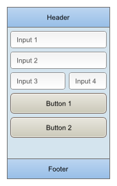
All Panel types (Cards, Navigators and Layouts) can have an optional header and footer. In the diagram below, the Panel Card has a header and footer.
If your application contains two or more Panel Cards, then you will need a mechanism for displaying multiple Panel Cards at once, or for transitioning between Panel Cards.
The Panel Navigator is the mechanism by which you can transition from one Panel Card to another.
Note: Actually, stated more accurately, the Panel Navigator is a mechanism for transitioning from one Panel to another (not Panel Card) , since the transition is not limited to Panel Cards. As we will discuss shortly, a Panel Navigator can contain nested Panel Navigators and Panel Layouts, in addition to nested Panel Cards.
Here is how a Panel Card is represented in the UX builder:
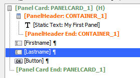
As you can see the 'tree control' that shows the controls in the UX component has a [Panel Card] begin and [Panel Card] end entry. All items within these two entries are inside the Panel Card.
In the above example, the Panel Card also has a header (indicated by the [PanelHeader] begin and [PanelHeader] end entries.
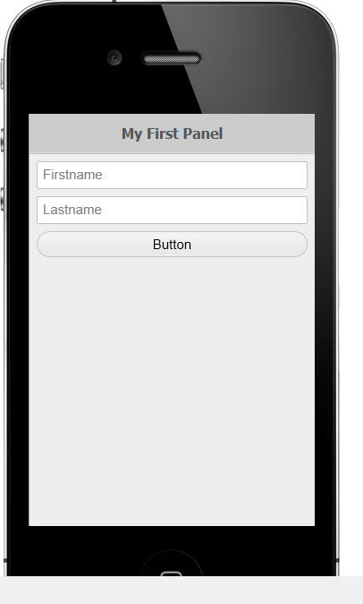
Here is how this UX component will render in the iPhone4 mobile simulator:
The Panel Navigator is a mechanism for transitioning from one Panel to another Panel.
The Panel Navigator contains nested Panels.
The nested Panel can be Panel Cards, Panel Layout and Panel Navigators.
In its simplest form, the Panel Navigator contains child Panel Cards.
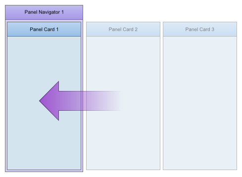
For example, in the image below you can see a Panel Navigator that contains three child Panel Cards.
The Panel Navigator shows one of its child Panels at a time. In the image below, the Panel Navigator is showing Panel Card 1.
The Panels that are displayed in a Panel Navigator automatically size themselves so that they fill the Panel Navigator window.
The Panel Navigator exposes four different ways in which you can transition from one Panel to another. These are:
When the Panel Navigator is configured to use Carousel style navigation, a swipe gesture with your fingers will transition from one Panel to another.
In the above image, when the user swipes from right to left on Panel Card 1, the Panel Navigator will transition from displaying Panel Card 1 to Panel Card 2.
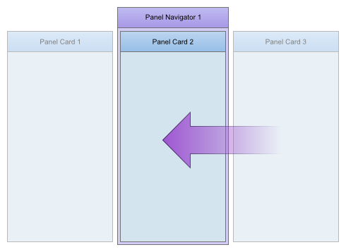
As the user drags on Panel Card 1 it will being to move out of view and Panel Card 2 will begin to move into view. If the user stops dragging before Panel Card 2 is full in view, then one of two possible outcomes will occur:
Once Panel Card 2 has come into view, the user can either drag from left-to-right (to bring Panel Card 1 back into view), or from right-to-left, to bring Panel Card 3 into view.
Once Panel Card 3 has come into view, if the user swipes from left-to-right on Panel Card 3, then Panel Card 3 will begin to move out of view, but as soon as the user stops the drag gesture, Panel Card 3 will bounce back into full view because there are no additional Panels after Panel Card 3.
Loop Navigation
You can optionally set the 'Loop' property for the Navigator so that when the user swipes from left to right on Panel Card 3, Panel Card 1 will be displayed.
And, when the user swipes on Panel Card 1 from left-to-right, Panel Card 3 will come into view.
In other words, the Panels in the Panel Navigator behave as if they are in a continuous loop.
Flow Direction
You can control the 'flow' direction of the Panels in a Panel Navigator. In the above examples, the 'flow' direction is Left-to-Right. The options for the 'Flow' property are:
For example, if the 'flow' property for a Panel Navigator is set to 'TTB' (top-to-bottom), then swiping up on the Panel that is currently visible in the Panel Navigator will bring the next Panel into view.
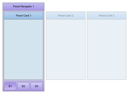
The Panel Navigator can be configured to operate in 'Tab' mode. In this case, the transition from one Panel to the next is accomplished by clicking on a tab button. Swiping on a Panel card will not transition from one Pane to the next.
As the image below shows, there is a button for each Panel in the Panel Navigator. Clicking the button will bring the corresponding Panel into view. In this image, button 1 (B1) has been clicked and therefore Panel Card 1 is shown in the Panel Navigator.
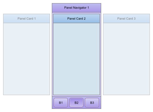
Next, button 2 (B2) has been clicked and therefore Panel Card 2 is shown in the Panel Navigator.
This option is generally only used in a desktop Web application. The Panels appear like a traditional tab control with a band of tab labels allowing you to select the active Panel Card.
This option is used when you want to use Javascript code to control which Panel in the Panel Navigator is visible.
The UX component has a method to programmatically activate the Panel that you want to set focus to.
For example:
{dialog.object}.panelSetActive('PANELCARD_2');
A Panel Layout is a mechanism for displaying two or more Panels at a time.
The Panel that are displayed in a Panel Layout can be any type of Panel (e.g. Panel Layout, Panel Navigator or Panel Card).
The Panels in a Panel Layout are displayed in the specified 'flow' direction.
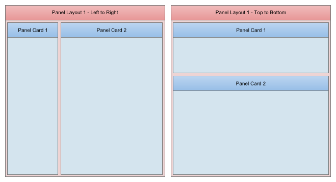
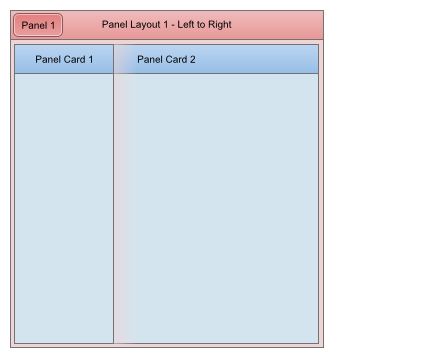
For example in the image below on the left we have a Panel Layout that contains two Panel Cards. The 'flow' direction is LTR (left-to-right), so Panel Card 2 is show to the right of Panel Card 1.
However, by simply changing the 'flow' property of this Panel Layout to 'TTB' (top-to-bottom), we can change the visual appearance to show Panel Card 2 below Panel Card 1.
Notice that the Panels shown in the Panel Layout automatically size themselves to consume all of the available space.
If the size of the browser window changes (or, in the case of a mobile device, if the device orientation changes), the Panels in the Panel Layout will automatically resize themselves so that they continue to fill the available space.
When a Panel is inside a Panel Layout, it has a size property. If the Panel Layout 'flow' property is set to LTR or RTL (i.e. a horizontal flow direction), then size property refers to the panel width (the height is automatically 100% of the Panel Layout). On the other hand, if the flow property is set to TTB or BTT (i.e. a vertical flow direction), the size property refers to the panel height.
The size property can be expressed as an absolute size (e.g. 2in) or a relative size, using the 'flex' convention.
For example, if you have four Panels in a Panel Layout and the Panels have their size specified as flex(1), flex(2), flex(1) and 1 inch respectively, then the size of each Panel in the Panel Layout will be computed as follows:
Now, assume that the Panel Layout is being rendered on a tablet device, using a TTB flow direction, and that the available height in the Panel Layout for its child Panels is 8 inches. The actual height of each Panel in the Panel Layout is:
In the images shown above, it is clear that Panel Card 1 appears to be about half the size (width in the case of the image on the left, and height in the case of the image on the right) of Panel Card 2. This is achieved by setting Panel Card 1's size to flex(1) and Panel Card 2's size to flex(2).
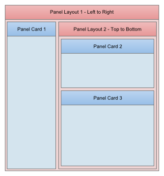
As noted previously, a Panel Layout can contain any type of Panel. In the images above, the Panel Layout contained two Panel Cards. But, by nesting Panel Layout and Panel Navigators inside Panel Layouts, you can create complex layouts.
For example, in the image shown below, we have modified the Panel Layout (i.e. Panel Layout 1) and replaced Panel Card 2 with a Panel Layout (i.e. Panel Layout 2), which in turn contains two Panel Cards.
Notice that the 'flow' direction on Panel Layout 2 has been set to TTB (top-to-bottom). The 'flow' direction for Panel Layout 1 is LTR (left-to-right).
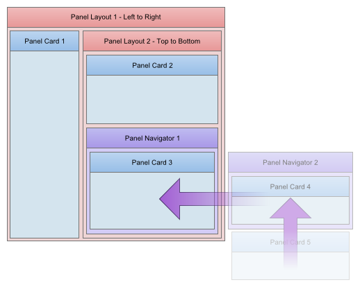
And this is by no means the end of the richness of the layout that we can create. For example, in the image shown below, Panel Card 3 has been replaced by a Panel Navigator (Panel Navigator 1).
Panel Navigator 1 shows Pane Card 3 initially, but (since its 'flow' property has been set to LTR - left-to-right), when the user drags to the right on Panel Card 3, the next Panel in the Panel Navigator 1 comes into view. In this case, this Panel is another Panel Navigator (Panel Navigator 2) and this Panel Navigator will initially show Panel Card 4.
When the user swipes upwards on Panel Card 4 (since the 'flow' property for Panel Navigator 2 has been set to TTB - top-to-bottom), Pane Card 5 will come into view.
This is clearly a very complex layout, but it is easily defined in the UX Component builder.
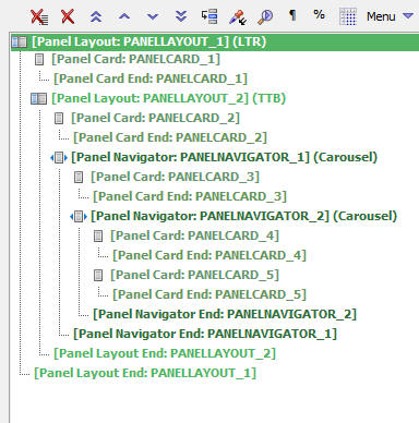
The above layout can easily be envisaged using the following 'tree' structure, which is very close to how this layout would be represented in the UX Builder.
Panel Layout 1
Panel Card 1
Panel Layout 2
Panel Card 2
Panel Navigator 1
Panel Card 4
Panel Card 5
Here is how the above structure of Panels would be represented in the UX Builder.
Note: The UX Builder representation is slightly more 'complex' than the simple tree structure shown above because the UX Builder shows an entry in the tree for both the Panel start and the Panel end.
Note 2: Obviously, the UX Builder shown below has been further simplified because each of the Panel Cards shown do not actually contain any controls. Of course, in a real component, each Panel Card would contain controls (such as text boxes, buttons, lists, charts, etc.)
An advanced option for Panels allows you to set a minimum size for a child Panel in a Panel Layout. If there is insufficient space to show all of the child Panels (because one or more of the child Panels have a minimum size requirement which is greater than the available space), the Panels in the Panel Layout that have been marked as 'dockable' (i.e. allowed to be hidden) will be docked, thus freeing up more space to display the Panel(s) that have a minimum size.
Panels that have been 'docked' can be show (i.e. 'un-hidden') in one of two ways:
In applications for mobile devices this is a common pattern. For example, when designing a 'split-view' type layout for a tablet, there will be sufficient space when the tablet is in landscape orientation to display the two panels (termed the 'navigator' and 'detail' Panel) in the split-view simultaneously. But when the tablet's orientation is changed to portrait, the 'navigation' pane in the 'split-view' will automatically be hidden (because of the minimum size that has been set for the 'detail' Panel).
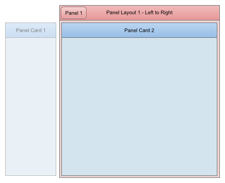
In the image below, we have Panel Layout with two child Panel Cards. As the image shows, Panel Card 1 has been 'docked' (i.e. Panel Card 1 is not visible in Page Layout 1 and in the image it is shown to the left - outside - Panel Layout 1 to indicate that it is 'there' but not shown).
Panel Card 1 has been docked because:
Note: We will discuss the different 'Dock' properties in more detail below.
Notice also that in the Header for Panel Layout 1 there is a button. Clicking this button will show the 'docked' Panel (Panel Card 1).
When a docked Panel is shown there are two ways in which the currently visible Panels can be treated.
More On The Dock Property
The screenshot below shows where you can set the 'dock' property for a Panel in a Panel Layout.
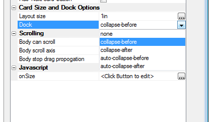
The options for the 'dock' property are:
In the above example, the 'Dock' property for Panel Card 1 was set to 'auto-collapse-before', which means that the Panel Card 1 will be collapsed automatically (but only if necessary, because some other Panel with a minimum size needs the space occupied by this Panel).
However, you could configure Panel Card 1 so that it is always collapsed (i.e. 'docked') regardless of the size of the browser window or orientation of the mobile device.
You can also specify if the 'docked' Panel is 'before' or 'after' the visible Panels. This property determines where the 'docked' Panel gets shown when it is shown.
In the above image, when Panel Card 1 is shown it is shown on the left side of Panel Layout 1 (because the 'flow' property of Panel Layout 1 is set to LTR and the 'dock' property of 'Panel Card 1' is 'auto-collapse-before'.
However, had the 'dock' property of 'Panel Card 1' been set to 'auto-collapse-after', then when Panel Card 1 was shown, it would have been shown on the right side of Panel Layout 1.
Furthermore, had the 'flow' property of Panel Layout 1 been set to TTB, then when Panel Card 1 was shown, it would have been shown at the bottom of Panel Layout 1.
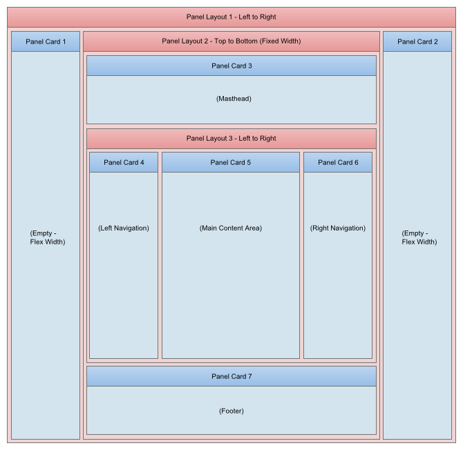
As noted previously, Panels are not just for mobile applications. You can also use Panels in desktop Web application. Once good use of Panel Layouts is to construct complex page layouts.
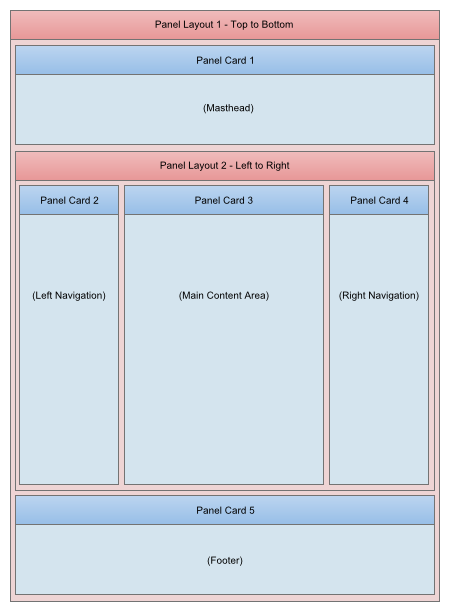
The New York Times web site is a good example of a complex page layout that can easily be accomplished using Panel Layouts.
If you look at the image below, you will see that the page is divided into several different 'logical' sections.
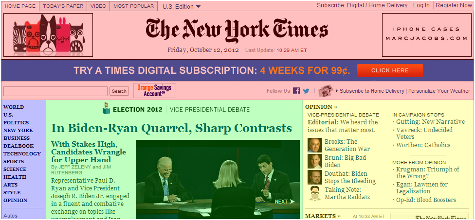
The following structure of Panel Layouts and Panel Cards (which contain the actual content) will duplicate the layout of the New York times site show above:
If you view the New York times side in your browser, you will notice that the page has a fixed width and is horizontally centered in the browser window.
This is easily accomplished by wrapping the above structure in another Panel Layout as shown in the image below. The structure of this 'container' Panel Layout is:
Panel Layout 1
Panel Card 1
Panel Layout 2 (the Panel Layout shown in the above diagram)
Panel Card 2
Panel Card 1 and Panel Card 2 are empty - they do not have any controls in them. Their sole purpose is to force Panel Layout 2 to render in the center of the screen. In addition, the widths for Panel Card 1 and Panel Card 2 are set using the 'flex' option. As a result of this, when the browser window is resized, the main layout (Panel Layout 2) remains horizontally centered in the page.